The network for creativity
Join 1.25M professional creatives like you
Connect with clients, get discovered, and run your business 100% commission-free
Creatives on Contra have earned over $150M and we are just getting started
Back to feedPost

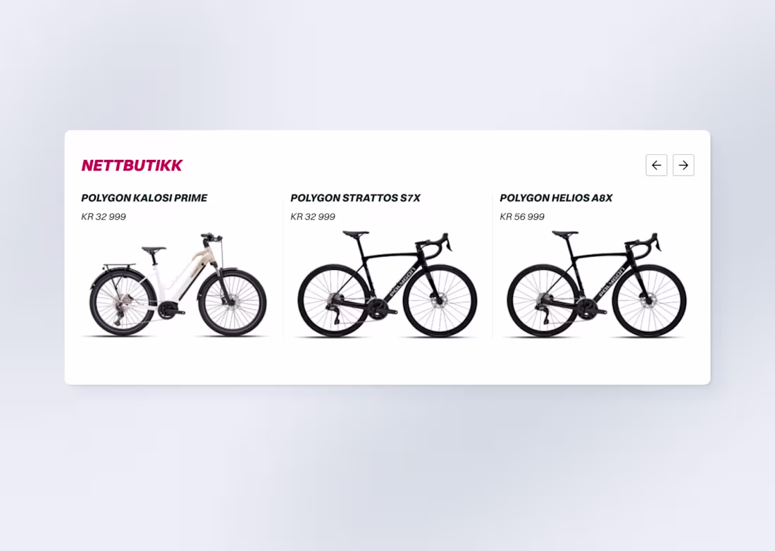
One fumble I made when redesigning a website for a Bike shop, resulted in fewer overall conversions.
For the shop page, it was decided that we put the title and price above the product images. The overall layout featured huge images stacked beside each other, which would take up the entire width of the screen.
The reasoning was that the large image elements would create a natural separation between the products. Also, it looked cool.
It wasn´t until a bit later that we understood that visitors struggled with the confusing layout hierarchy. Especially when product cards were stacked on top of each other. (We observed a user navigating this live).
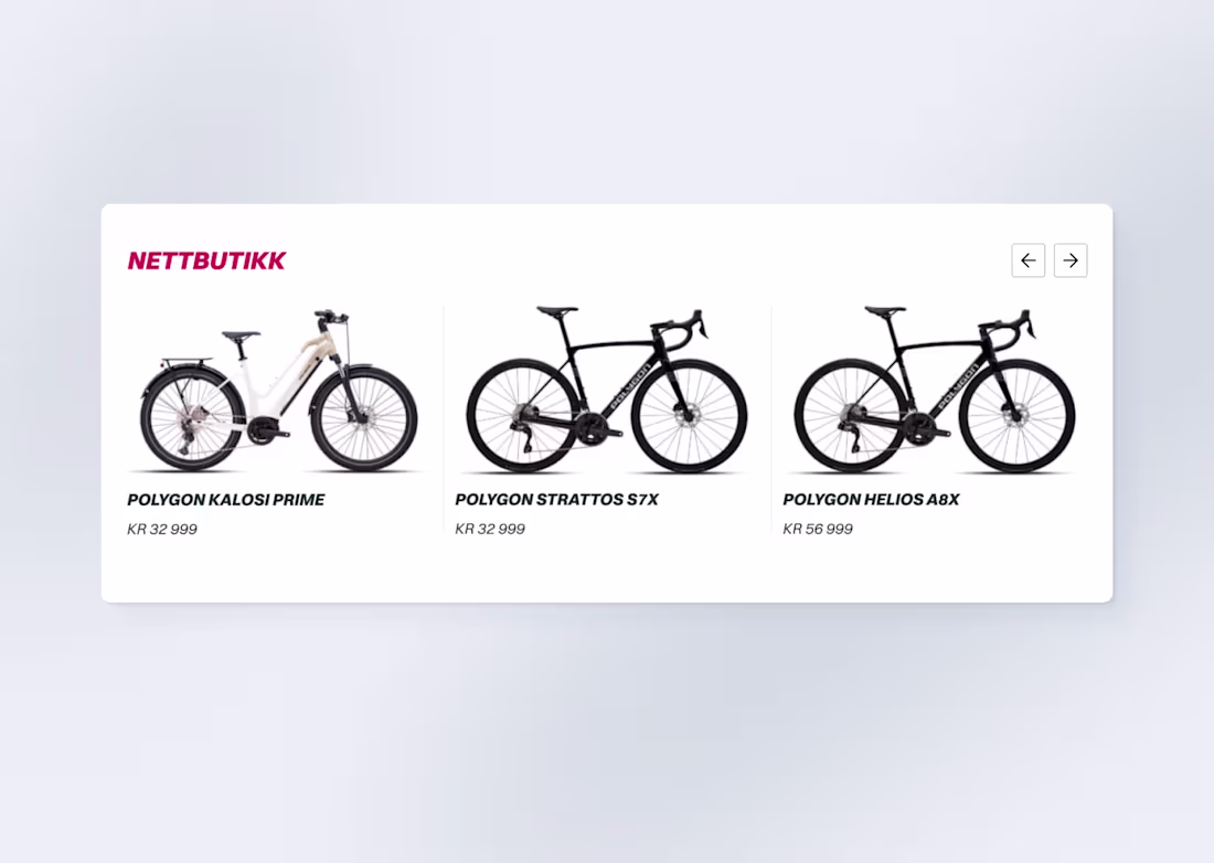
If you think about it, it makes sense. The image should do the heavy lifting and pique interest first. Only when we rationalize things, do we look at information like title, price, and additional information. It´s how we make decisions when shopping in the real world.
Emotion before logic. Not vice versa.
Minor fix, big difference.
The network for creativity
Join 1.25M professional creatives like you
Connect with clients, get discovered, and run your business 100% commission-free
Creatives on Contra have earned over $150M and we are just getting started
Related posts

Designers don't have a clear career development path.
That's what surprised me when I was listening to this episode of Creative Confessions yesterday.
I guess that's why improvise with design challenges, short courses, side projects, shiny objects. It might look a bit wonky from the outside by it's actually pure dedication in the absence of structure.
This project 'Webheads' is an example of that. I created 105 above the fold designs for a range of fictitious businesses to flex my design muscles a bit and get better with colour, type and composition.
We're dedicated to getting better, but totally self-motivated.
I guess we're self-directed in a system that never gap us a map.
What do you do to get better?


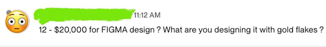
20K for design?” No.
$20K is not for design. It’s for fixing decisions that are already costing you money.
Because the problem isn’t UI. The problem is: users don’t reach the value onboarding doesn’t convert flows break motivation the product isn’t generating revenue, even though it could
We’ve had cases where redesigning onboarding increased conversion by +40%. You’re not paying for screens. You’re paying for your product to start working. And yes - it’s not for everyone.
If you want to understand where your product is losing money - you can book a strategic session here: 👉 https://contra.com/s/k6qZgFA2-mobile-app-ui-ux-design-audit-and-growth-strategy-for-mobile-app
🔖 Tags
#mobileappdesign #uxdesign #productdesign #growthdesign #uxstrategy #mobileux #appdesign #conversionrate #retention #onboarding #startupdesign #saasdesign #figmadesign #uidesign #productgrowth #userexperience #uxaudit #designstrategy #appgrowth #uxui #asol_design


some clients just have an attitude, don't they? hahaha

Homepage design of our Framer eCommerce project fully integrated with Shopify using Framer Commerce. Framlix goal was to make clean and modern website but making sure it stand-out on market.
💬 Have we achieved that? Let us know in comments!


Trending


Notion
Notion isn’t just where you work, it’s starting to work for you. What agents are you building?
brandguidelines
Brand guidelines are becoming living systems, not static documents. What are you building for your clients?
aivideo
AI video tools are moving at warp speed. Which ones are you experimenting with?
illustration
Handcrafted illustration is bubbling up across the web. What are you drawing lately?
freelancerlife
Freelancer life is wins, pivots, and everything in between. What’s yours right now?