The network for creativity
Join 1.25M professional creatives like you
Connect with clients, get discovered, and run your business 100% commission-free
Creatives on Contra have earned over $150M and we are just getting started
Back to feedPost
Taste Test
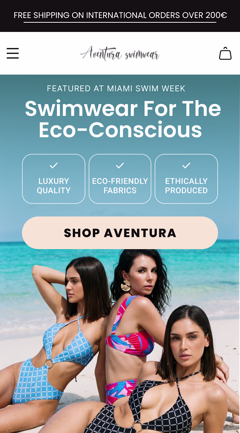
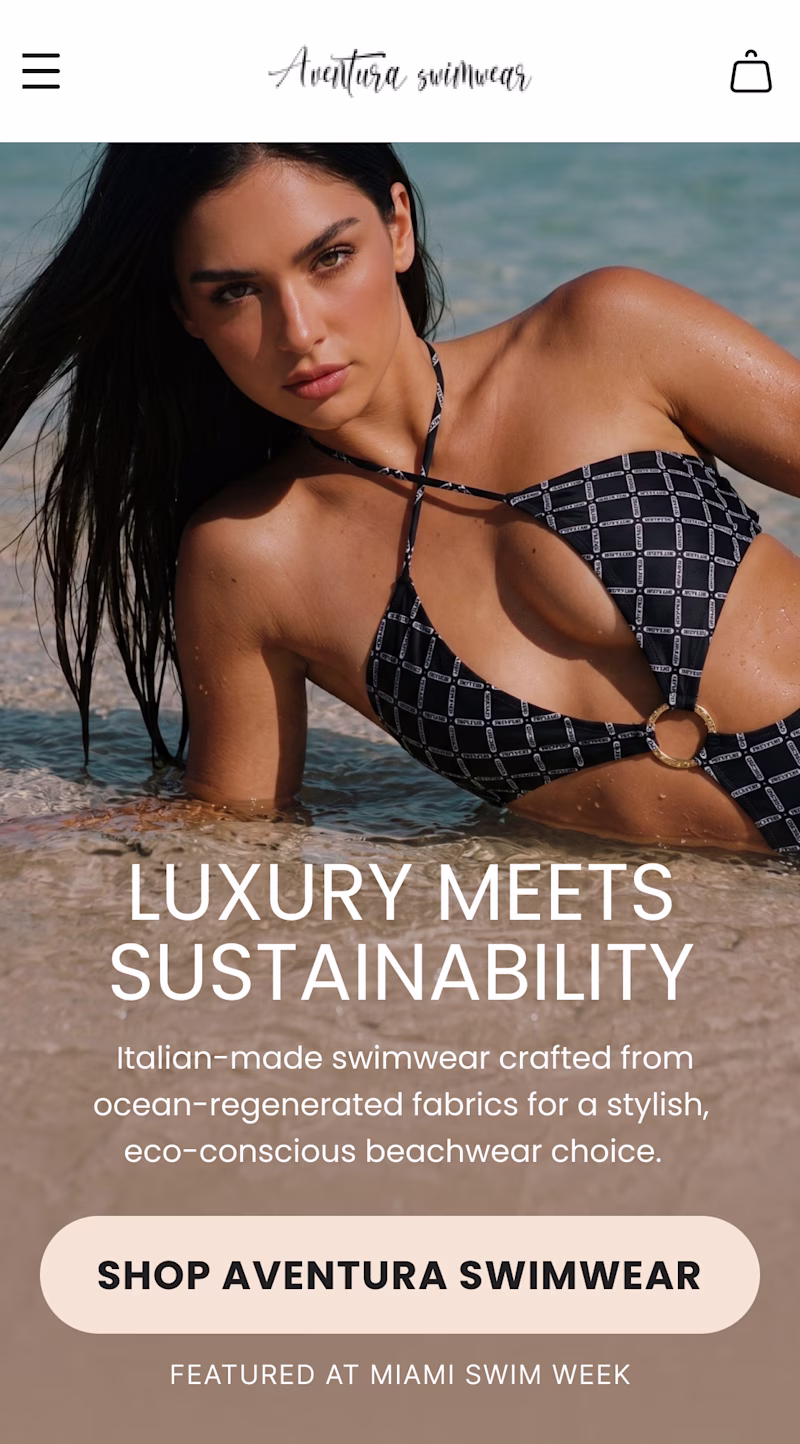
Quick A/B test for this hero section redesign for Aventura Swimwear.
Here, I focus on highlighting what's unique to the brand above the fold.
Which variation do you think is better? The original design is also attached.
13 votes
Ends in 3h
Cool designs
i appreciate your comment.
Option 2
Just curious...why option 2?
Most of my clients, liked the 2nd-type most, especially for ecommerce.
Interesting...I actually have a baise for option 1 because of the trust signal, wasn't expecting people would go for the other option at all. lol
Going with option 2
Hmm..any reason why you prefer that?
Option 2
seems people are going for option 2...which is a bit surprising
It shouldn't be surprising tho
B is enough 💯
Hi Fidel, I work directly with the Aventura Swimwear team and we have seen this post. While we appreciate the time taken to explore these concepts, we do need to clarify that this work was not commissioned, approved or created in collaboration with the brand.
I will send you a direct message regarding this.
Hi, thank you for reaching out. To be clear this was entirely speculative work, created independently as a CRO and UX exercise, and was never presented as an official Aventura project.
Happy to continue the conversation in DMs.
Option 2
The network for creativity
Join 1.25M professional creatives like you
Connect with clients, get discovered, and run your business 100% commission-free
Creatives on Contra have earned over $150M and we are just getting started
Related posts
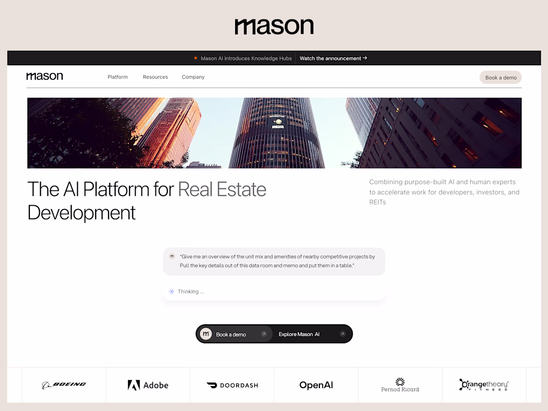
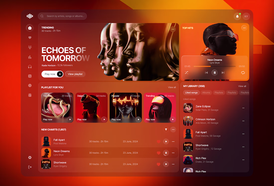
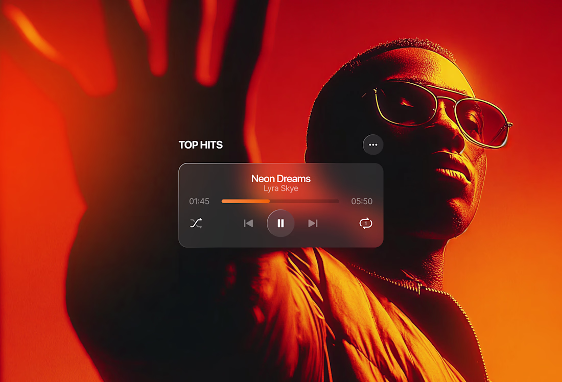
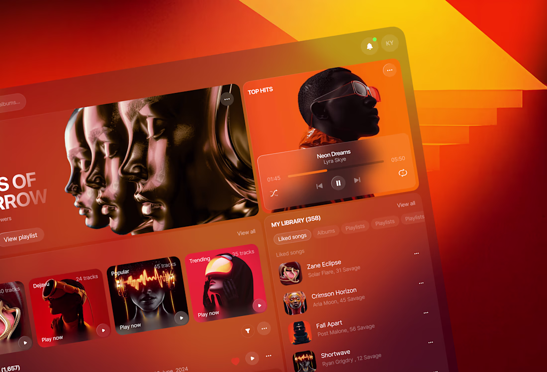
New Project Casestudy for Mason AI :
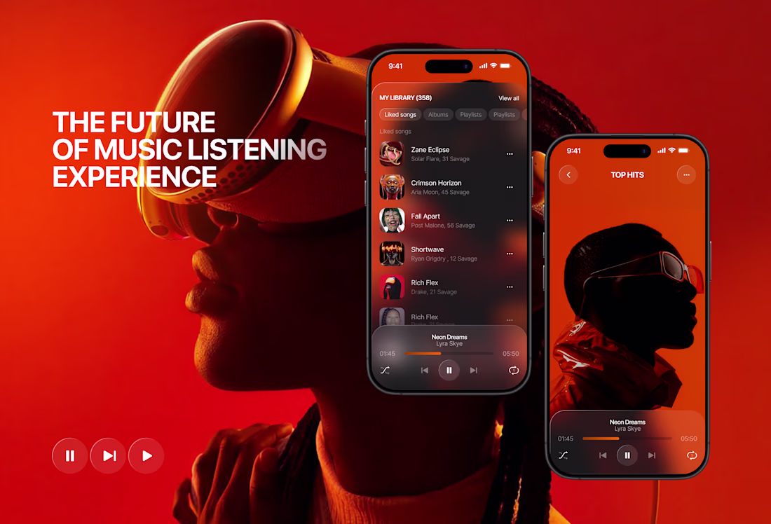
Music streaming platform concept 🎧
Music has always been emotional. The interface around it should be too.
This is a concept for a music streaming platform built around one idea — immersion. Not just in the music, but in the visual experience of discovering and listening to it.
The warm palette of deep reds, burnt oranges, and dark backgrounds wasn't accidental. It creates a mood. It makes you want to stay, scroll, and listen.
What I focused on:
→ A dashboard that surfaces the right content without overwhelming
→ A "now playing" experience that feels cinematic
→ Mobile screens that carry the same visual weight as desktop
→ Typography and hierarchy that guide without interrupting the vibe
This is a concept — but built on real UX logic. Because even imaginary products deserve thoughtful design. 🎧🖤
#MusicApp #UIDesign #ProductDesign #DarkUI #AppDesign #UXDesign #MobileDesign
This palette is an absolute dream! The burnt orange and deep red tones mixed with that sleek dark UI create an incredibly warm, midnight-session vibe. It perfectly captures how music feels. Brilliant work! 🎧🔥
Another client sent us an AI-built page asking if we can "spruce it up." Hold our beer. 🍺
Designer vs. AI, who takes it?
Also, comment if you've been gifted one of these beautifully bland masterpieces produced by Claude to spruce up.
9 voted
14%
56 voted
86%
65 votes
Closed
Who even voted AI 😭
Trending
Claude
Claude has entered the design space. How are you using Claude Design?
Contra University
Learn from expert creatives how to earn more using next-gen AI tools.
MagicPath
The canvas is infinite, and exploration is becoming the workflow. How are you using MagicPath?
creativeaiflow
Creative AI workflows are evolving. What tools do you use, and what are their strengths and weaknesses?
freelancerlife
Freelancer life is wins, pivots, and everything in between. What’s yours right now?