The network for creativity
Join 1.25M professional creatives like you
Connect with clients, get discovered, and run your business 100% commission-free
Creatives on Contra have earned over $150M and we are just getting started
Back to feedPost

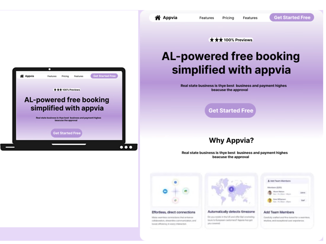
🚨 A beautiful website isn’t enough if users don’t know what to do next.
The problem:
AI-powered booking platforms can easily feel overwhelming when too much information is presented at once.
My solution:
I designed a cleaner booking experience in Figma with:
→ Clear visual hierarchy
→ Simple user flow
→ Focused content
→ Strong CTA
→ Trust-building sections
The expected result:
A more understandable experience where users can quickly see what the product does, know what to do next, and move toward booking with less friction.
This is a concept design, created to demonstrate how thoughtful UI/UX can turn a complex AI experience into something simple and intuitive.
If you're building an AI/SaaS product and need a cleaner, more conversion-focused experience:
💬 DM me “AI” — I’d love to hear what you’re building.
#AI #SaaS #UIUX #ProductDesign #WebDesign #Figma #LandingPage

The network for creativity
Join 1.25M professional creatives like you
Connect with clients, get discovered, and run your business 100% commission-free
Creatives on Contra have earned over $150M and we are just getting started
Trending
retrofuturism
Share your favorite designs from the past exploring the distant future. Or your own take on the aesthetic 🚀
halftone
Dots. Texture. Grain. Let's see your designs using the halftone technique.

Midjourney
Creatives are showing off what they're making with Midjourney.
colorgrade
Video editors sound off: How do you enhance the mood of your video in color grading?





Related posts

Recent design work 🙂↕️
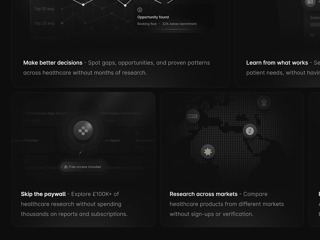
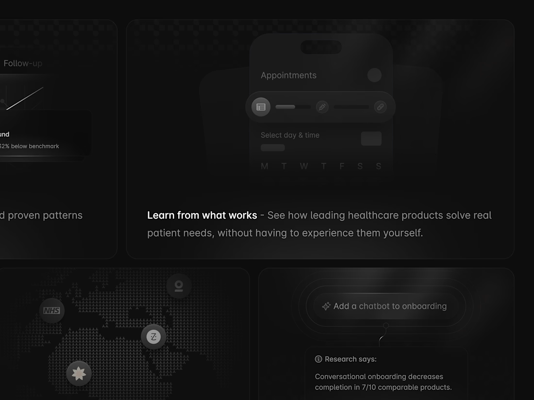
I design the best bento sections, even monochrome 😌
Happy Sunday 🥂

Looks amazing

Animated UI Components: Figma + Figma Motion
I designed and animated a set of UI components in Figma using Figma Motion.
The goal was simple: make everyday interface interactions feel more natural, responsive, and enjoyable.
What I worked on
I started by designing the components with a focus on:
Clear visual hierarchy
Consistent spacing
Reusable components
Clean typography
Proper interaction states
A consistent visual language
After creating the components, I used Figma Motion to bring them to life.
Why motion?
Good UI shouldn’t only look good when it’s static.
The way an element appears, changes, responds, or moves can make an interface feel much easier to understand.
For the animations, I focused on keeping the movement:
Smooth
Simple
Purposeful
Fast enough to feel responsive
Subtle enough not to distract
The goal wasn’t to add animation just for decoration.
Each transition was designed to give the user feedback and make the interaction feel more connected.
My process
1. Design the component
I first created the UI component and made sure the structure, spacing, typography, and visual states were consistent.
2. Define the interaction
I considered what should happen when the user interacts with the component—how it should appear, change, or respond.
3. Add motion
I then used Figma Motion to create the transitions and refine the timing and movement.
4. Refine
I adjusted the animation until it felt natural and balanced with the rest of the interface.
The result
The final components combine UI design and motion design to create interactions that feel more polished and intentional.
This project was also a good reminder that small interactions can have a big impact on how a product feels.
Designed in Figma.
Animated with Figma Motion.

Clean work🔥
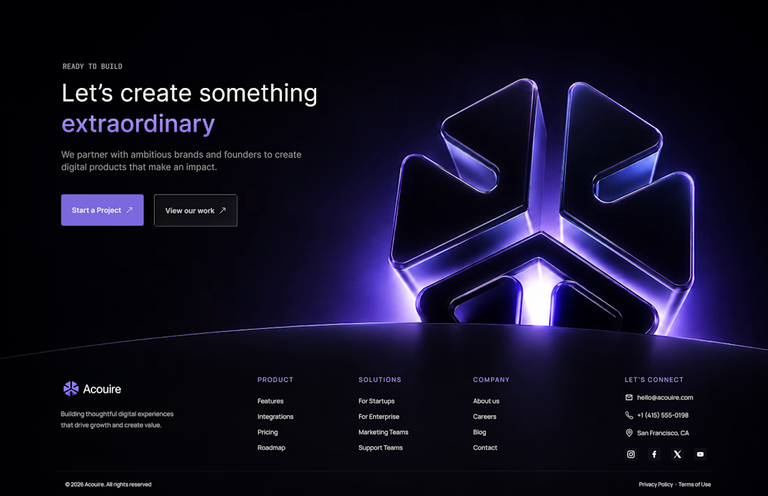
What if the footer was designed to be remembered, not just reached?
#UIDesign #WebDesign #LandingPage #Figma #UXDesign #UIUX #Footer #FooterDesign