The network for creativity
Join 1.25M professional creatives like you
Connect with clients, get discovered, and run your business 100% commission-free
Creatives on Contra have earned over $150M and we are just getting started
Back to feedPost
Week 2 of #ContraQuest
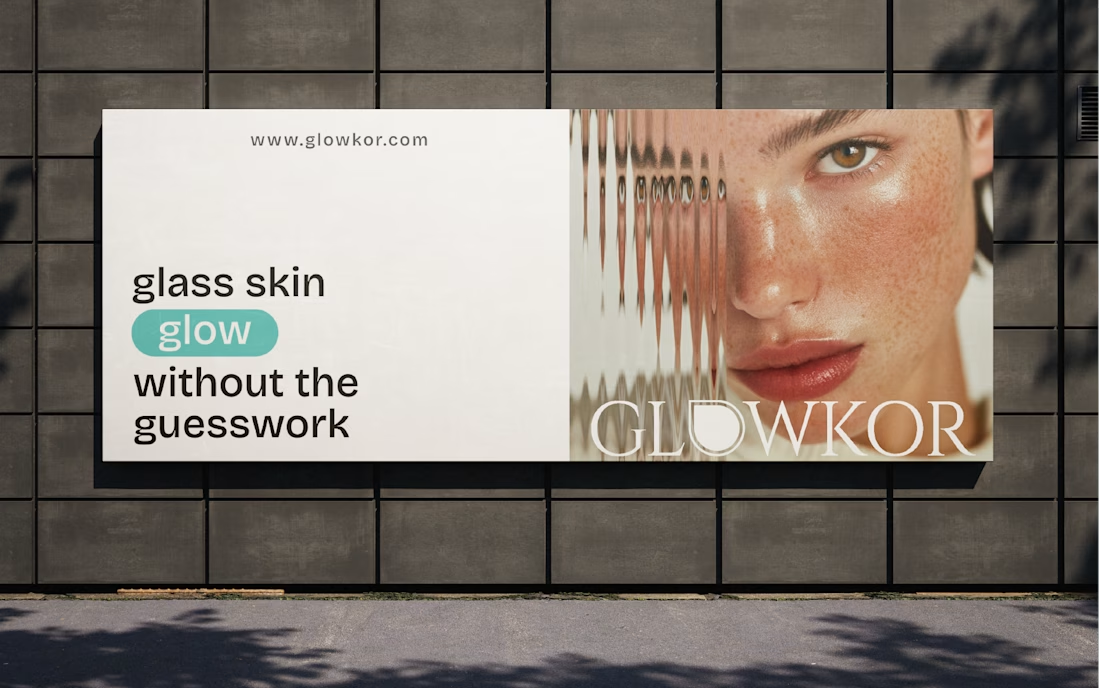
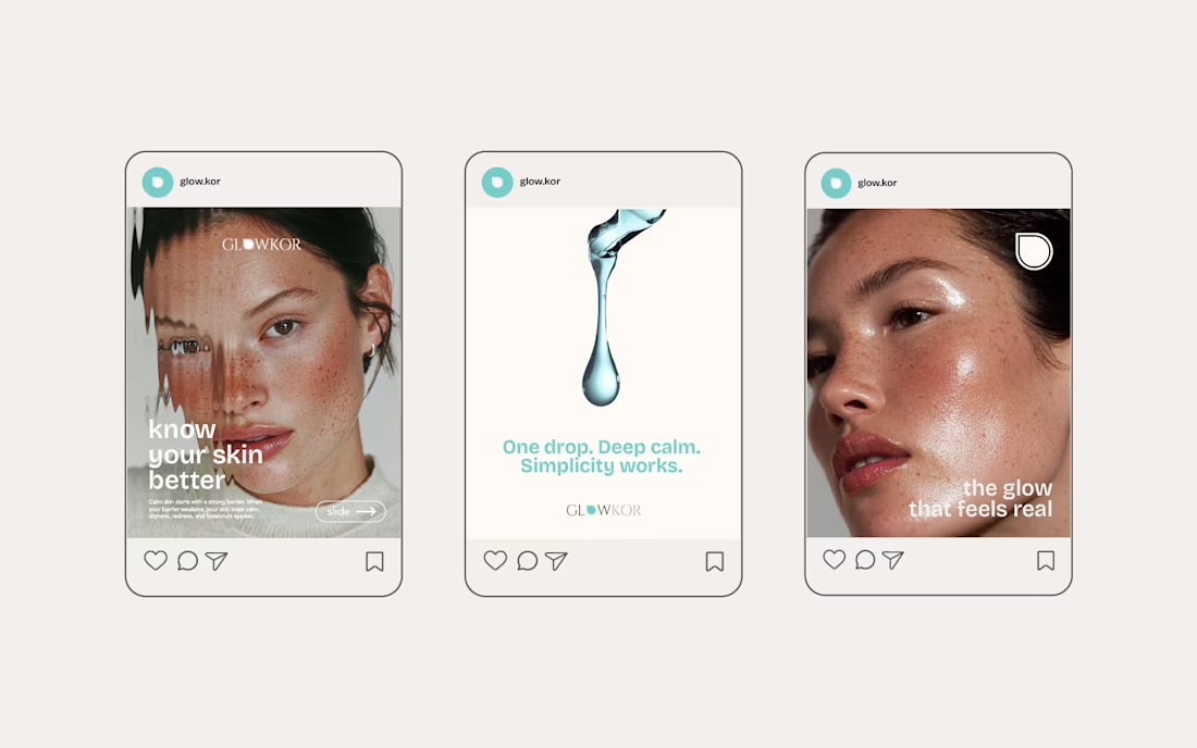
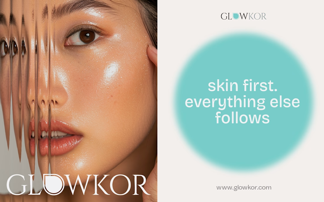
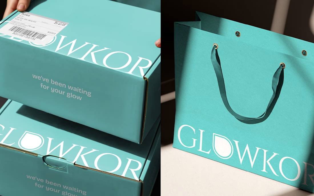
This is Glowkor, a retail brand focused on curated K-beauty skincare.
The design focuses on softness and restraint: calm layouts, clean skin imagery, and quiet typography. Nothing loud or forced; just visuals that feel confident, modern, and trustworthy in real use.
I used Adobe Illustrator and Adobe Photoshop as the tools. What I enjoyed most was finding the balance between minimal and warm, especially across social content, outdoor placements, and packaging.
In 2026, I want to work with cafés, beauty, food, wellness, lifestyle, and creative brands that want their visuals to feel true to their personality and confident in how they show up.
Hi, I'm Adel!👋 Just joined Contra and I'm honestly so inspired by everyone's work here. I'd love to connect and chat with more creative people 😊




Nice👍

Thank you🙌

nice work!
Thanks😊

Remembering "Breakfast at Tiffany's" movie btw, thanks to the color, great branding for sure!
Thanks! Appreciate it! The colors were meant to feel fresh, light and approachable. Happy you like it🙌


beautiful & clean design!
Thanks! Glad you like it! Exploring clean minimalist styles is fun, especially coming from my usual bold style 😄

Hi, Adel!
Hi Mark!

Absolutely beautiful!
Thank you☺️
This is so beautiful, love the color!
Thank you for your kind words🫶🏻

The focus on softness for Glowkor is really coming through. The clean skin imagery and quiet typography create a very trustworthy and modern aesthetic for a K-beauty brand.
Thank you for noticing! Yes, those elements were chosen to reflect a trustworthy and modern direction for the brand😊

Looks Amazing!!
Thanks! 😊

Love the color, great work!
Thank you! Glad you like it 😊

amazing work
thanks✨

That 'warm access' phrasing is gold. Most beauty sites still blast cold clinical vibes
Thank you! That was exactly the intention, keeping it warm and approachable rather than overly clinical 🙌

I love the glass effect! How did you make it?
Thanks! I made it in Photoshop using blur, and a bit of highlight to create the glass effect 😊
Very cool. works really well!


Absolutely love this so much! The typeface and the color are beautiful😍
Thank you so much! That really means a lot coming from you 🫶🏻

love them!
Thanks!🙌

Definitely conveys a clear brand identity! Looks very fresh and inviting😍
omg thank you🫶🏻

Thank you✨

This is beautiful 🔥
Thank you✨

this look amazing
Thanks😊

This is amazing. I love that stutter effect on the image. It mimics an oily screen.
Glad you like it! I tried to give the image a subtle personality🫶🏻
It stands out. Nice work 🙌

Nice 😍
Thank you! ✨

OMG THANKS 🥺

great work 🔥
Thanks🙌

This is a great example of restraint done right. The softness isn’t passive—it’s intentional, confident, and deeply aligned with how modern K-beauty brands build trust. Nothing here feels decorative; every visual choice supports credibility, calm, and real-world usability across...
Wow, Varghese, thank you so much for this! Honestly, reading your comment made my day! I’m so glad you noticed the softness. I was really trying to balance minimal and warm, and it’s awesome to hear it landed the way I hoped. I wanted the brand to feel thoughtful and scalable:...

beautiful 🙌
Thank you🙌

sweeeet
Thanks!😊

This is very Beautiful!!🔥 🚀 💯
Appreciate it🙌

so refreshing to look at!!
Thank you✨

Welcome to Contra! This work is stunning - the restrained, minimal aesthetic is perfect for K-beauty. The balance between warm and clean you mentioned really comes through. Looking forward to seeing more of your work here!
Thank you so much for the warm welcome! I really appreciate you taking the time to notice those details. That balance was something I cared a lot about, so it means a lot to hear it came through. Looking forward to sharing more work here and seeing other creatives’ work 👀✨
The network for creativity
Join 1.25M professional creatives like you
Connect with clients, get discovered, and run your business 100% commission-free
Creatives on Contra have earned over $150M and we are just getting started







Related posts

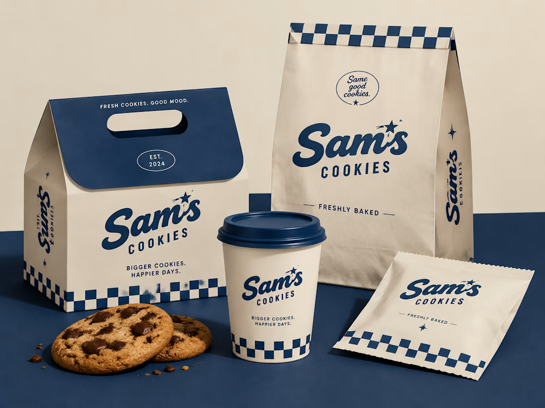
Turning a simple cookie into a memorable brand experience.
A packaging concept created to combine strategy, nostalgia, and a timeless American feel.
#BrandIdentity #PackagingDesign #FoodBranding #CreativeDirection

Beautiful design 😍

Meriot personal portfolio Website Homepage showcase
A portfolio website designed to turn personal expertise into a strong digital presence.
The goal was to create a website that communicates experience, personality, expertise, and credibility within the first few seconds.
I focused on:
Clear positioning and personal branding
Strong visual hierarchy
Editorial-style typography
Project-focused storytelling
UX/Product Design service presentation
Testimonials and social proof
Clear CTA for potential clients
Responsive, conversion-focused layouts
The visual direction combines minimal typography, bold imagery, dark/light sections, and subtle interactions to give the portfolio a distinctive personality without making it difficult to navigate.


Top notch execution

Design Direction Poll!
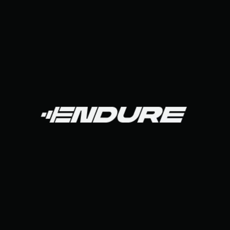
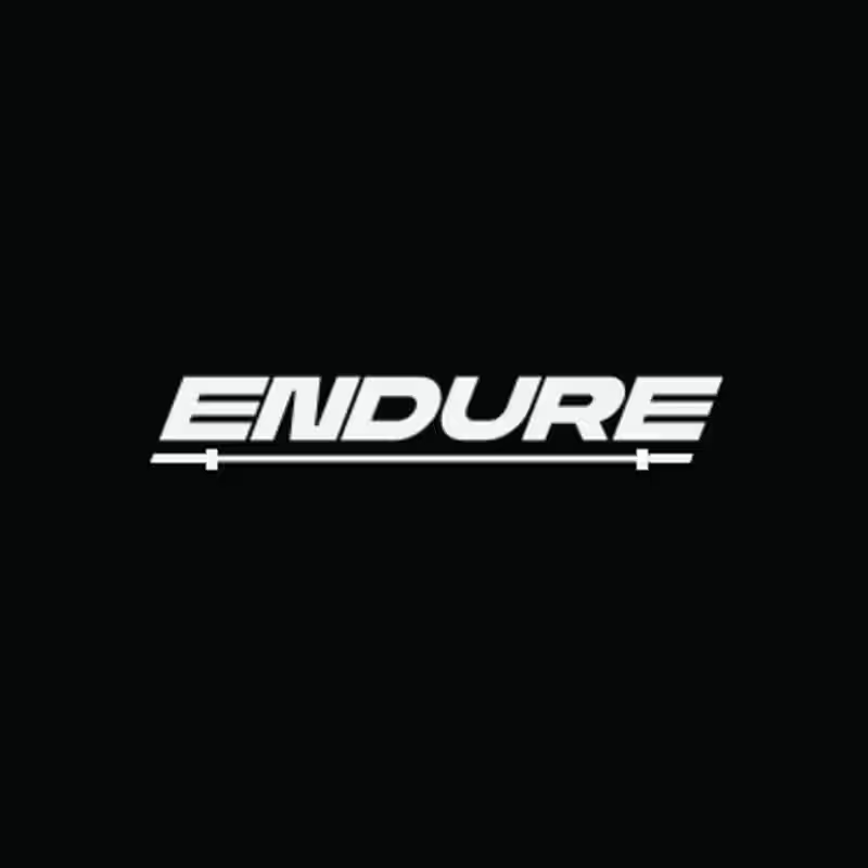
Two versions of the same Endure logo concept; same aggressive italic letterforms, same racing DNA. One detail changes the entire read.
Which version hits harder? 👇
14 voted
78%
4 voted
22%
18 votes
Closed
