The network for creativity
Join 1.25M professional creatives like you
Connect with clients, get discovered, and run your business 100% commission-free
Creatives on Contra have earned over $150M and we are just getting started
Back to feedPost

A few changes on your homepage can make a huge difference in conversion.
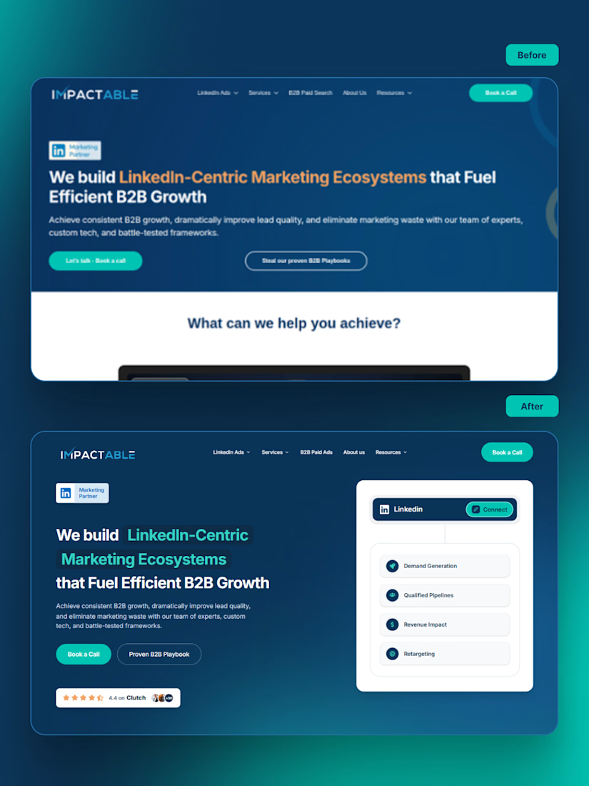
A few weeks ago, I came across Impactable - B2B LinkedIn Agency, and I honestly love what they've built. Their positioning is clear, the messaging is strong, and it already feels like a solid B2B brand.
From a conversion standpoint, though, I spotted a few opportunities that could help the homepage work even harder:
1️⃣The LinkedIn Marketing Partner badge is a great authority signal. I'd definitely keep it. I just think some of the stronger proof, like customer reviews, should also appear above the fold to build trust even faster.
2️⃣The CTA buttons feel visually disconnected. Grouping them creates a clearer path to action.
3️⃣The headline makes a strong promise, but the hero doesn't visually reinforce it. A supporting visual would help communicate that promise much faster.
So I redesigned just the hero section.
The biggest changes I made were:
1️⃣ Kept the LinkedIn Marketing Partner badge and moved stronger proof above the fold.
2️⃣ Brought the CTA buttons closer together to create a clearer next step.
3️⃣ Added a hero visual that reinforces the promise in the headline.
4️⃣ Introduced stronger credibility signals before visitors start scrolling.
None of these change the positioning. They simply make the value easier to understand and trust.
Sometimes the biggest conversion gains don't come from rewriting your offer. They come from helping visitors believe it faster.
What would you improve? I'd love to hear another perspective.
The network for creativity
Join 1.25M professional creatives like you
Connect with clients, get discovered, and run your business 100% commission-free
Creatives on Contra have earned over $150M and we are just getting started
Trending
retrofuturism
Share your favorite designs from the past exploring the distant future. Or your own take on the aesthetic 🚀
halftone
Dots. Texture. Grain. Let's see your designs using the halftone technique.

Midjourney
Creatives are showing off what they're making with Midjourney.
colorgrade
Video editors sound off: How do you enhance the mood of your video in color grading?


Related posts

LinkedIn is facing a huge challenge.
You and I know how important it is to connect, engage, and build relationships on LinkedIn.
But with the rise of AI, more people are trying to automate their connections, comments, and even their content.
Here’s the truth: Real connections can’t be automated.
The AI mania on LinkedIn is a direct result of people feeling the need to do "more" with "less". That doesn't really work with networking.
Instead of falling into the AI trap, here are some simple steps to build an authentic LinkedIn presence:
1. STOP focusing on numbers.
↳ Don’t aim to connect with 100+ people each week. Focus on building as many genuine connections as you can.
2. Comment with intention.
↳ Don’t comment for the sake of commenting. Engage only when you truly have something meaningful to say.
3. Post when you have value to add.
↳ Don’t feel pressured to post every day. Share only when you have topics you genuinely want to discuss.
There are many ways to optimize your personal brand to make it time-efficient, but using AI to engage with your audience for you or create your content from scratch isn't one of them.


SaaS landing pages are built on clarity.
Not only on features.
Users land on your site just to find the reason to stay.
Before adding another feature, check if your landing page has all of these:
Clear outcome
One primary CTA
Visual hierarchy to guide users
Social proof
If your SaaS landing page isn’t converting,
It’s probably lacking one of those.
Save this if you’re building a SaaS product.


The homepage is a promise. The rest of the site has to keep it.
Share your thoughts?