The network for creativity
Join 1.25M professional creatives like you
Connect with clients, get discovered, and run your business 100% commission-free
Creatives on Contra have earned over $150M and we are just getting started
Back to feedPost
Built a visual identity system for a studio operating between AI, storytelling, strategy, and creative direction.
The challenge was balancing human imperfection with structured intelligence — resulting in a minimalist editorial system rooted in movement, texture, and narrative.


Identity System / Brand Direction / Website / Presentation Language
The network for creativity
Join 1.25M professional creatives like you
Connect with clients, get discovered, and run your business 100% commission-free
Creatives on Contra have earned over $150M and we are just getting started



Related posts

Skincare labels can be difficult to decipher, especially when you’re trying to understand ingredients, spot potential allergens, and find products that fit your budget.
Purefy is an AI-powered clean beauty app designed to make that process simpler. Scan a product barcode to explore ingredient information, then compare personalized alternatives across different price points. The experience brings product discovery and comparison into a clear, approachable mobile interface.
Soft pastels, rounded elements, and expressive typography give the app a fresh visual identity while keeping product information at the center.

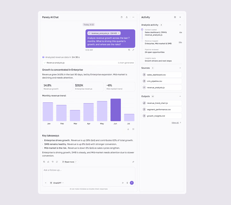
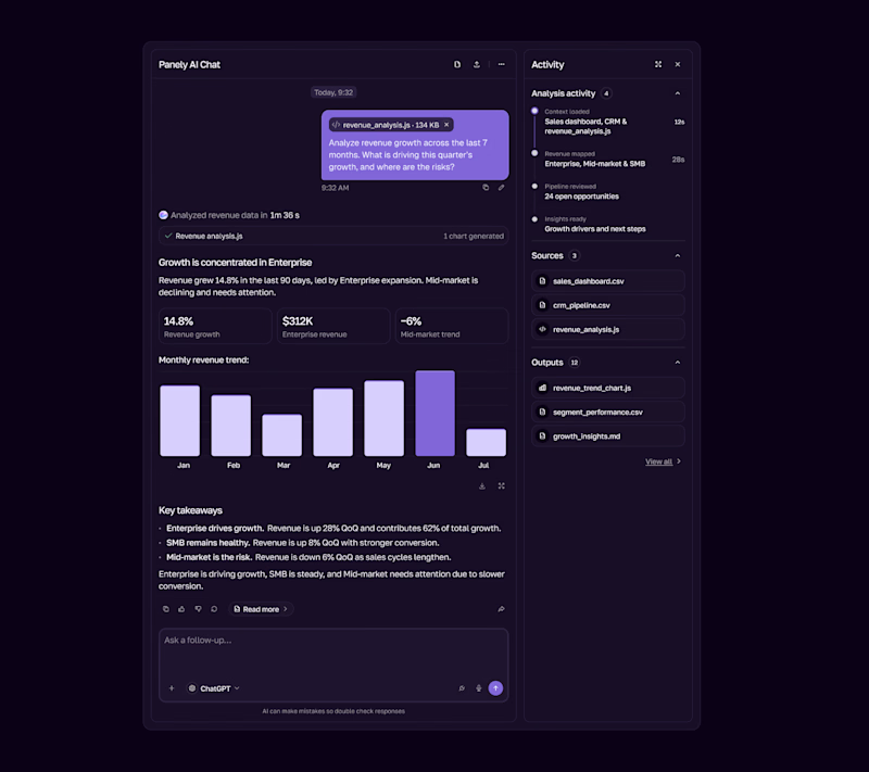

I'd pick Light for an analysis tool, the charts and sources read better on a pale surface and the violet bars still pop. Dark works as the night option. Is the sources panel on the right open by default?

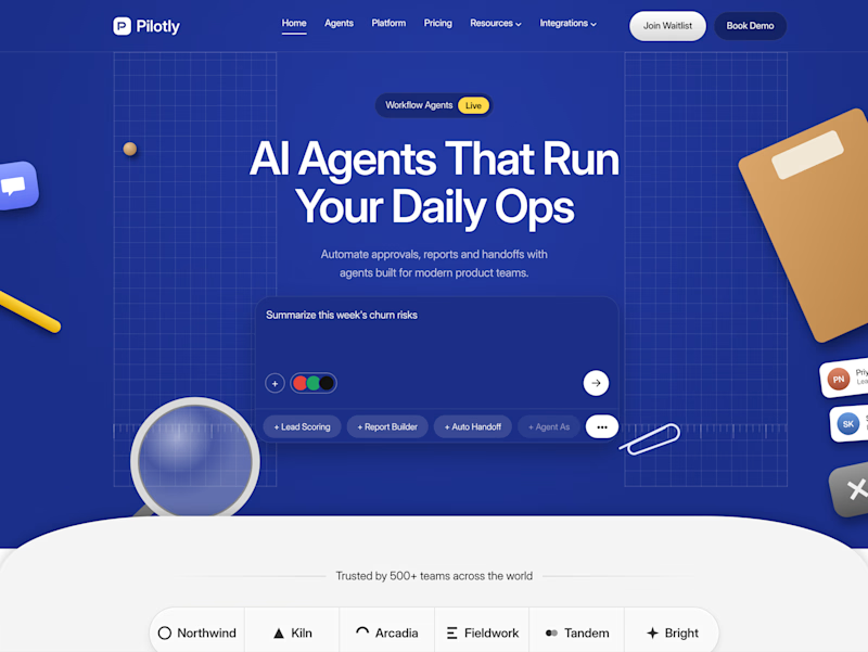
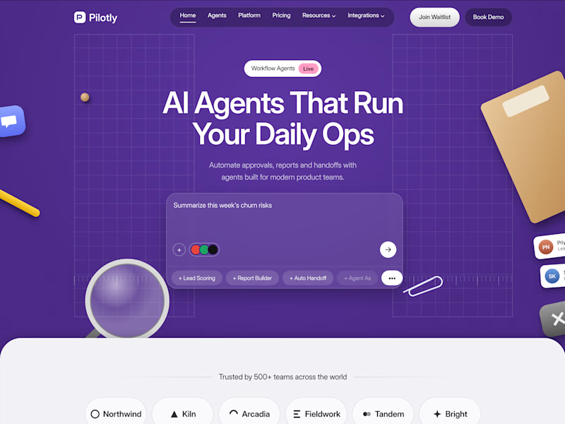
Testing two color directions for Pilotly, an AI agent platform for product teams.
Which direction would you pick for an AI automation product?

3 voted
100%
0 voted
0%
3 votes
Closed
I'd pick Violet Desk. Blue is what every SaaS uses, violet stands out and still says AI, and the orange sticky notes pop more against it. Does the hero chip row under the headline work on mobile?