The network for creativity
Join 1.25M professional creatives like you
Connect with clients, get discovered, and run your business 100% commission-free
Creatives on Contra have earned over $150M and we are just getting started
Back to feedPost


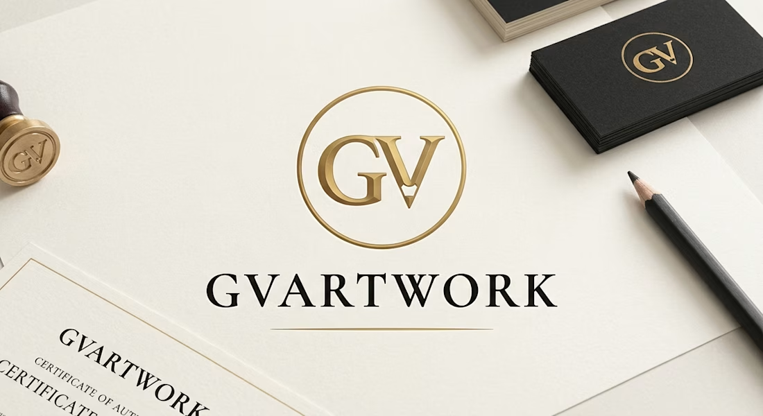
1. Central Logo & Monogram
The "GV" Monogram: Positioned inside a thin, metallic burnished gold circle. The letters are rendered in a 3D embossed gold finish.
Hidden Pencil Nib Motif: The bottom tip of the letter "V" is shaped like the sharpened tip of a drawing pencil, tying the monogram directly to traditional hand-drawn portraiture.
Brand Wordmark: Directly beneath the circle is "GVARTWORK" set in a classic, wide-spaced black serif typeface, anchored by a thin horizontal gold accent line underneath.
2. Surrounding Brand Collateral & Props
Wax Seal Stamp (Far Left): A brass seal stamp engraved with the matching "GV" monogram, reinforcing authenticity and bespoke craftsmanship.
Certificate of Authenticity (Bottom Left): A textured off-white document bordered with a thin gold frame, displaying the "GVARTWORK" header and "CERTIFICATE OF AUTHENTICITY" text.
Business Cards (Top Right): A stack of thick matte-black cards featuring the gold "GV" circular monogram foil-stamped on the face.
Drawing Pencil (Bottom Right): A sharpened black-barrel graphite/charcoal pencil resting on the paper, highlighting the tactile, traditional medium behind the brand.
Surface & Lighting
Texture: Everything rests on a warm, heavy-grain off-white fine art paper stock (#F7F5F0).
Lighting: Soft directional lighting casts natural shadows from the stamp, pencil, and card stack, giving the flat logo and mockups realistic depth.
The network for creativity
Join 1.25M professional creatives like you
Connect with clients, get discovered, and run your business 100% commission-free
Creatives on Contra have earned over $150M and we are just getting started






Related posts

Which one would you rather see on a muddy Sunday morning?
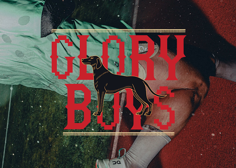
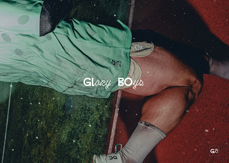
Two logos for the same five-a-side team. Same photo, same sweaty energy, very different personalities.
Option A: red slab serif with pixel notches, a black hound in the middle, gold ticker rules top and bottom. It looks like a pub sign that got into a video game. Loud, heritage, a bit smug.
Option B: tiny white wordmark, half clean sans, half pixel script, with a little G8 stamp in the corner. It looks like it already has a sponsor and a good agent. Quiet, modern, a bit cool.
One screams “we have a trophy cabinet.” The other whispers “we are not telling you about the trophy cabinet.”
Reply A or B. Be honest, nobody’s feelings are on the line except mine.
17 voted
57%
13 voted
43%
30 votes
Closed

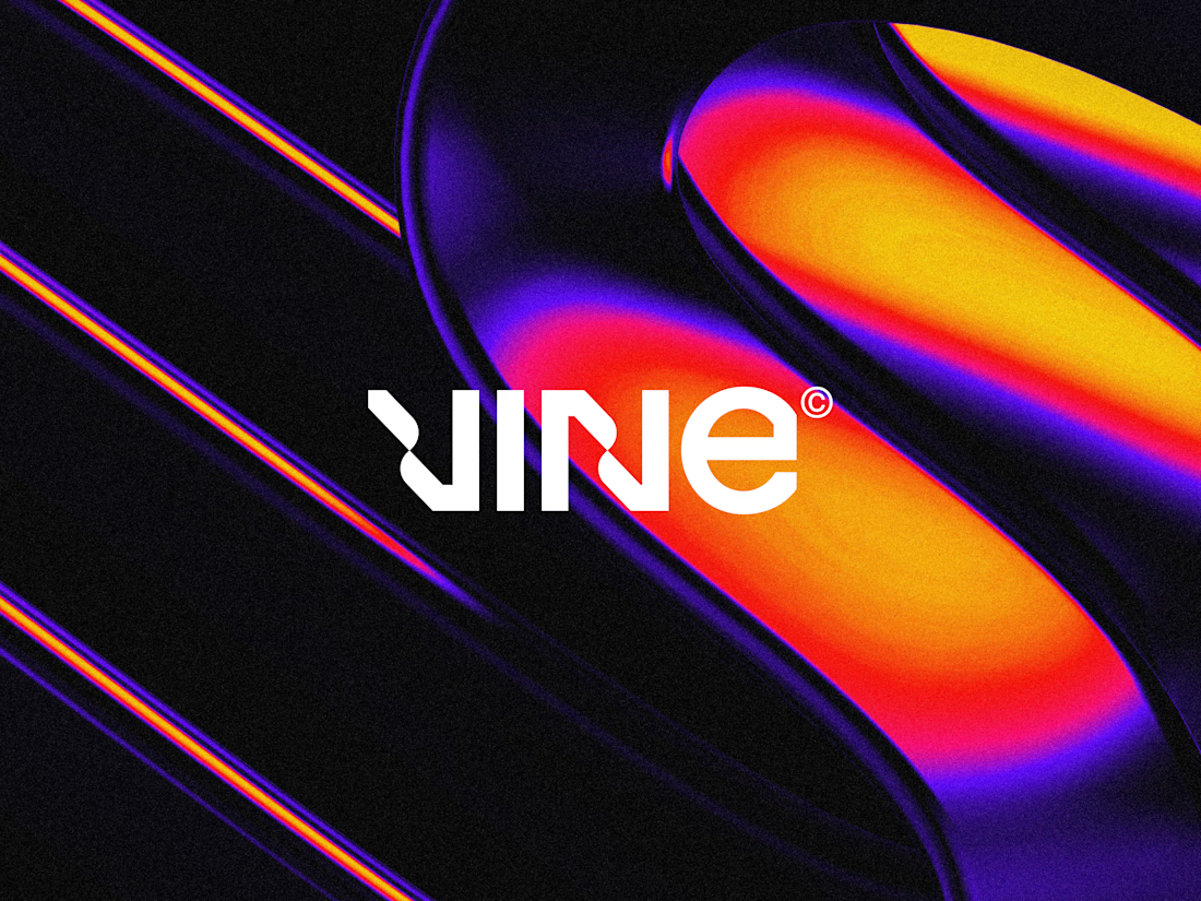

The sharp V pops against that vivid gradient.

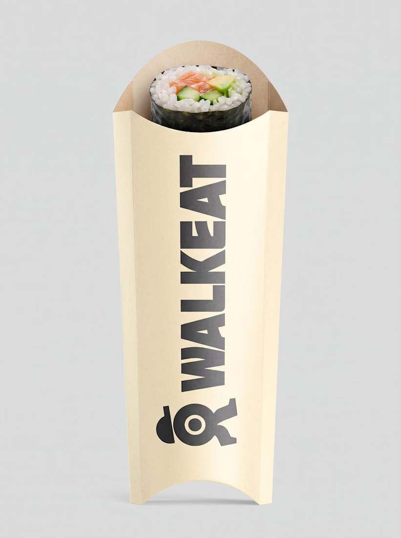
A sushi roll with a life of its own.
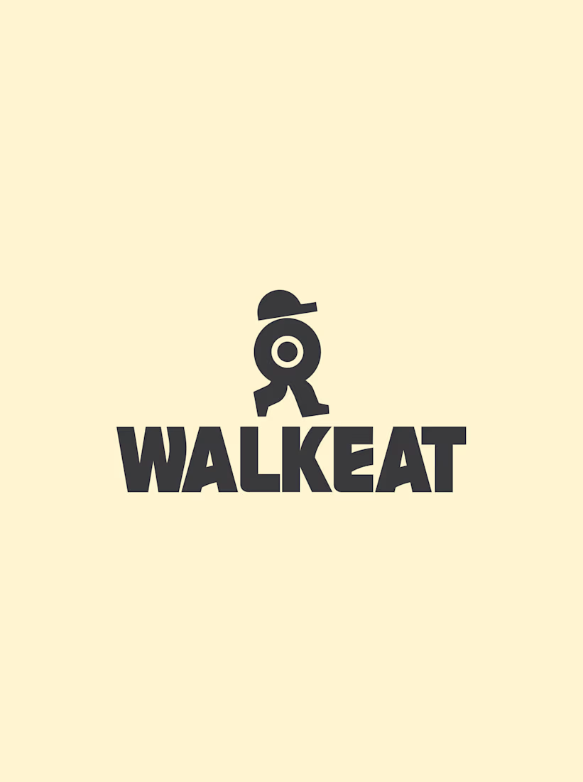
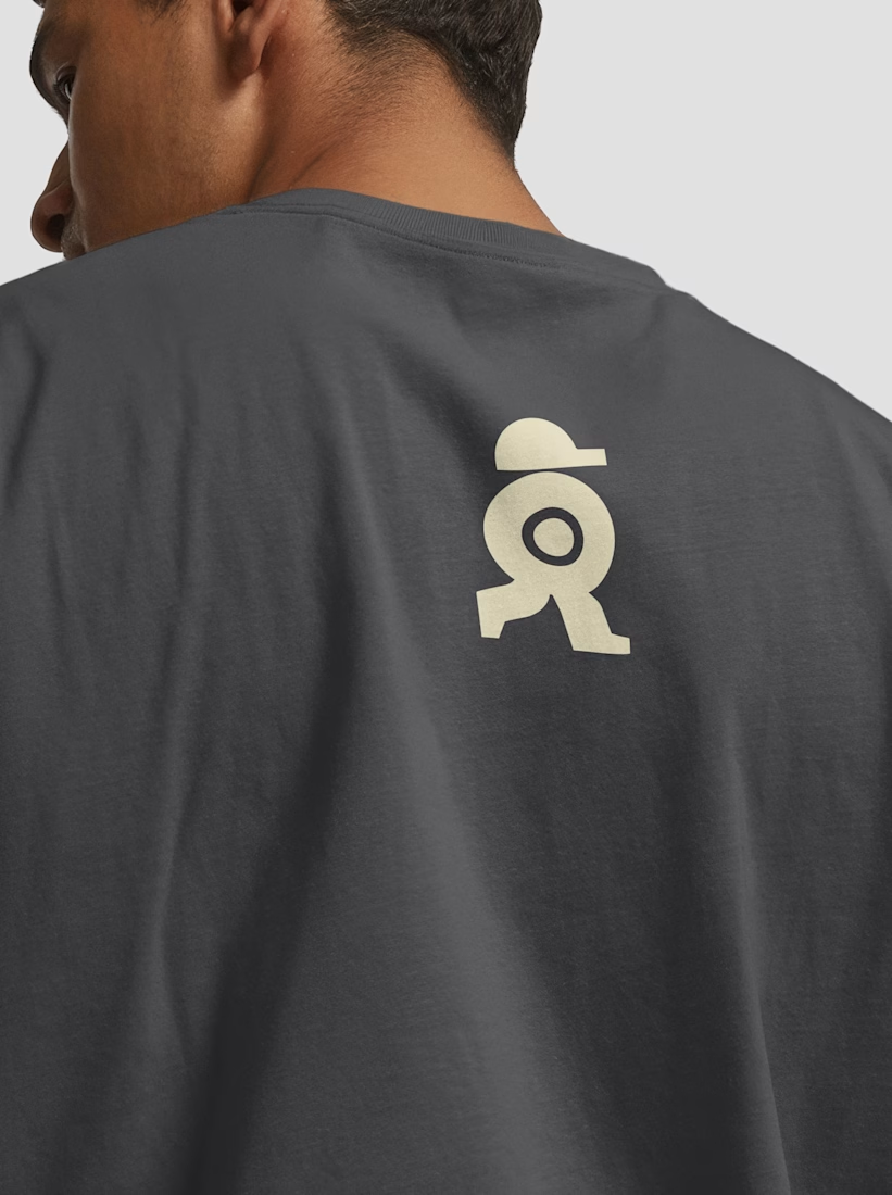
The WALKEAT identity transforms the shape of a sushi roll into a walking character. Its circular center references the cross-section of the roll, while the cap and legs bring movement and personality to the figure.
The custom-designed wordmark reinforces this concept through subtle modifications to the W, A, and E, creating a visual connection between typography and symbol.
A simple, playful and contemporary identity that communicates the product without relying on literal Japanese imagery or an overly cartoonish character.




Great work!!