The network for creativity
Join 1.25M professional creatives like you
Connect with clients, get discovered, and run your business 100% commission-free
Creatives on Contra have earned over $150M and we are just getting started
Back to feedPost
Taste Test

Feiyi I 肥遺 🐍✨ NO.4 of ShanHai Cuties
From the original 3D render to an interactive foil card ,which version do you prefer?
Foil Card 🃏 or 3D Render?


5 votes
Ends in 15h

🔥 Love the detials
🙌

render is very well detailed
Thanks bro !
The network for creativity
Join 1.25M professional creatives like you
Connect with clients, get discovered, and run your business 100% commission-free
Creatives on Contra have earned over $150M and we are just getting started

Challenges
View all


Related posts

3D Motion Design - A vs B Poll - Minimal White vs Premium Detailed Copper coins with F logo flowing in spiral. Which feels more premium? Rendered in Blender 4.2, 4:3 (1600x1200), 98% photoreal.
2 voted
13%
13 voted
87%
15 votes
Closed


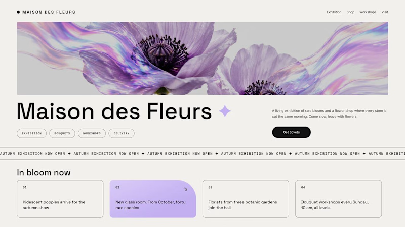
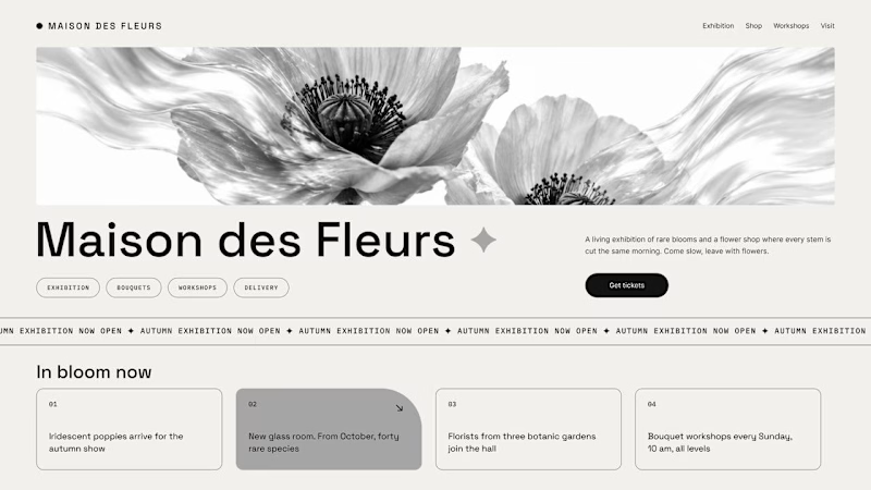
Should a flower shop ever go black and white?
Same flower house, same layout. We only took the color out.
1. Full color. The iridescent petals do the selling: lilac, pink, a little shimmer. The photo is the brand, and every accent on the page borrows from it.
2. Monochrome. No color at all. Shape, texture and typography have to carry everything, and the page suddenly reads like a gallery catalogue.
Color sells the flower. Monochrome sells the exhibition.
Which one would get you through the door?
67 voted
91%
7 voted
9%
74 votes
Closed

The problem with monochrome is that, throughout computer history, it has conditioned users to associate gray and monochrome with being disabled, dysfunctional, or something to ignore and avoid.
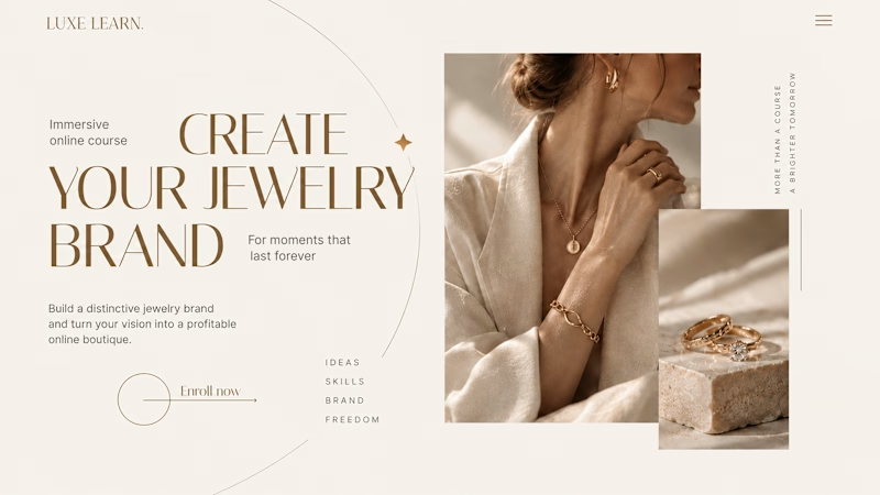
Same course. Same content. But two completely different feelings ✨
Which version would you choose?
27 voted
59%

19 voted
41%
46 votes
Closed

Option 2 is more practical ❤️❤️