The network for creativity
Join 1.25M professional creatives like you
Connect with clients, get discovered, and run your business 100% commission-free
Creatives on Contra have earned over $150M and we are just getting started
Back to feedPost

Storytelling and branding for Crahhy [Part 1]
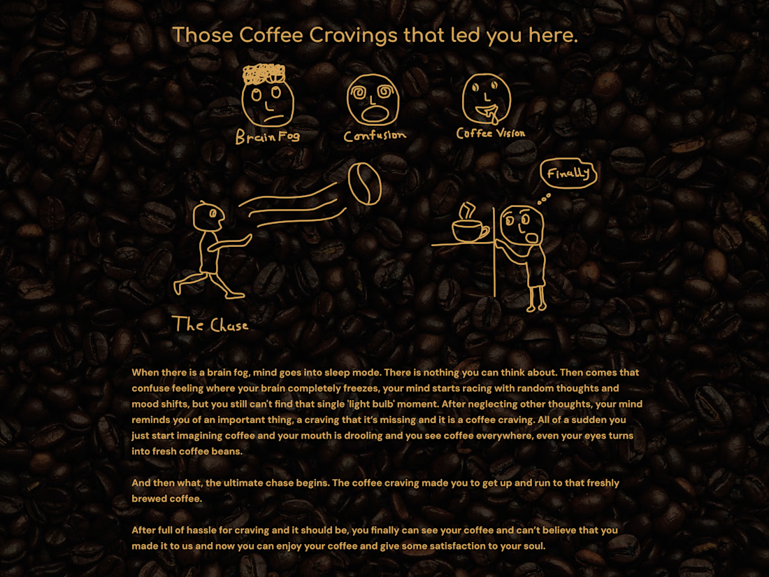
Crahhy is a specialty coffee brand rooted in the relatable human psychology of coffee cravings. We’ve all experienced that mental freeze — whether waking up to morning brain fog or hitting an afternoon slump. Your mind feels stuck, and that frantic craving takes over until you hold that freshly brewed cup.
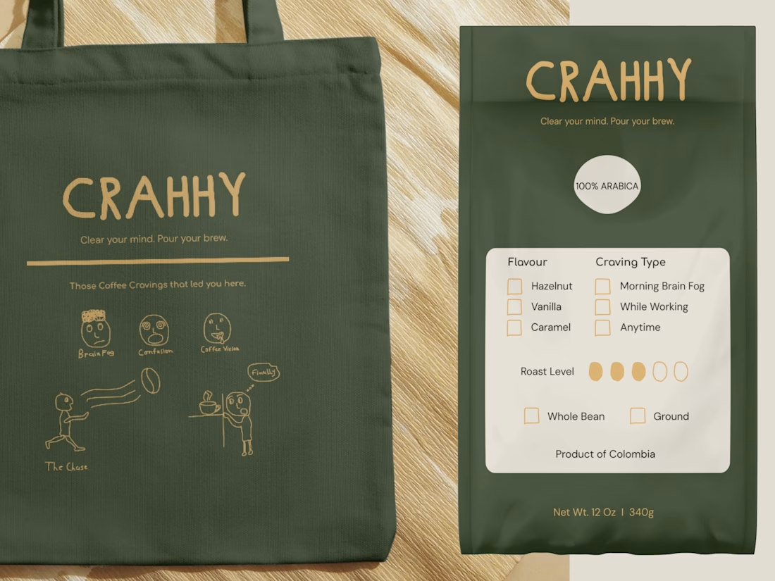
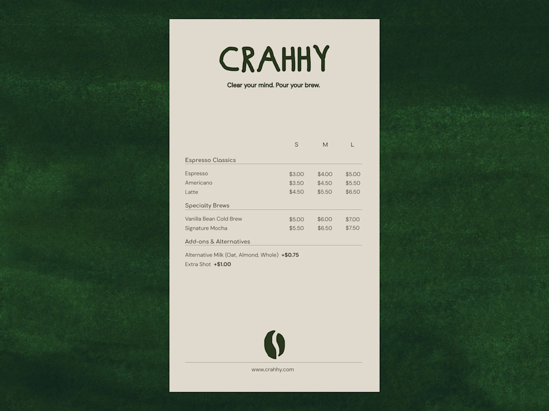
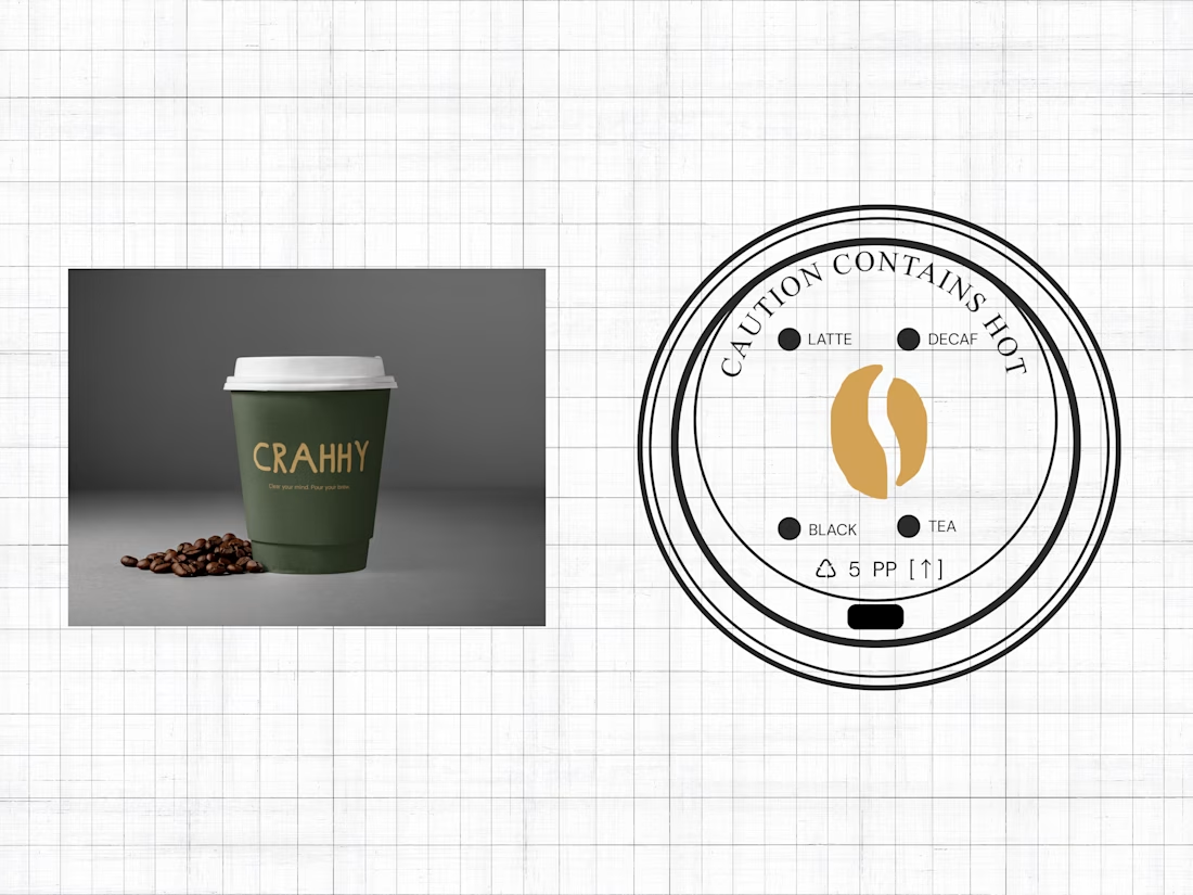
For branding, I designed custom tote bag with comic strip, coffee bag with interactive craving checkboxes, editorial menu card and a coffee lid featuring the bean submark.
The network for creativity
Join 1.25M professional creatives like you
Connect with clients, get discovered, and run your business 100% commission-free
Creatives on Contra have earned over $150M and we are just getting started







Related posts

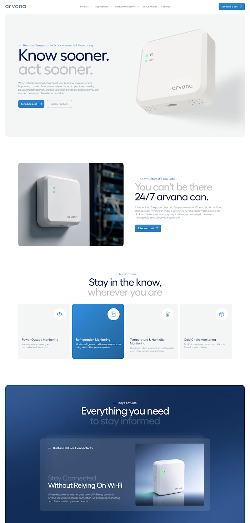
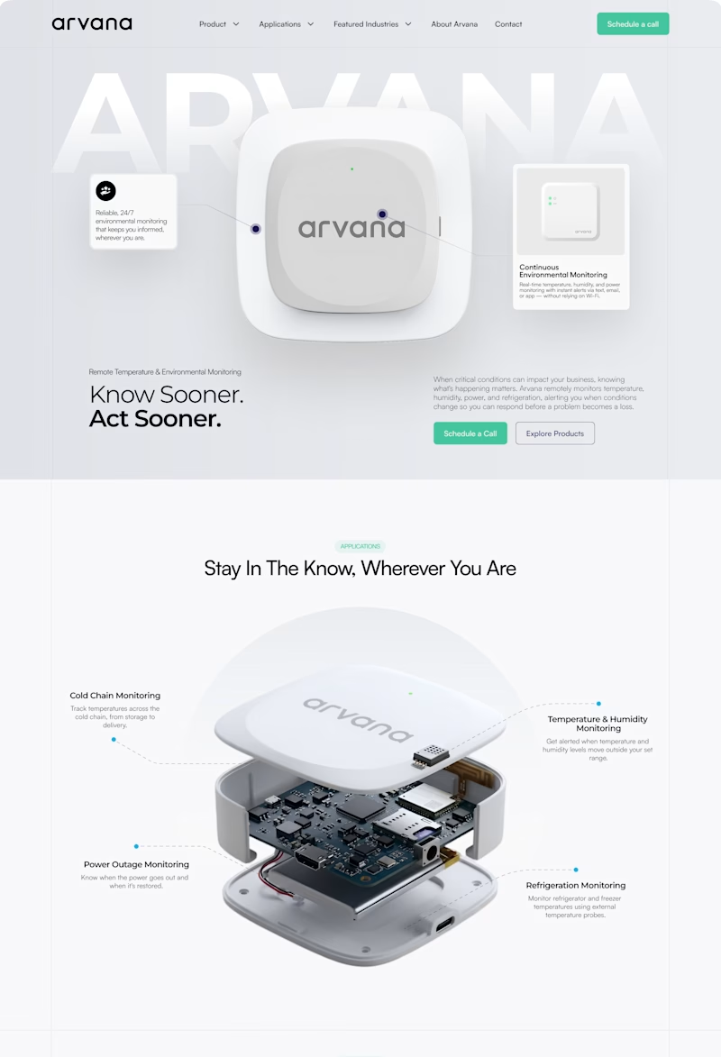
✨ Two website concepts. One brand. Which Arvana design stands out?
I explored two creative directions for Arvana, balancing clean aesthetics with product-focused storytelling and a modern tech feel. 🌐💡
🔵 Option 1: Clean & Corporate 🟢 Option 2: Bold & Interactive
Which direction would you choose? 👀
Cast your vote! 🗳️👇
1 voted
4%
25 voted
96%
26 votes
Closed


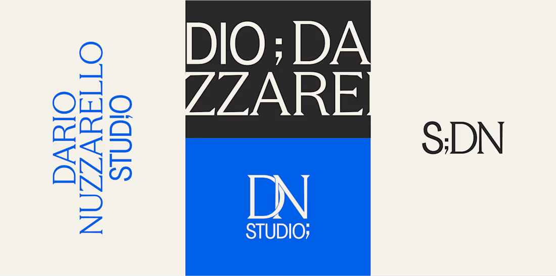
How do you brand a business that doesn’t fit into one box?
Dario Nuzzarello built a Studio that works across engineering, IT, strategy, and software. The challenge was creating a typographic identity that could bring all those disciplines together without limiting the brand to just one.
I wanted to avoid making it feel overly technical or cold. Since Dario’s work is highly custom and interdisciplinary, the identity needed to feel precise and structured while still being human and approachable.
Sometimes, the best solution is finding the right type, proportions, and details to make a name stand on its own.
What do you think about the final result?


A studio that spans engineering, IT, strategy and software is a naming and typography problem more than a logo problem, so leading with type was the right call. Precise but human is a hard line to walk. Did Dario push for a symbol at any point?
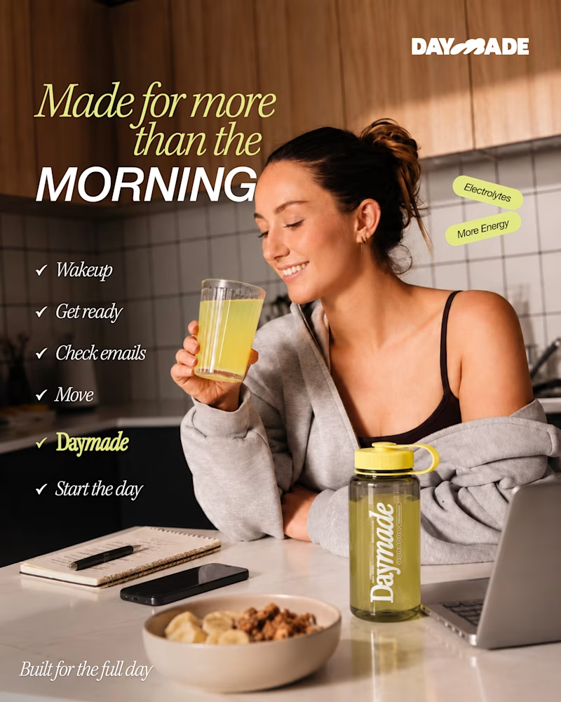
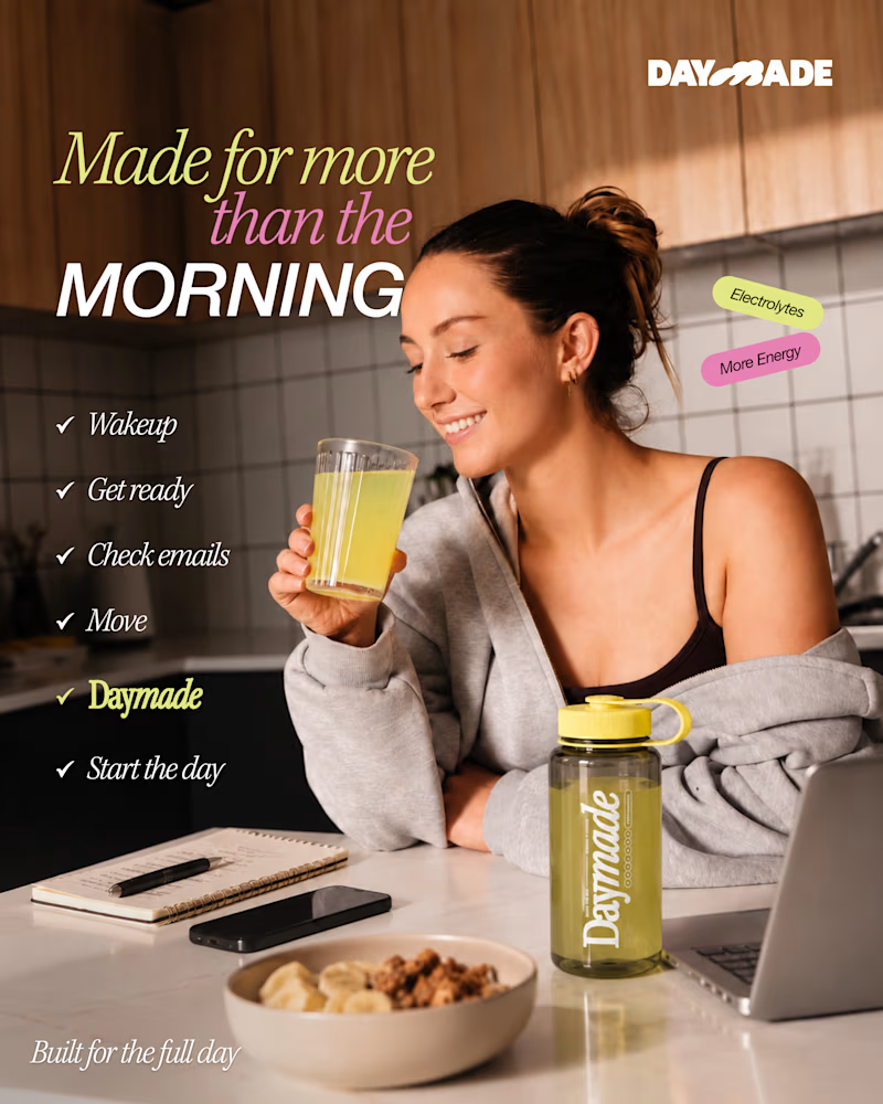
✨ Two styles. One campaign. Which Daymade design hits differently?
I explored two creative directions for Daymade, combining lifestyle storytelling with bold typography and fresh, energetic colors. ☀️🥤
💛 Option 1: Fresh & Minimal 💗 Option 2: Bold & Playful
Which one grabs your attention? 👀
Cast your vote! 🗳️👇
25 voted
26%
73 voted
74%
98 votes
Closed

Option 2 looks better