The network for creativity
Join 1.25M professional creatives like you
Connect with clients, get discovered, and run your business 100% commission-free
Creatives on Contra have earned over $150M and we are just getting started
Back to feedPost

As a brand designer, there is nothing more frustrating than having your own studio’s visual identity completely ready, sitting in Figma files for months, completely stalled.
That was my reality with Revelic Space. I’ve always built client brands with absolute precision and strategy, but when it came to launching my own studio, I hit a massive wall: the technical gap between my high-fidelity vision and a custom, responsive website. I completely refused to use a cookie-cutter template that would hold my brand’s potential hostage. I wanted total control over the UX, the grids, and the details. But coding it from scratch was out of my depth.
That’s exactly why I entered the #StitchChallenge. I didn’t use Google Stitch to offload my creative work or let AI make arbitrary decisions for me. This has been a high-stakes collaboration. I act as the creative director supplying the strategy, the assets, and the aesthetic; Stitch acts as my master craftsman, doing the heavy technical lifting to translate that vision into a working, responsive reality.
The site isn't fully live just yet, but for the first time, this dream feels entirely tangible. I am closer than ever to officially opening the doors to Revelic Space, built exactly on my own terms.
Check out my full process video and prototype below to see how the build is coming together!
https://stitch.withgoogle.com/preview/15799499426401424847?node-id=6d669e25e4ab41508e7b318967c36f7f


This is strong, the idea of using Stitch as a bridge between creative direction and production feels like a practical workflow, not just a concept.
My submission for this challenge
https://on.contra.com/pnfJBQ
Open to feedback.

on.contra.com
Introducing Voya: Revolutionize Your Travel Planning Experience
Connect with next-gen talent and tools to get work underway. Hire more independents. Start more projects. Get more creative.

Such a relatable story. Designers are the worst at meeting their own deadlines.
The network for creativity
Join 1.25M professional creatives like you
Connect with clients, get discovered, and run your business 100% commission-free
Creatives on Contra have earned over $150M and we are just getting started





Related posts

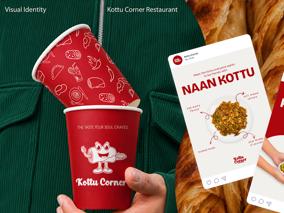
What if your business already has a logo, but nothing else that makes it recognizable as a brand?
That was the starting point for my recent branding project for Kottu Corner, a restaurant in the UAE.
They came to me with an existing logo, but without a complete visual identity to support it.
Redesigning the logo simply for the sake of change wouldn't have been a smart business decision. With the brand preparing for a major transformation, the existing logo was the one familiar element customers could still recognize. Changing it alongside everything else would risk losing that connection and making the brand feel unfamiliar to the very people who already knew and trusted it.
Instead, I focused on developing a cohesive brand identity around it, guided by the restaurant's audience, business goals, and plans for future franchise growth.
From brand strategy and visual direction to packaging, merchandise, and other brand touchpoints, the goal was to create an identity that feels recognizable, consistent, and true to the business.
Because sometimes, good branding isn't about changing what already exists. It's about building on it.
Explore the full case study! ❤️


Cool work!!

One of the hardest things in branding is knowing what not to change.
Nubank recently worked with Koto to evolve its visual identity as the company expands internationally.
They kept the recognizable logo but rebuilt the wider system around typography, colour, illustration, photography, and motion.
The interesting part for me is how much of this work happens inside the actual product.
Animations built in Rive, a more consistent interface language, and an identity that needs to work across different markets without losing its personality.
I think that's where branding is heading, especially for digital-first companies.
A good identity shouldn't just look great in a presentation. It needs to work just as well inside the product people use every day.

Top-notch branding/rebranding

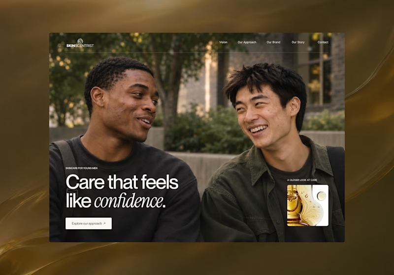
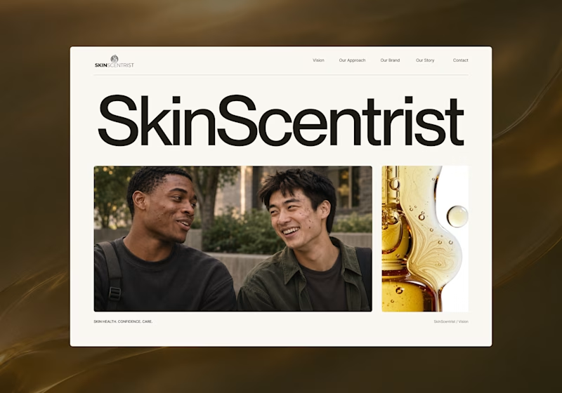
I’m exploring two homepage hero directions for SkinScentrist, a skincare brand focused on helping young men feel more confident in their skin.
Both concepts use the same imagery but take very different approaches to storytelling and visual hierarchy.
Direction 1 feels more emotional, immersive, and lifestyle-driven. The full-screen photography and bold messaging create a stronger connection to confidence and self-care.
Direction 2 feels more minimal, editorial, and brand-focused. The oversized typography, clean layout, and product imagery give it a more refined, contemporary skincare feel.
Direction 1: immersive, personal, emotional
Direction 2: minimal, editorial, premium
Which direction feels stronger for a modern skincare brand?
14 voted
93%
1 voted
7%
15 votes
Closed

Direction one — the full-screen photo feels warmer.