The network for creativity
Join 1.25M professional creatives like you
Connect with clients, get discovered, and run your business 100% commission-free
Creatives on Contra have earned over $150M and we are just getting started
Back to feedPost

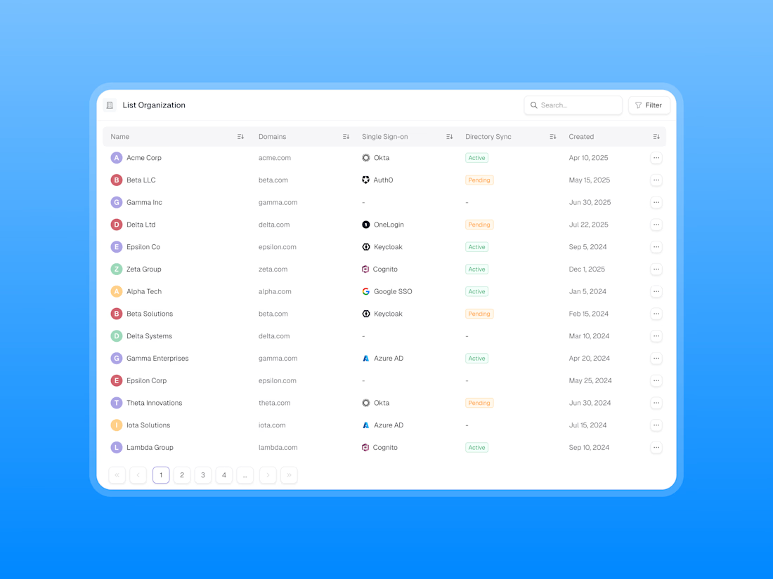
Designing a clean, scalable table component for modern SaaS dashboards.
Focused on information hierarchy, readability, and efficient data management, this table UI brings organisation data, SSO providers, directory sync statuses, and creation dates into one structured view.
✨ Clean data presentation
🔍 Search and filter functionality
🏷️ Clear status indicators
↕️ Sortable columns
📄 Intuitive pagination
🎯 Consistent spacing and visual hierarchy
Great dashboard design isn’t just about displaying data — it’s about making complex information easier to scan, understand, and manage.
What do you think of this table component?


Spot on, Kaushal! High-density SaaS tables are always tricky to balance without cluttering the cognitive load. Love the clean hierarchy and SSO status visualization here! 👏🔥"

Clear status indicators are the unsung detail in a table like this, Kaushal. Pairing them with sortable columns and intuitive pagination makes dense SSO data feel manageable. Strong, scannable work.
The network for creativity
Join 1.25M professional creatives like you
Connect with clients, get discovered, and run your business 100% commission-free
Creatives on Contra have earned over $150M and we are just getting started








Related posts


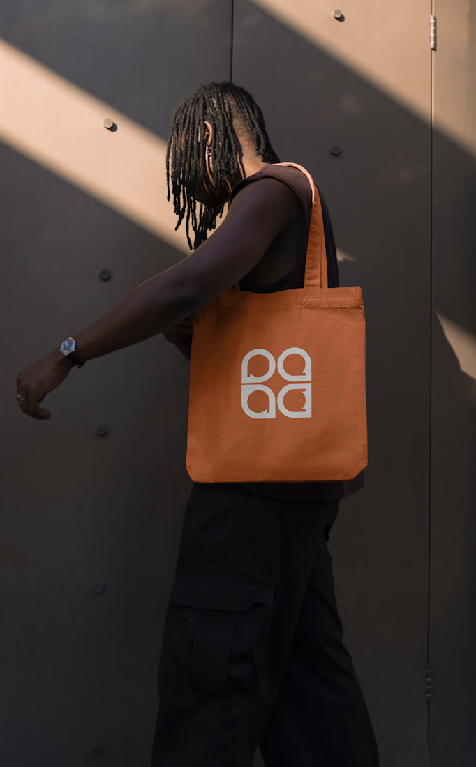
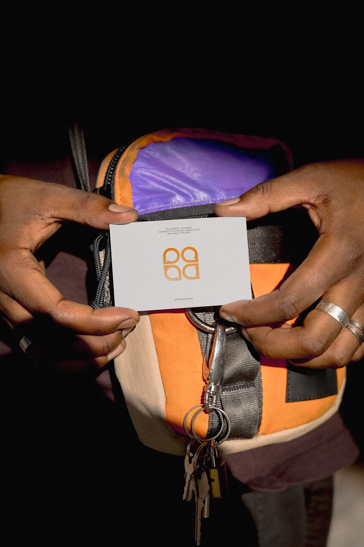
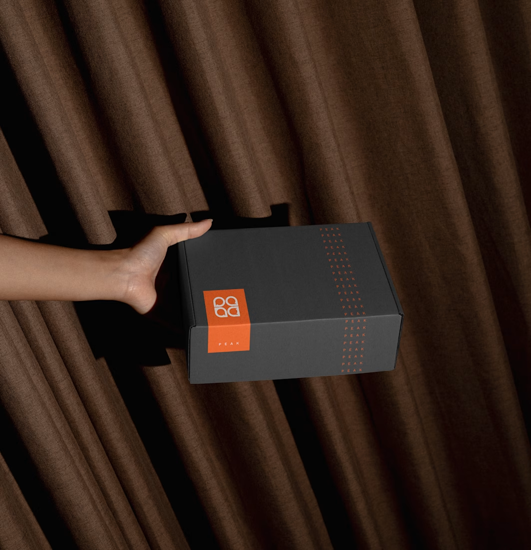
Fresh case study 🚀🚀🚀
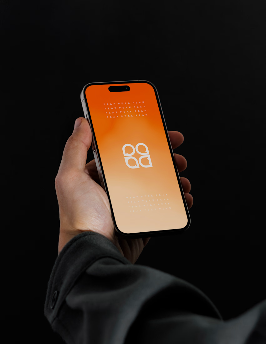
Brand identity for Peak, an all-in-one website builder for WordPress that I design and build. A four-letter mark, a warm paper-and-ember palette and one system that runs from the favicon to the packaging.

A four-letter mark that has to hold from favicon to packaging is a tough constraint. Did you draw one letterform first and build the other three from it, or design them together as a set from the start?

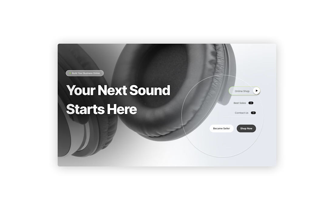
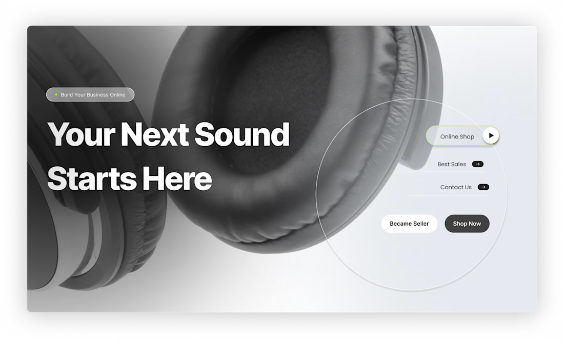
An e-commerce concept designed for the next generation of audio technology. Featuring a minimalist white aesthetic, bold typography, and product-focused visuals, the design puts the spotlight on the technology while creating a seamless shopping experience.
Designed in Figma with a focus on visual impact, usability, and conversion-driven UI.

Very minimal yet futuristic! I love it!

Beautyy


