The network for creativity
Join 1.25M professional creatives like you
Connect with clients, get discovered, and run your business 100% commission-free
Creatives on Contra have earned over $150M and we are just getting started
Back to feedPost
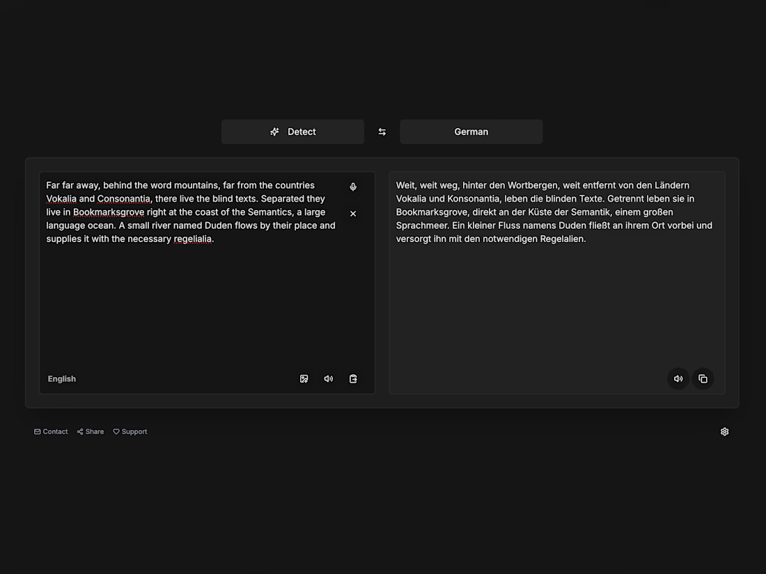
After 4+ years of building with Bubble, WolfspaceAI became a meaningful step into AI-assisted full-stack development — and a genuinely rewarding experience 🎉
I feel how Bubble gave me this product thinking, like no other course or self-learning ever did


WolfspaceAI doesn’t have a business goal at this stage.
It’s a personal project I created to go through the full development cycle and bring more of my own values into the product — minimalism, direct functionality, clear UX, and an experience that feels pleasant both visually...

Amazing journey. Bubble really is an incredible place to develop product thinking. Wishing you all the best 🚀
The network for creativity
Join 1.25M professional creatives like you
Connect with clients, get discovered, and run your business 100% commission-free
Creatives on Contra have earned over $150M and we are just getting started





Related posts

A few things we’ve been working on this month.
Different industries, different problems, but the same goal: making complex products feel simple, clear, and trustworthy.
Fintech → Investment Banking → Geospatial AI
More projects are still in progress.
Full case studies coming soon.






This is the kind of work I enjoy seeing — simple, focused, and actually thought through.

A little Three.js experiment — a torn-edge reveal built with a custom shader and Sobel edge detection.
I wanted the transition to feel more organic and physical than a typical image reveal.


Custom shader + Sobel edge for a torn reveal is the kind of WebGL detail people feel even if they can't name it.

Balabol - the smartest AI translation app backed with five different LLMs.