The network for creativity
Join 1.25M professional creatives like you
Connect with clients, get discovered, and run your business 100% commission-free
Creatives on Contra have earned over $150M and we are just getting started
Back to feedPost

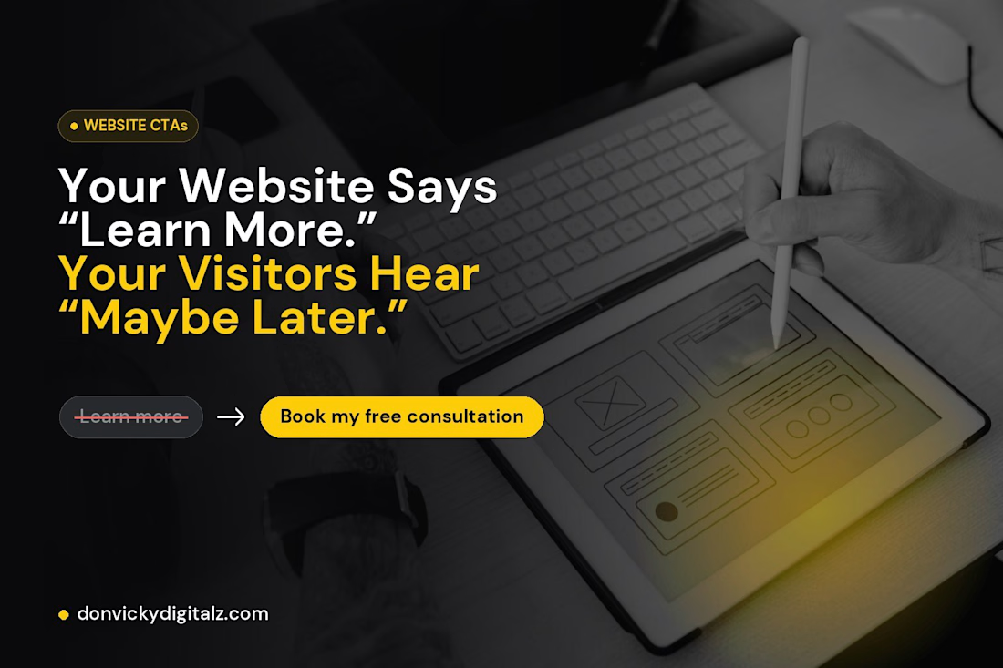
Your Website Says “Learn More.” Your Visitors Hear “Maybe Later.”
This week I audited the buttons on my own website.
“Learn more” appeared 7 times.
“Get in touch” appeared 4 times.
Neither told a visitor what they’d actually get.
Worse, my “Get in touch” buttons opened an email app, while my header button opened my booking page. Same goal, two different experiences.
So I rewrote them:
❌ Learn more → ✔ Book my free consultation
❌ Get in touch → ✔ Start your project
❌ Explore projects → ✔ See more on Behance ↗
❌ (nothing) → ✔ Not sure what you need? Let’s figure it out together
That last one matters most. Some of my sections built interest… then just stopped. No next step at all.
A good button does three things:
→ Says what happens when you click
→ Shows up at the moment someone is convinced
→ Leads everyone to the same easy next step
Your buttons are the only part of your website that asks people to do something. They deserve more than two words.
Quick challenge: open your homepage and count your “Learn more” buttons. How many did you find? 👇
The network for creativity
Join 1.25M professional creatives like you
Connect with clients, get discovered, and run your business 100% commission-free
Creatives on Contra have earned over $150M and we are just getting started



Related posts

Webiste redesign for Saas company


2 voted
4%
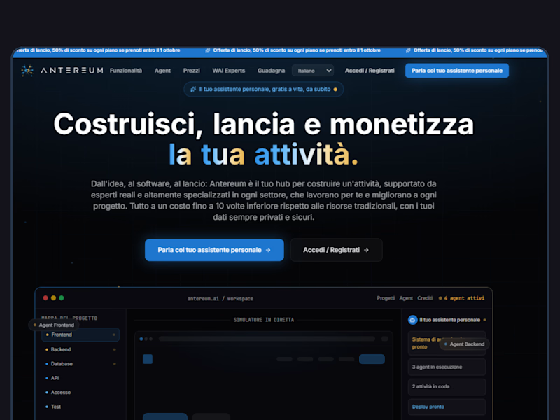
44 voted
96%
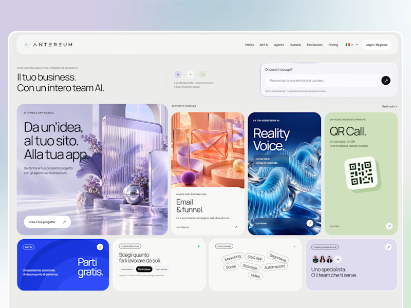
46 votes
Closed

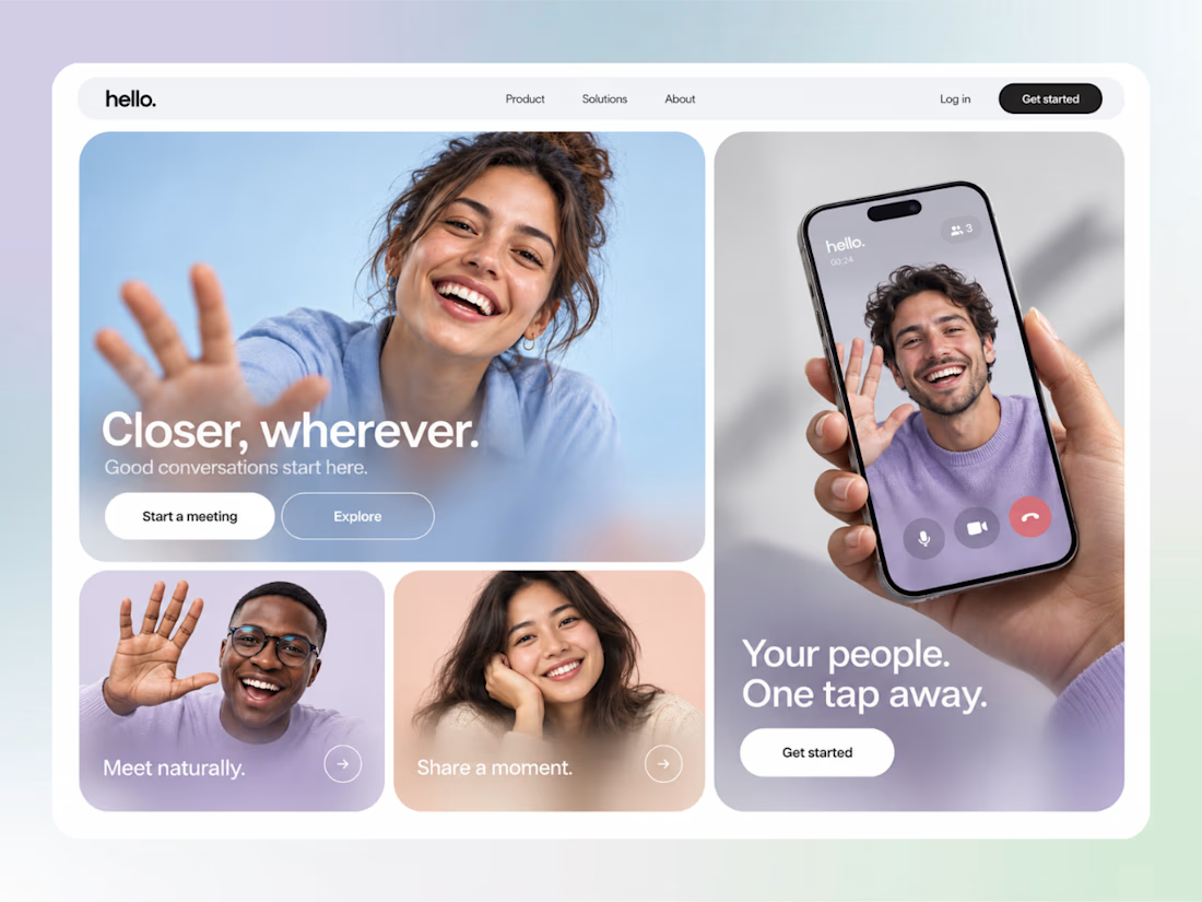

cool

Made a Hero section for a hotel that doesn’t exist.
The sea and sky change with the actual time in Greece, so it looks different every time you open it. scroll and the sun goes down
if you run a hotel and want something like this, message me.

Great job 🎉🎉