The network for creativity
Join 1.25M professional creatives like you
Connect with clients, get discovered, and run your business 100% commission-free
Creatives on Contra have earned over $150M and we are just getting started
Back to feedPost

An interactive mythical character slider where you can switch between characters using the arrows or by clicking on the individual characters.
Made completely in Framer 💯
DM for remix link!


The network for creativity
Join 1.25M professional creatives like you
Connect with clients, get discovered, and run your business 100% commission-free
Creatives on Contra have earned over $150M and we are just getting started



Related posts

Halden - Landing Page Concepts
Halden sells to grid operators, and there were two good ways to pitch it: tell them what's coming, or show them everything happening now. Rather than pick one on instinct, I designed the landing page as an A/B test so real traffic decides.
The two pages share one 12-column grid, the same section order, type system and components. Each variant changes only its message, its hero visual and its light color, so any difference in demo requests comes from the pitch and not the layout.
The work was building a system flexible enough to carry two different stories without either one feeling like the backup version.
Forecasting (act before demand spikes) vs metering (see and bill every kilowatt)
Primary metric: Demo requests from the hero CTA
4 voted
57%
3 voted
43%
7 votes
Closed

I'd pick Forecasting. "From meter reading to early action" tells a grid operator what they get in one line. Did you write both hero lines before designing the visuals?

Two ad designs, same offer, very different vibes. Which one would make you stop scrolling and tap “Start Today”?
Drop your pick below and tell me why. I’m collecting honest feedback on layout, colors, and what feels most clickable.
Option A: bold, dark gradient with a glowing neon feel.
Option B: clean, bright, and playful with a white background.

5 voted
38%

8 voted
62%

13 votes
Closed

Option A for me. The dark neon version pops harder in a busy feed and the headline reads faster. B feels friendlier but blends in a bit more.

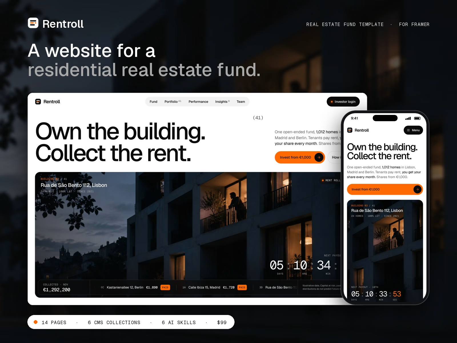
Just shipped Rentroll: a Framer template for residential real estate funds.
Most fund sites open on a skyline and an "Invest now" button. Rentroll opens on a live countdown to the next payout and the rents coming in.
→ A scroll-driven rent roll runs from day 1 to payday, city by city
→ Follow the Rent traces €100 from the tenant to the investor, cost by cost
→ Every building gets its own CMS page with a facade: point at a window to see its rent
→ One Performance page for the share price, every payout and every fee
14 pages, 6 CMS collections, 3 code components, a Start Here page in 13 steps and 6 Agent Skills.
$99, one-time. Remix link delivered instantly after checkout:
https://contra.com/products/kBs1ku1d-rentroll-framer-template-for-real-estate-funds

The €100 breakdown is clever.