The network for creativity
Join 1.25M professional creatives like you
Connect with clients, get discovered, and run your business 100% commission-free
Creatives on Contra have earned over $150M and we are just getting started
Back to feedPost

Kings'n'Queens: Full Site & App System Design for a Smart-Matching Dating Startup
UI Designer · UX Designer · Web Designer · Figma · Mobile App Design · Dating App Design · Design Systems
About the client
Kings'n'Queens is a dating platform built around one idea: compatibility over swiping. Instead of the endless-scroll, surface-level matching that defines most dating apps, it uses an intelligent matching model that weighs deeper compatibility signals, the pitch being fewer, better matches instead of infinite mediocre ones.
The client came to me with a brief and early wireframes for their marketing site and needed a designer to take that direction and turn it into a complete, polished UI system across six pages: landing page, pricing, about, contact/support, privacy policy, and a 404 state, designed as one connected system rather than six separate pages.
The challenge
Dating apps have a trust problem before they have a design problem. The category is crowded with near-identical pink gradients and stock-photo couples, and users are numb to it. Working from the client's brief, the job was to design something that felt premium, safe, and intentional, not another swipe factory, while still hitting the conversion mechanics a real dating product needs: clear plan tiers, a frictionless path from "curious" to "downloaded," and enough proof (how it works, safety, FAQs) to get a skeptical user over the line.
The harder constraint was consistency at scale. Six pages, two platforms (marketing site + native app), one voice. Nothing about safety messaging on the landing page could contradict the tone of the actual in-app screens shown in the mockups, and every page needed to feel like it belonged to the same product without becoming repetitive, all while staying faithful to the wireframes and direction the client had already set.
What I designed
Information architecture across six pages, Home, About Us, Pricing, Support, Privacy Policy, and a 404, each with a clear single job. Pricing isolates the monetization decision (Free / Professional $9.99 / Enterprise $19.99) so it's never competing with brand storytelling. About Us carries the mission and team framing. Support is a dedicated contact path instead of burying it in a footer link. Even the 404 stays on-brand instead of defaulting to a generic error screen a small detail, but it's the difference between a system and a one-off page.
A reusable component system, built once and repeated deliberately: the same navigation and CTA button, an FAQ module that pairs an in-app phone mockup with an accordion (used on the landing page, pricing, and about pages), and a closing conversion banner ("Ready To Find Your Perfect Match?") that appears at the bottom of every page as a consistent last chance to convert. Reusing these components across six pages meant polishing them once and getting six pages of consistency for free.
A four-step "How It Works" narrative on the landing page, create your profile, smart matching, verified interactions, meaningful conversations, designed specifically to answer the two objections dating-app users have before they'll download anything: "is this just another swipe app" and "is this safe." Verification and safety get their own step rather than being a footnote, because for this category, trust is the actual product.
Real product screens used as proof, not stock mockups. The match grid, profile detail view, and in-app FAQ shown in the phone mockups throughout the site are pulled from the actual Kings'n'Queens mobile app UI, a separate design project I also worked on (case study on that coming separately). Using the real app screens instead of generic phone-mockup stock meant the marketing site was selling the actual product, not an approximation of one.
Editorial typography over "dating app" cliché. Bold, oversized black headlines against a warm pink/red gradient, leaning closer to a confident lifestyle brand than a typical playful dating app, so the product reads as premium and intentional rather than gimmicky.
Delivered
Full UI/UX design for all six pages, taken from the client's initial brief and wireframes to a complete, developer-ready Figma system: six responsive pages, a working component library, and a consistent design language that carries the real Kings'n'Queens app experience through to the marketing site.


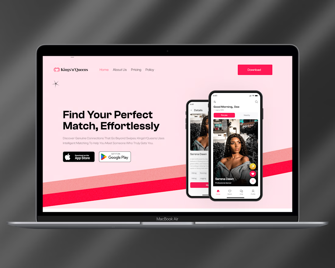
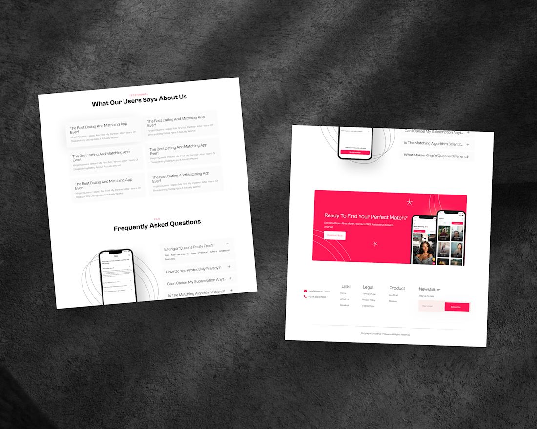
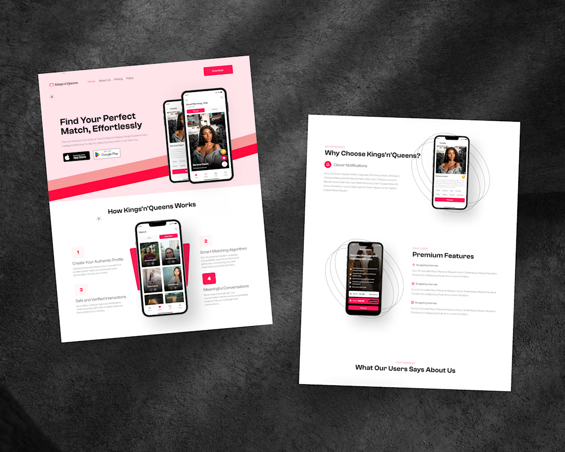

Building the product around compatibility rather than endless browsing gives the platform a clearer premise. A shared site-and-app system is also the right foundation for a startup that needs consistency across touchpoints.
The network for creativity
Join 1.25M professional creatives like you
Connect with clients, get discovered, and run your business 100% commission-free
Creatives on Contra have earned over $150M and we are just getting started



Trending
retrofuturism
Share your favorite designs from the past exploring the distant future. Or your own take on the aesthetic 🚀
halftone
Dots. Texture. Grain. Let's see your designs using the halftone technique.

Midjourney
Creatives are showing off what they're making with Midjourney.
colorgrade
Video editors sound off: How do you enhance the mood of your video in color grading?
Related posts

Renovate | Website Design
I'm currently working on several projects in parallel. I'm also working on several parts of the upcoming case study.


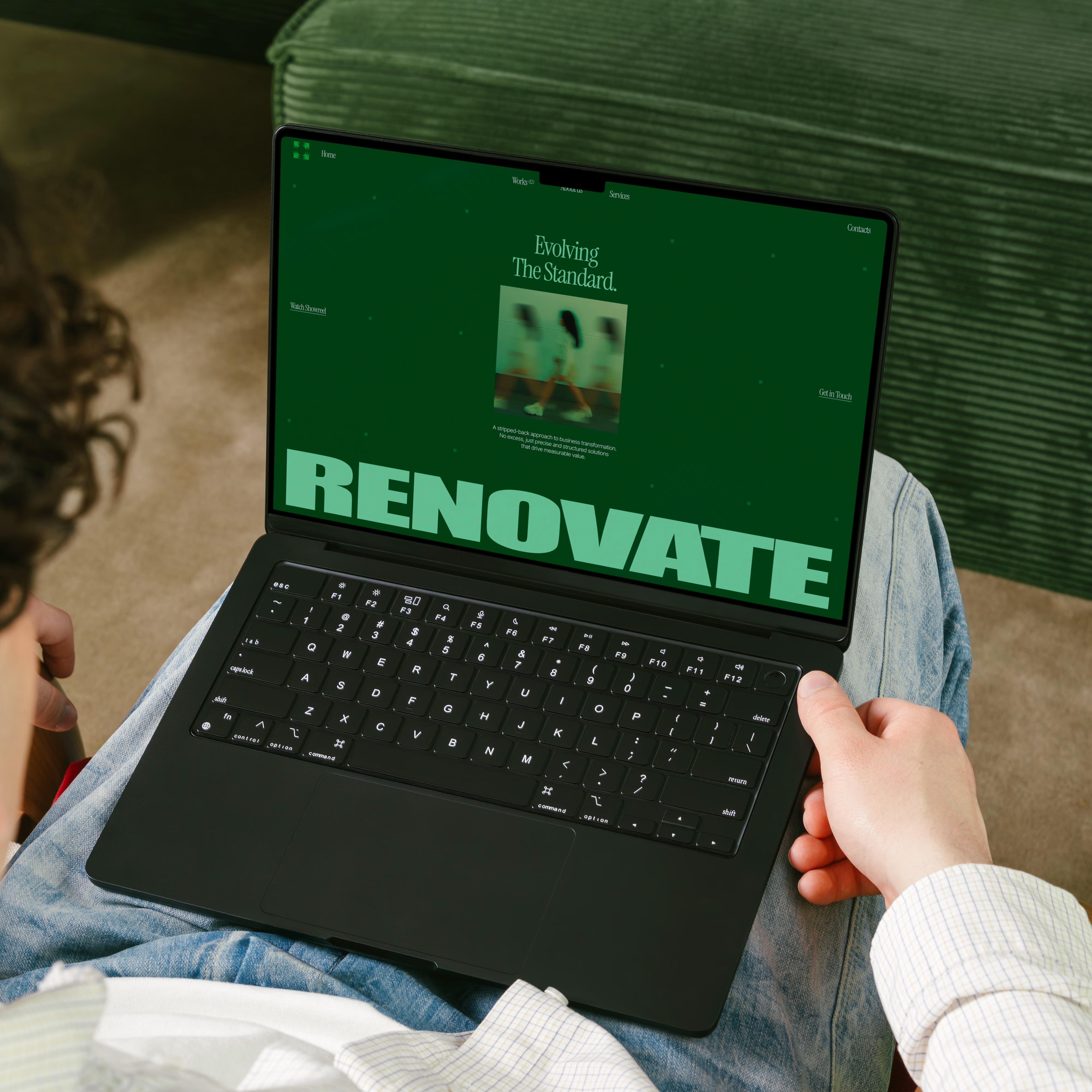
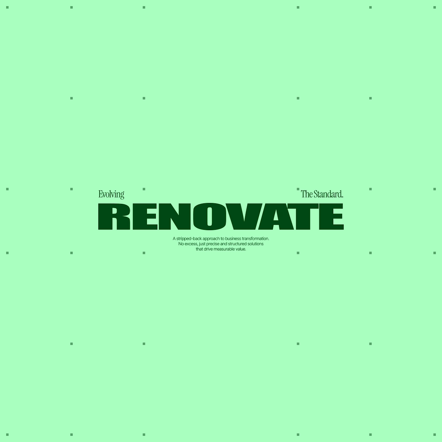
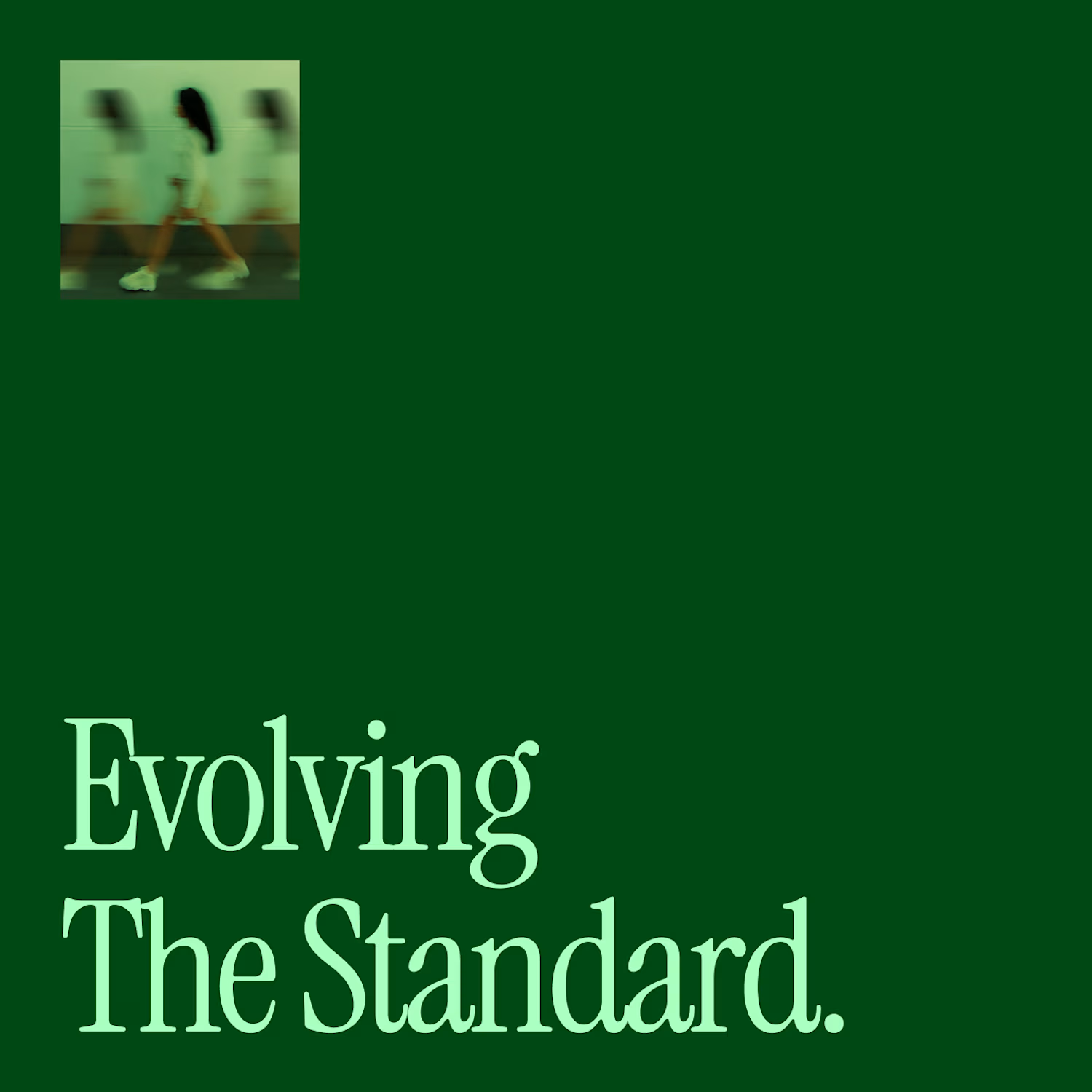

Its insanely good color contrast. High-end🔥❤️

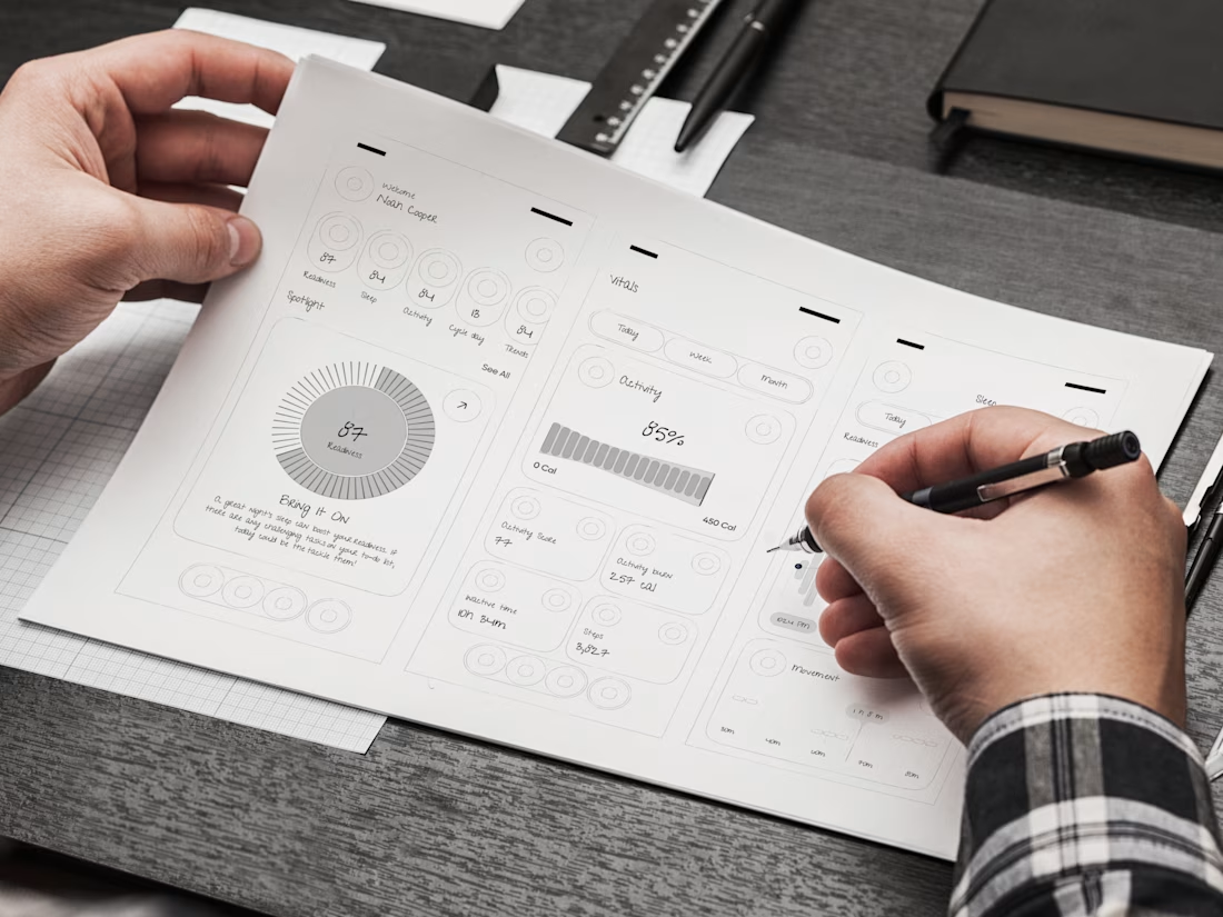
Mobile App UX Sketching – Health Tracker UI Concept
Great digital products don't start with polished visuals—they start with robust, user-centered wireframing. Before writing a single line of code or designing final UI components, mapping out seamless user flows is essential for building a successful health and fitness platform.
We created this detailed Fitness & Health Tracker Mobile UX Wireframe Sketch to demonstrate how early-stage low-fidelity design solves complex data visualization challenges. Built for HealthTech founders, wearable startup teams, biohacking platforms, and fitness SaaS creators, this paper wireframe concept lays the UX blueprint for tracking daily readiness, vitals, and activity metrics.
The Problem We Solved
Health and fitness apps often struggle with "data overload." Aggregating sleep scores, activity intensity, recovery stats, and daily vitals into a single screen can easily overwhelm users, leading to low retention and high app abandon rates.
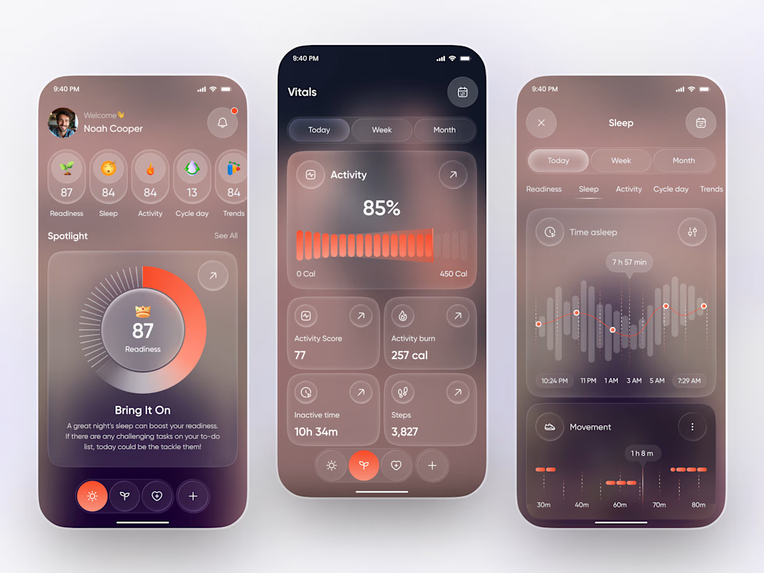
This UX sketching process focuses on information architecture and visual hierarchy. By structuring raw telemetry into distinct modules—such as a central Readiness Score ($87$), daily vital metrics, and progress bars ($450\text{ Cal}$)—we ensure complex health data remains clear, motivating, and actionable.
Key UX Wireframing Highlights
Readiness & Spotlight Dashboard: A high-level daily readiness score ($87$) supported by quick-glance status indicators for sleep quality, activity levels, cycle tracking, and weekly trends.
Vitals & Activity Telemetry Module: Structured layout balancing daily calorie burn ($257\text{ cal}$), active vs. inactive time ($10\text{h } 34\text{m}$), and total step count ($3,827$).
Time-Series Analytics Flow: Clear view toggles (Today / Week / Month) paired with low-fidelity bar charts to establish intuitive data navigation.
Ergonomic Layout & Thumb-Zone Mapping: Critical CTA zones and key metrics positioned within natural screen reach for effortless single-handed navigation.
Building a HealthTech App, Fitness SaaS, or Wearable Companion?
Whether you are a founder bringing a new HealthTech MVP to market or an established wellness brand redesigning your digital product, we provide end-to-end UX/UI design services—from hand-drawn wireframe strategy to high-converting, pixel-perfect production designs.


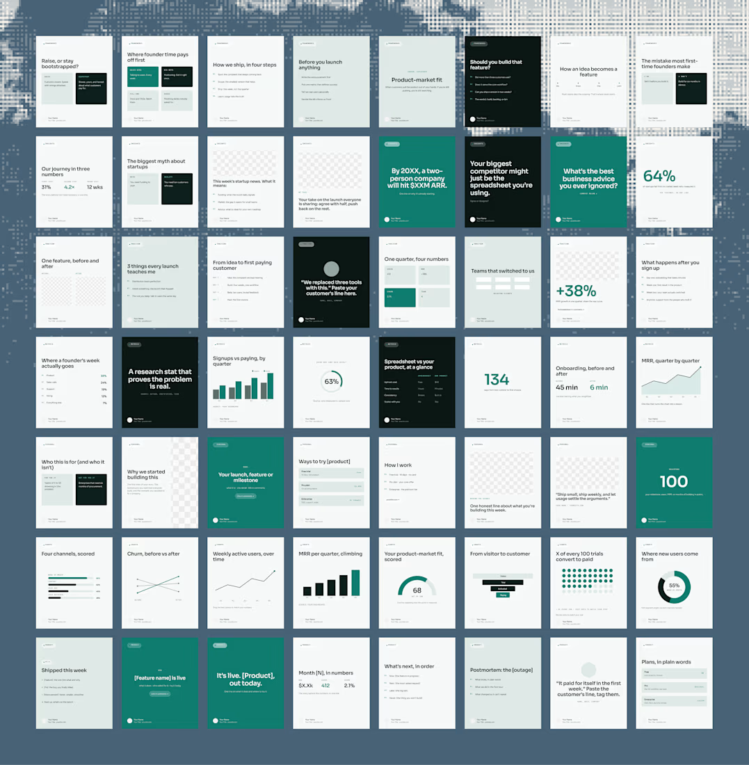
Are you a first-time founder and can’t seem to find a moment to post on LinkedIn?
Get yourself a Figma system filled with ready-to-use posts and placeholder content.
Change the look to your liking, adjust the text and you’re good to go.
Your potential clients won’t know about you if you’re not out there.
No time to set it up yourself?
I also do custom LinkedIn systems. Built around your branding, your tone of voice & content you can actually use.


The idea is practical and very relevant for founders. I like how the system turns content creation into something repeatable instead of starting from a blank canvas every time.