The network for creativity
Join 1.25M professional creatives like you
Connect with clients, get discovered, and run your business 100% commission-free
Creatives on Contra have earned over $150M and we are just getting started
Back to feedPost

5 Kajabi website mistakes that can cost you sales
You can have great courses, a strong brand, and valuable content.
But if your Kajabi website is confusing, visitors may leave before they ever see what you offer.
Here are 5 mistakes I often look out for:
1. Too much information on the homepage
Your visitor should quickly understand who you help, what you offer, and what to do next.
2. No clear call to action
Do you want people to book a call, join your course, or learn more? Make the next step clear.
3. A sales page that does not build trust
People need to understand the problem you solve, what they will get, and why they should trust you.
4. Poor mobile experience
Many people will visit your website from their phone. Your pages should look and work well on smaller screens.
5. No clear path to purchase
Your website should guide visitors from interest to action without making them figure everything out themselves.
A good Kajabi website is not just about making your pages look good.
It should help your visitors understand your offer, trust your brand, and take the next step.
That is what I focus on when building and improving Kajabi websites for coaches, creators, and online educators.
Which one do you see most often: 1, 2, 3, 4, or 5?
#KajabiExpert #Kajabi #KajabiWebsite #CourseCreator #OnlineCourse #WebDesign #SalesFunnel #OnlineBusiness



The network for creativity
Join 1.25M professional creatives like you
Connect with clients, get discovered, and run your business 100% commission-free
Creatives on Contra have earned over $150M and we are just getting started
Trending
retrofuturism
Share your favorite designs from the past exploring the distant future. Or your own take on the aesthetic 🚀
halftone
Dots. Texture. Grain. Let's see your designs using the halftone technique.

Midjourney
Creatives are showing off what they're making with Midjourney.
colorgrade
Video editors sound off: How do you enhance the mood of your video in color grading?
Related posts

A set of mobile app icons exploring various visual styles from Y2K aesthetic and 3D skeuomorphism to retro pixel art and vector mascots.
Special thanks to Dana for helping out with one of the logos for the icons! 🙌
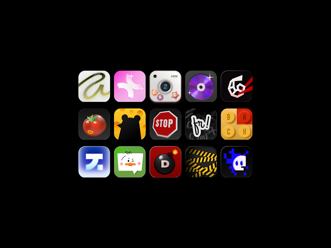
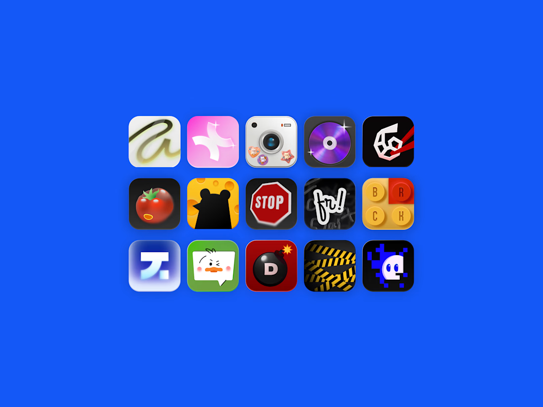

I'm so excited to be part of such an awesome project! Watch out for the bomb, Marho!🔥

How do you make a logo feel alive without making it feel like a gimmick? 🤖
Quickchat AI builds no-code AI Agents that handle real work - customer support, sales, internal ops - reading docs and resolving conversations on their own. As the product scaled, the brand needed to catch up: something as sharp and credible as the tech itself, in a market where every AI startup looks the same.
I could have leaned into something loud - a mark morphing through wild transformations, motion for the sake of motion. Instead the direction was restraint. The wordmark reveals with one clean underline stroke. The icon wakes up letter by letter before landing on the final mark, closing on a small wink instead of a flourish 😉.
Every timing decision was intentional: fast enough to feel instant, controlled enough to feel trustworthy. That's the whole brief in one sentence.
The palette stayed just as disciplined 🎨 - one electric blue carrying the energy, one warm yellow breaking up the dark neutrals. Nothing decorative, everything load-bearing.
Where do you draw the line between motion that shows a product's personality and motion that's just there to show off?





1, great work 🙌