The network for creativity
Join 1.25M professional creatives like you
Connect with clients, get discovered, and run your business 100% commission-free
Creatives on Contra have earned over $150M and we are just getting started
Back to feedPost


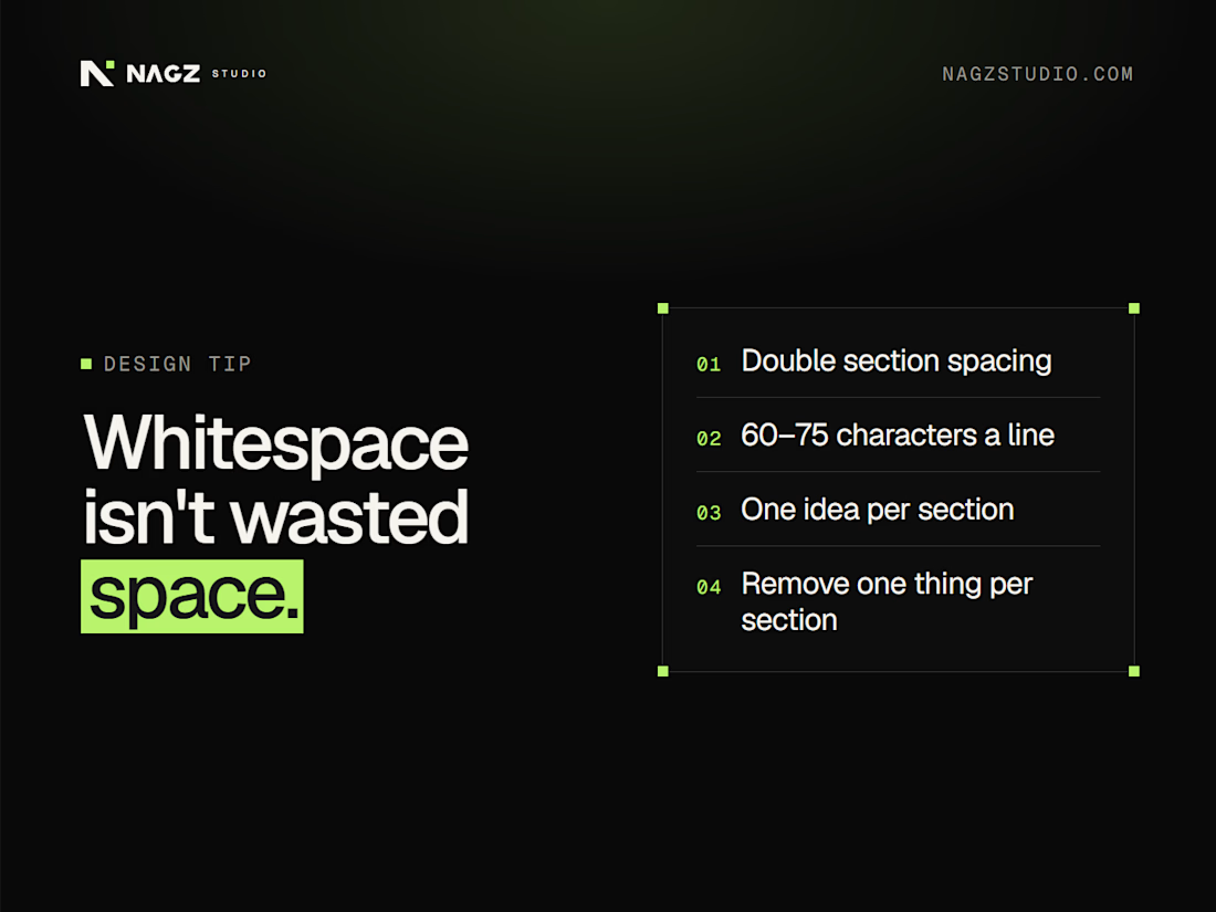
Whitespace isn't wasted space
Crowded pages feel cheap. Space makes a page feel confident.
Quick fixes you can make today:
→ Double the space between sections
→ Keep lines of text to about 60–75 characters wide
→ One idea per section
→ Give the headline room: more space above it, less below
→ Remove one element from every section
Space tells visitors what matters. Clutter tells them nothing does.
Which section of your site feels the most crowded?
#WebDesign #UIDesign #DesignTips #WebsiteDesign #UX
The network for creativity
Join 1.25M professional creatives like you
Connect with clients, get discovered, and run your business 100% commission-free
Creatives on Contra have earned over $150M and we are just getting started
Related posts


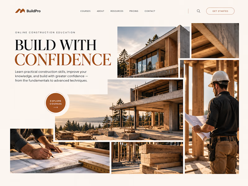
Same course. Same content.
But two completely different feelings ✨
Which version would you choose?

18 voted
31%
40 voted
69%

58 votes
Closed

option 2 feels a bit more cinematic, the confident feeling is embedded into the layout!


Officially @Spline - certified. Unofficially, we’ve been 3D-obsessed for years 😉🥇
Feels like the perfect excuse to bring back our interview with the Spline team - 🔗 Link
🎙️ We talked about how we use 3D to make complex B2B products easier to understand, with Elecctro as a real case.
Thank you, Spline, for the badge and for having us 💜
Curious to hear what you think 👇




great work deserves great badges 🏆 congratulations, Lynksen!


Rug Pad Wizard: a Figma design for a premium rug pad brand.
One site for two buyers, trade dealers and homeowners.

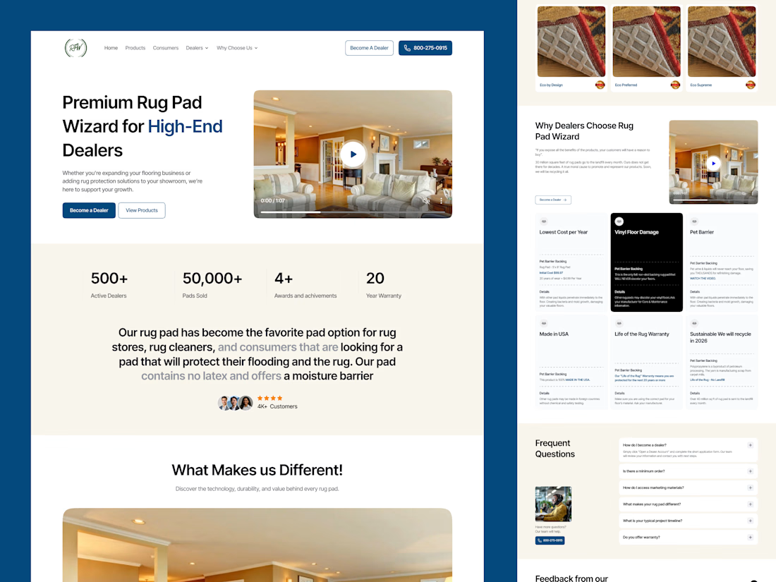

Smart to split dealers and homeowners on one site. The stats row under the hero is clean.