The network for creativity
Join 1.25M professional creatives like you
Connect with clients, get discovered, and run your business 100% commission-free
Creatives on Contra have earned over $150M and we are just getting started
Back to feedPost

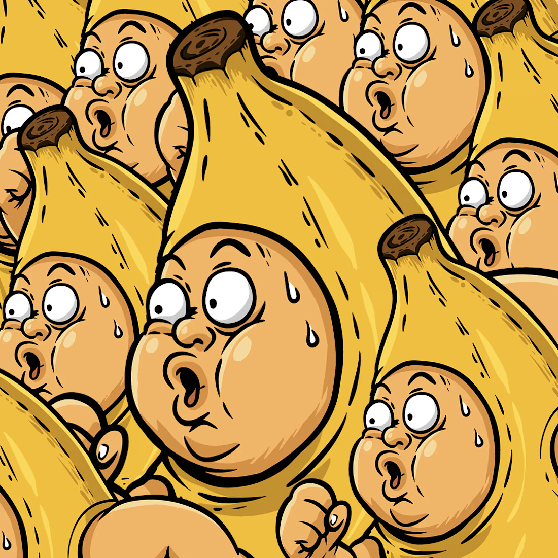
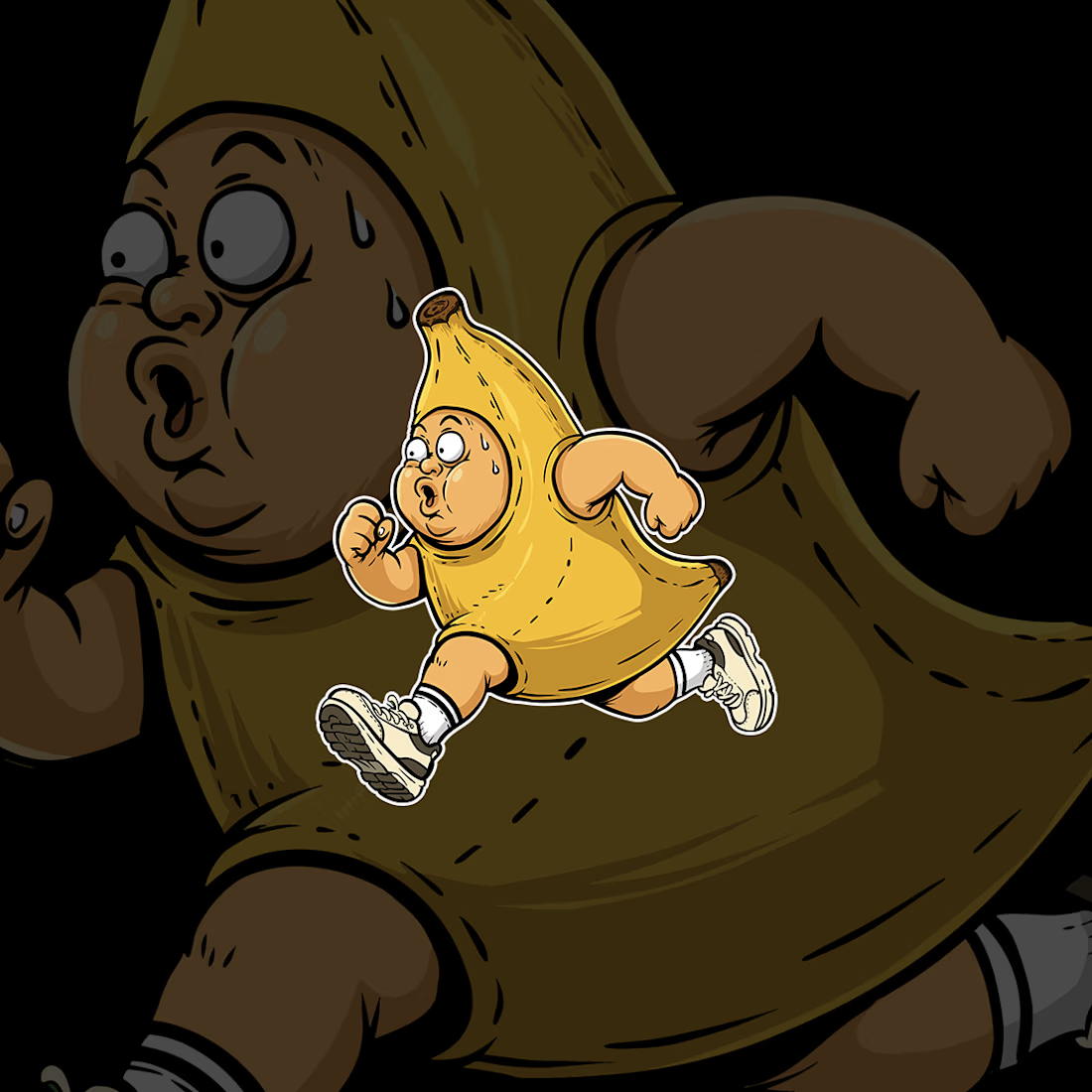
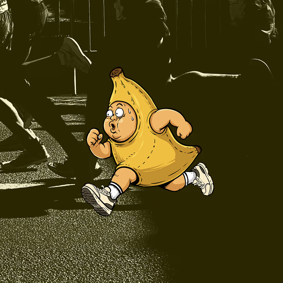
This project started with a simple idea from a local running club: creating a mascot that connects bananas with running and an active lifestyle.
The idea was based on the energy and nutrients we can get from bananas, which are often associated with sports and physical activity. I turned that idea into a fun character — a runner wearing a banana costume, full of energy and always on the move.
I wanted the character to feel playful, energetic, and easy to remember, while still representing the positive side of staying active and making exercise part of a healthy routine.
The final mascot was designed to work as a visual identity for the running club and could be used across social media, merchandise, and other club materials.


The network for creativity
Join 1.25M professional creatives like you
Connect with clients, get discovered, and run your business 100% commission-free
Creatives on Contra have earned over $150M and we are just getting started

Challenges
View all


Related posts

Creative Direction for Innerceuticals


The pivot from the real product bottle into that geometric particle animation is a smooth way to move from proof to brand world. Was Innerceuticals specifically asking for that split, ground it in the actual product first then get conceptual after, or did that pairing come together in the edit?

I'm working on a store concept mixing art supplies, gifts and tech. I presented two moodboards: one inspired by traditional art supply stores, and another cleaner, modern direction inspired by Japanese gift and tech stores. They chose option 2.
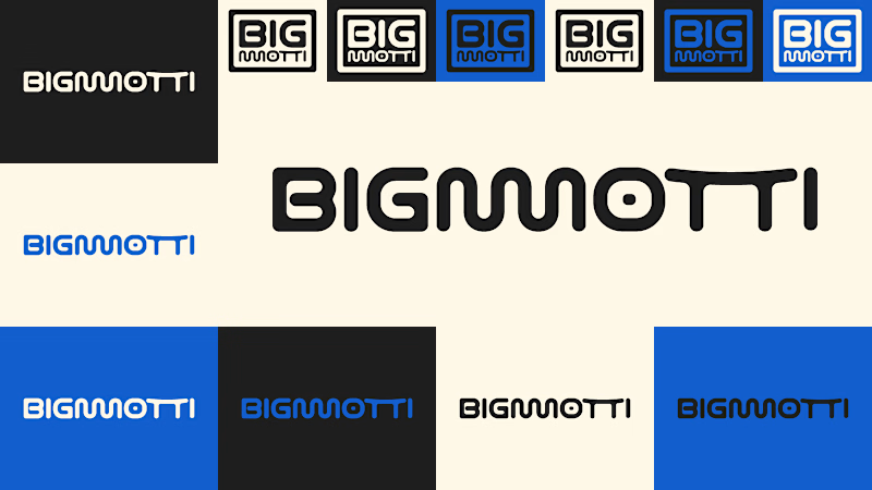
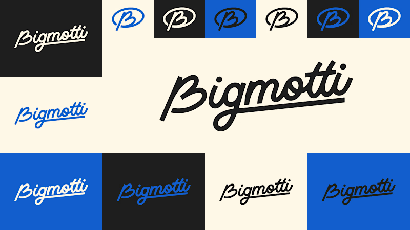
I presented four logo ideas. These two are my favorites and the ones the client liked most.
1_ Based on the second moodboard, with a more neutral and slightly futuristic feel. My favorite detail is the boxed version: its vertical weight balances with the I and O, making it feel tidy and visually appealing.
2_ Inspired by traditional art supply stores, but with a modern, clean style. Handwritten lettering adds a human touch and keeps it timeless.
Which one is your favorite and why?
Which one do you think the client chose?
1 voted
14%
6 voted
86%
7 votes
Closed
I'll guess they picked #1, the boxed Bigmotti reads cleaner next to a gift-and-tech assortment than the handwritten route. That vertical weight balance on the I and O is the kind of detail that's invisible until someone points it out, was there a runner-up logo the client seriously debated before landing on this one?

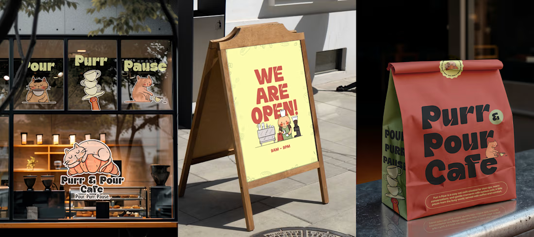
Purr & Pour Café 🐈☕
Purr & Pour is a playful branding concept for a cat-themed café, created around the idea of bringing together two things that make people ridiculously happy — coffee and cats.
For Purr & Pour, I developed a warm and playful visual language designed to feel welcoming, quirky, and a little bit whimsical.
The project explored how illustration can extend beyond a single artwork and become a complete brand experience — from the visual identity and illustrated elements to packaging, menus, social media creatives, and other customer touchpoints.
I wanted the brand to feel like a place where you could grab a coffee, hang out with cats, and forget about everything else for a little while. 🐾