The network for creativity
Join 1.25M professional creatives like you
Connect with clients, get discovered, and run your business 100% commission-free
Creatives on Contra have earned over $150M and we are just getting started
Back to feedPost

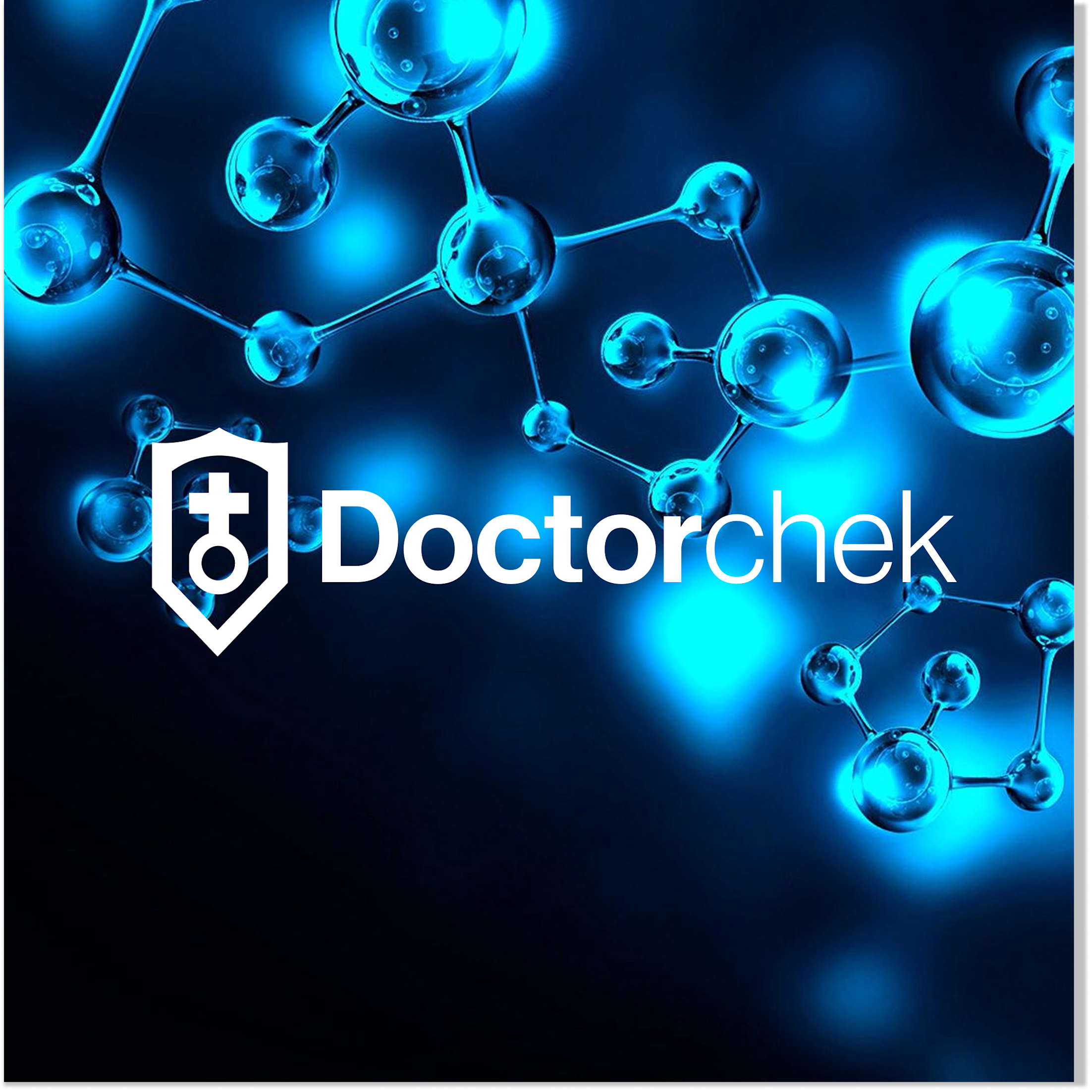
Aligning Doctorchek’s image with trust, accessibility, and modern telemedicine
I designed the brand identity and digital presence of Doctorchek, a growing telemedicine platform whose visual identity no longer reflected the quality, credibility, and scale of its healthcare services.
Doctorchek had evolved into a reliable platform connecting people with qualified healthcare professionals from the comfort of their homes.
Through a strategic design, I elevated the visual identity and online experience to clearly communicate trust, confidentiality, accessibility, and quality care, positioning the brand as a dependable and user-friendly healthcare partner.
The network for creativity
Join 1.25M professional creatives like you
Connect with clients, get discovered, and run your business 100% commission-free
Creatives on Contra have earned over $150M and we are just getting started






Related posts

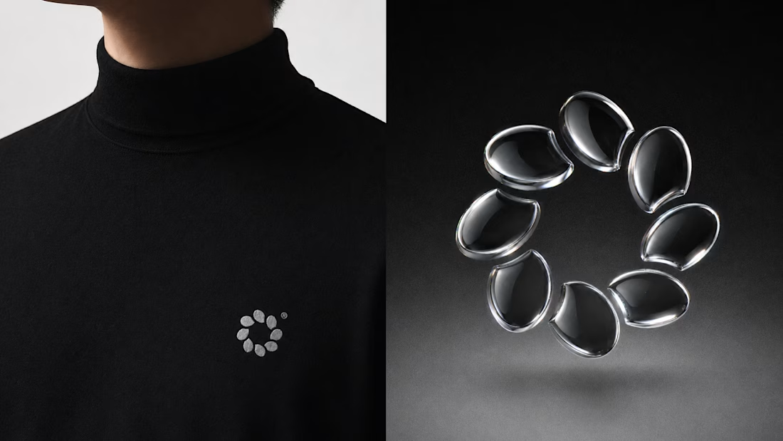
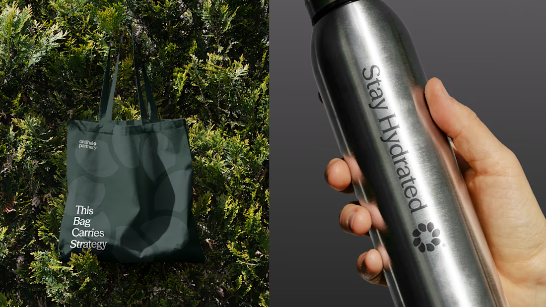
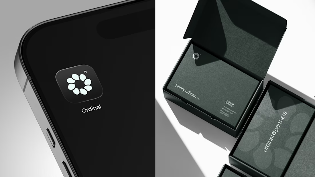
One brand, three different directions.
Sharing some of the logo exploration for Ordinal Partners.
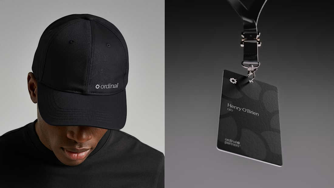

Visually appealing 🔥


Another set of mockups for Bakedwell


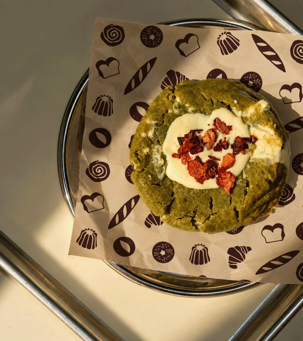
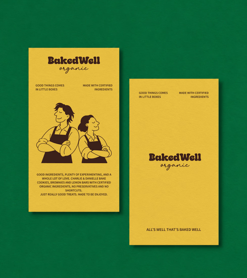
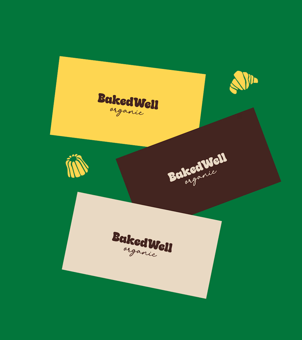
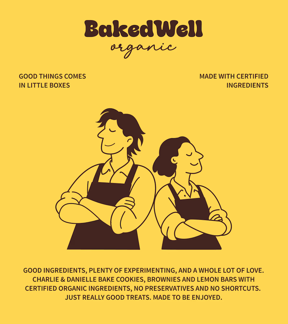

Forest green and mustard with the two bakers in flat illustration is a warm, confident pairing, and the cards read clearly. Contrarian take: the illustrated pair is the strongest asset here, stronger than the wordmark. If I owned BakedWell, I would put those two on the bag and the window and let the logo go smaller.

Four restaurants, one dot, and a suspicious amount of work for a punctuation mark.
07:00 bakery. 12:30 lunch counter. 18:45 dining room. 23:10 bar.
Norr & Co. case study, coming soon