The network for creativity
Join 1.25M professional creatives like you
Connect with clients, get discovered, and run your business 100% commission-free
Creatives on Contra have earned over $150M and we are just getting started
Back to feedPost

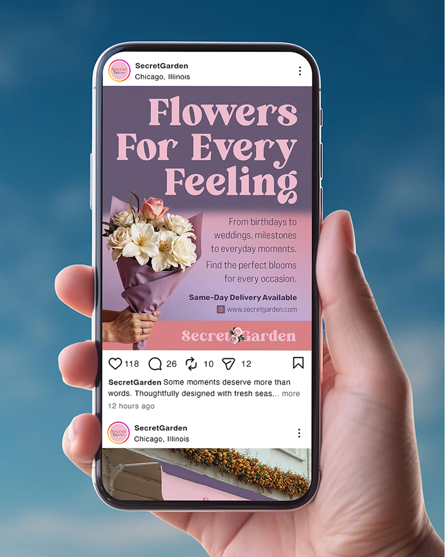
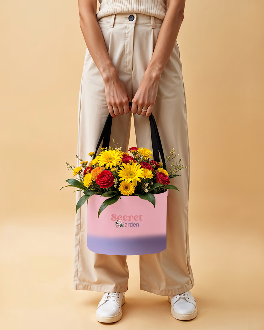
Meet Secret Garden. A floral brand concept built around the belief that flowers create meaningful memories. Designed as a premium yet approachable floral boutique, the project includes a social media design and flower basket.
The network for creativity
Join 1.25M professional creatives like you
Connect with clients, get discovered, and run your business 100% commission-free
Creatives on Contra have earned over $150M and we are just getting started











Related posts

A natural and premium packaging concept inspired by the purity of wildflower honey and the beauty of nature. The design combines warm honey tones, textured paper, bold typography, and a clean label layout to create an authentic, handcrafted feel.


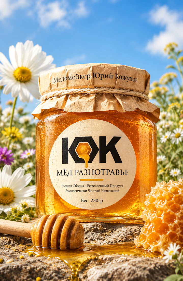

Love this! 🍯 That kraft paper texture + bold KOK mark with the honey drop is such a smart touch. Really nails that authentic, handcrafted Caucasian honey feel. The wildflower field backdrop makes it pop even more - premium but still natural.


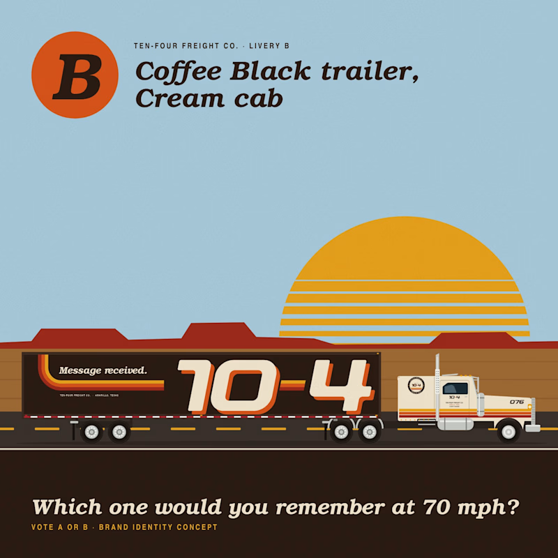

Cream trailer is better because the cargo light creamy color has better contrast with an environment it and black truck feels dangerous🔥🔥🔥
Great job Vaskrsije🎉🎉🎉

Have you ever designed packaging for a brand that never launched? 👀
Surprisingly, it’s happened to me more times than I expected.
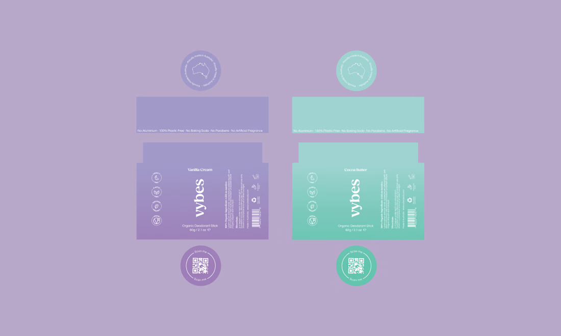
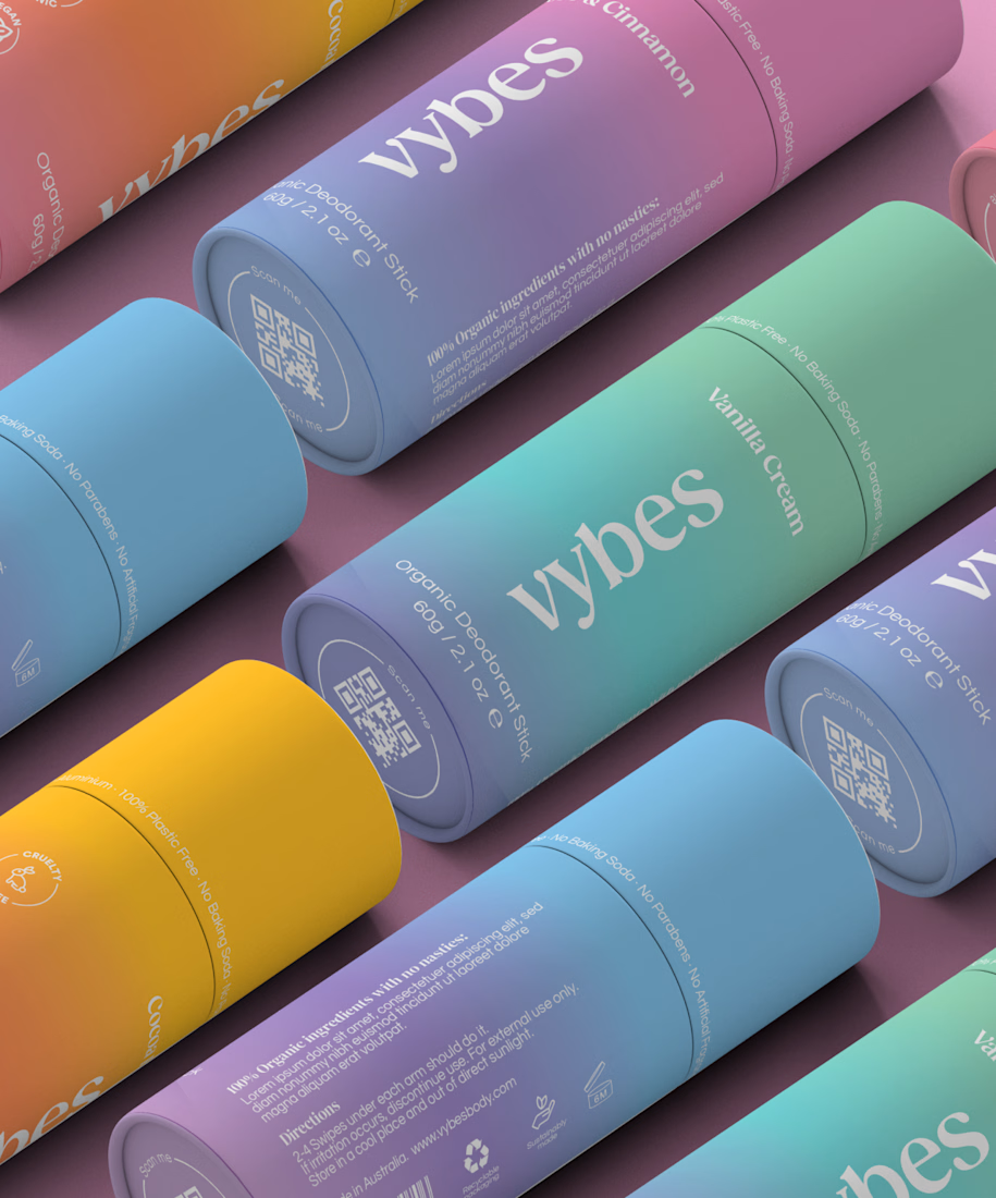
Vybes was an organic deodorant brand from Australia I worked on, designing packaging for a product that, in the end, never made it to market.
It’s a weird feeling putting so much thought into packaging for a product that people will never see on a shelf.
How many unreleased projects are hiding in your folders? 😂