The network for creativity
Join 1.25M professional creatives like you
Connect with clients, get discovered, and run your business 100% commission-free
Creatives on Contra have earned over $150M and we are just getting started
Back to feedPost
Taste Test
Which mood monster are you today?
7 voted
41%
10 voted
59%
17 votes
Closed

Ha, love this format for a quick pulse check. Option 2 is giving me chaotic-but-productive energy today. What made you land on "mood monsters" as the concept instead of a straightforward moodboard poll?

Thank you! These two are part of my bigger project of 15 different monsters with various moods
These two called Offline and In-love

Today I feel like option 2😅


Both of these characters are wonderful, but Option 2 ("Offline") hits perfectly. The subtle detail in how the heavy texture of the blanket drape folds right over the soft pink pom-pom feet is brilliant—it translates that exact cozy, weighted feeling of wanting to unplug and...
Thank you very much!
The network for creativity
Join 1.25M professional creatives like you
Connect with clients, get discovered, and run your business 100% commission-free
Creatives on Contra have earned over $150M and we are just getting started




Related posts

Good vibes only.
What’s driving your creative energy today?
Generated with H3.


That mint-and-pink street scene is pure good vibes, love the sneaker detail catching the light. What drives my energy lately is seeing a rough idea actually ship instead of sitting in drafts. Momentum is its own fuel.


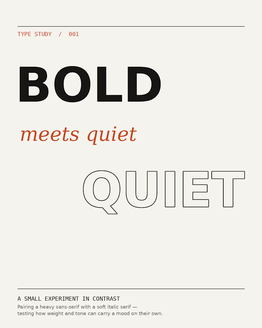
Type Study 001: A small experiment pairing a heavy sans-serif with a soft italic serif. Testing how weight and tone can carry a mood on their own. Feedback welcome


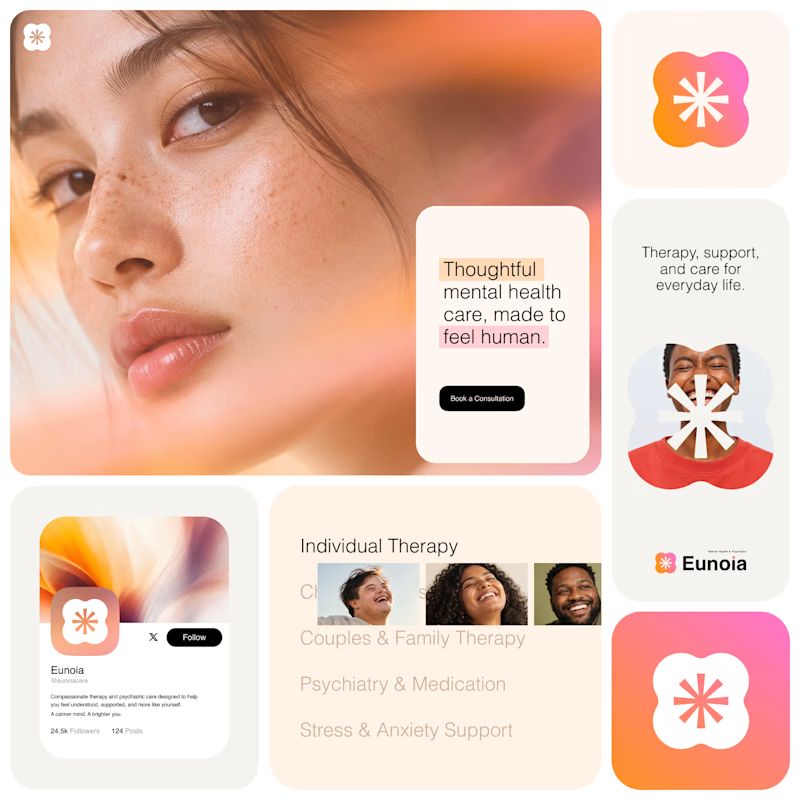
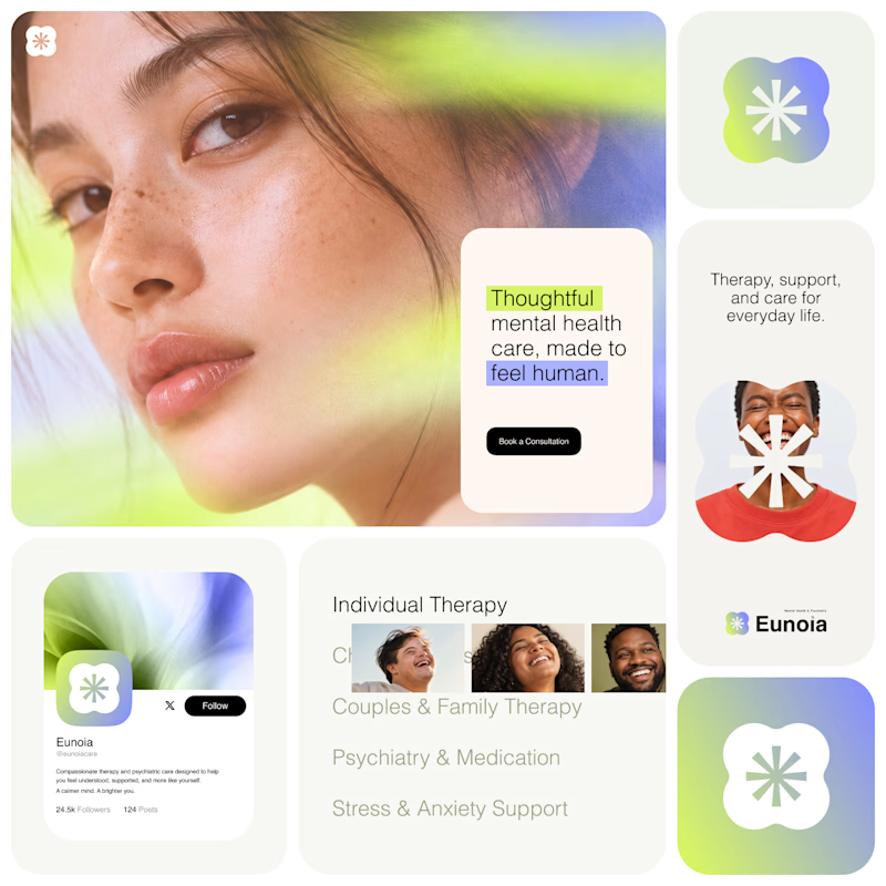
Exploring two visual directions for Eunoia, a mental health & psychiatry brand.
Direction 01 - Warm peach, orange and soft pink tones for a calm, human and comforting feel.
Direction 02 - Lime and periwinkle tones for a fresher, more optimistic and contemporary expression.
Same brand system. Different emotional energy.
37 votes
Ends in 23h