The network for creativity
Join 1.25M professional creatives like you
Connect with clients, get discovered, and run your business 100% commission-free
Creatives on Contra have earned over $150M and we are just getting started
Back to feedPost

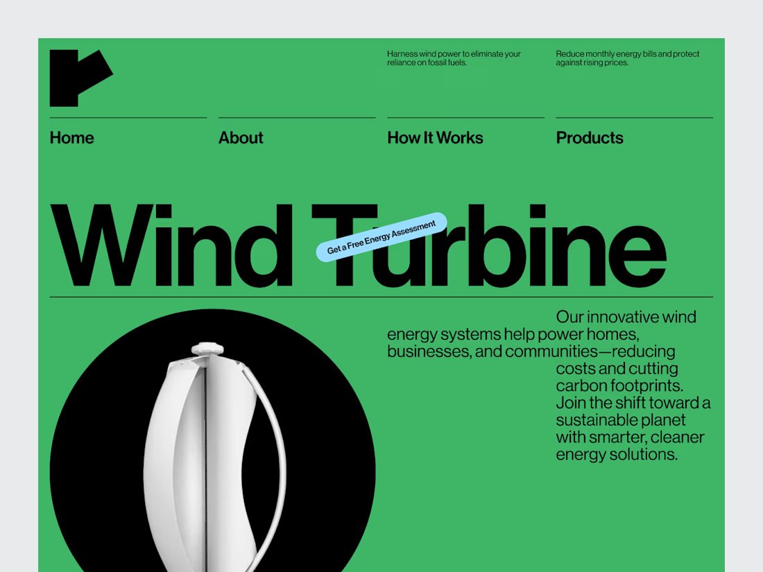
Wind Turbine Sales & Service Website Header Design
For a company working with wind turbines, the website needs to communicate credibility before the visitor starts digging into the technical details.
For this header concept, we focused on creating a strong first impression around the company's core offering: wind turbine sales and service.
The visual direction is clean and industrial, while the layout keeps the message and next step clear.
Services: Web Design · UI/UX Design · Brand Identity · Web Development
The goal wasn't to put the entire company on the first screen.
It was to make the first screen do its job well.
Designed by WaxyWeb.


Looks great


Well Played


Creative one!!!

Good work

The torn-tape announcement sticker is the small decision that sells "industrial, not corporate" harder than the black-and-green palette does — it reads like something physically stuck onto a job site, not a banner a marketing team approved.

Amazing 😊


Clean and professional execution! 👏 The balance between industrial credibility and a clear CTA works really well. The hero doesn’t try to say everything—it immediately communicates the value and guides the visitor toward the next step. ⚡

Giving the first screen one clear job makes sense for an industrial site. I’d carry that focus into separate routes for equipment buyers and existing owners needing service, since they arrive with quite different questions. Would those paths split in the hero or just below it?
The network for creativity
Join 1.25M professional creatives like you
Connect with clients, get discovered, and run your business 100% commission-free
Creatives on Contra have earned over $150M and we are just getting started











Related posts

looking for a great designer


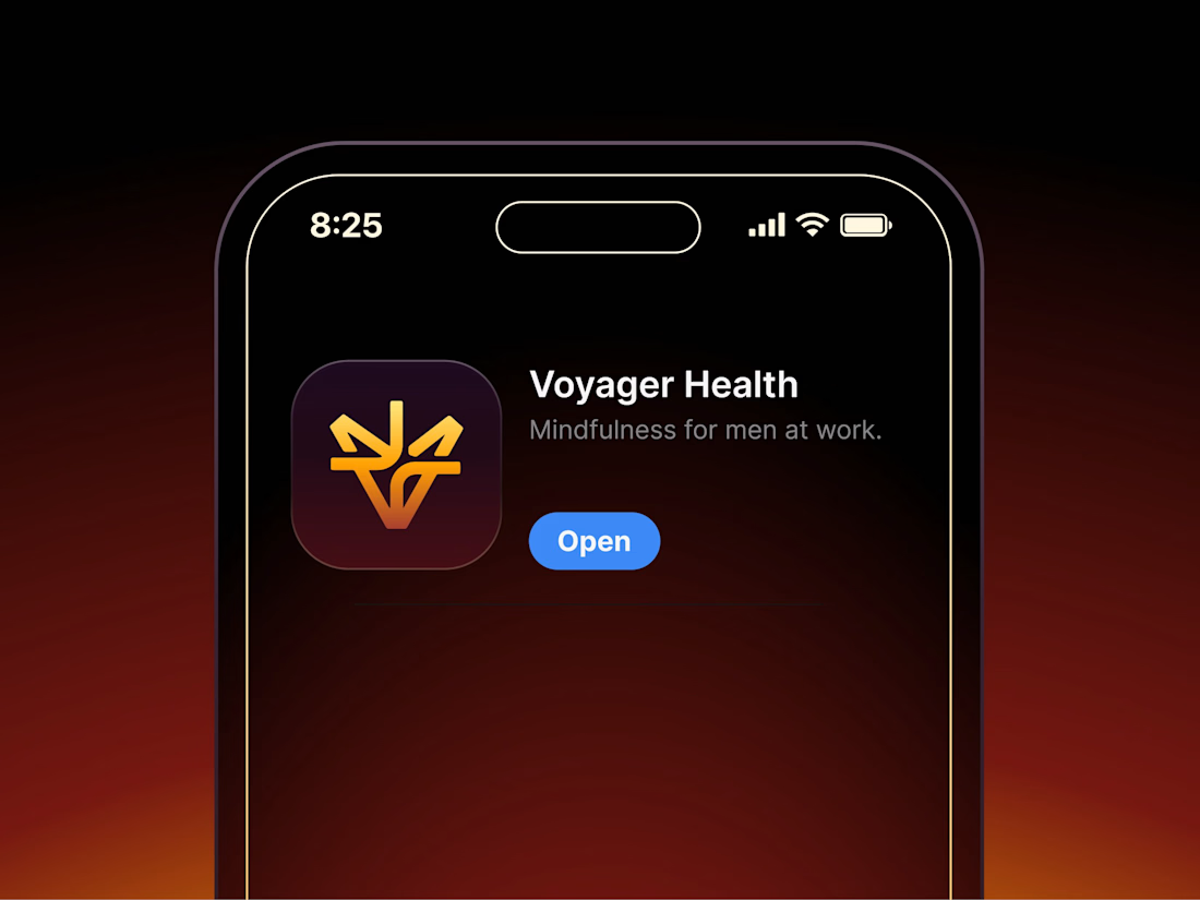

Aryna, that golden symbol pops so nicely against the plum background ✨

tiiny.host Landing Page
Description:
A clean, friendly landing page for tiiny.host, the easiest way to put a file online and share it with a link.
The goal was to make the product feel as simple as it actually is. The upload box sits right in the hero, so visitors can drag in a file and get a live link without scrolling or signing up first.
What I focused on:
1. Upload-first hero with a clear “Upload a File” action and file type tabs (Docs, Images, Code, Samples)
2. Hand-drawn illustrations and script accents to keep the tone light and approachable
3. Social proof up top: 500K+ users and logos like Salesforce, Nestlé, and Square
4. Soft sky gradient and plenty of breathing room so nothing feels technical or intimidating

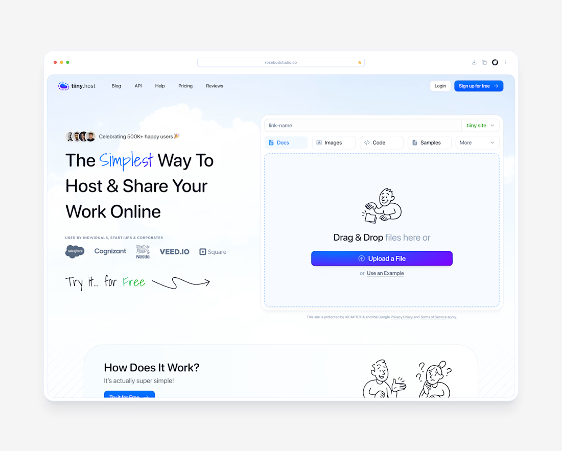

Putting the upload box right in the hero is the smart move, nobody has to go looking for it. You can use the product before you understand it, which is about as low as friction gets.

