The network for creativity
Join 1.25M professional creatives like you
Connect with clients, get discovered, and run your business 100% commission-free
Creatives on Contra have earned over $150M and we are just getting started
Back to feedPost
tiiny.host Landing Page
Description:
A clean, friendly landing page for tiiny.host, the easiest way to put a file online and share it with a link.
The goal was to make the product feel as simple as it actually is. The upload box sits right in the hero, so visitors can drag in a file and get a live link without scrolling or signing up first.
What I focused on:
1. Upload-first hero with a clear “Upload a File” action and file type tabs (Docs, Images, Code, Samples)
2. Hand-drawn illustrations and script accents to keep the tone light and approachable
3. Social proof up top: 500K+ users and logos like Salesforce, Nestlé, and Square
4. Soft sky gradient and plenty of breathing room so nothing feels technical or intimidating


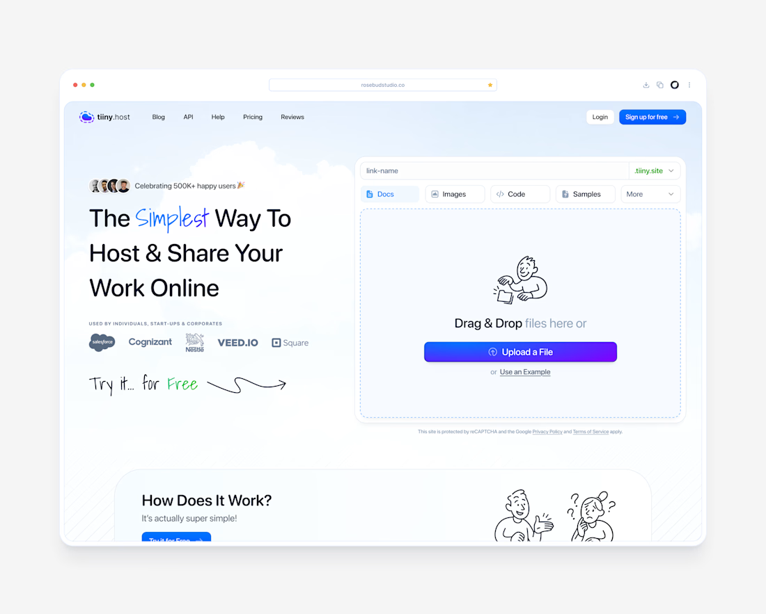


Zero friction. An upload first hero proves the value proposition instantly instead of just talking about it.

agree yes

The hand-drawn illustrations with the script accents are what make this landing page special, Dante. They keep a file-hosting tool feeling light and approachable instead of technical, which is exactly the tone the upload-first hero needed.
pray 🙏

Putting the upload box right in the hero is the smart move, nobody has to go looking for it. You can use the product before you understand it, which is about as low as friction gets.
exactly thanks muhammad 🙏
The network for creativity
Join 1.25M professional creatives like you
Connect with clients, get discovered, and run your business 100% commission-free
Creatives on Contra have earned over $150M and we are just getting started



Related posts

A fashion storefront needs to show the outfit and make its individual pieces easy to find.
For FORM, I paired a warm, editorial lookbook with clearly grouped product names, prices, and size choices.
Cream surfaces, charcoal typography, and consistent product cards connect the homepage with the desktop and mobile screen concepts.
One useful design principle from this project: give campaign imagery and shopping details their own readable zones. The collection can have a strong visual presence while the next product decision stays clear.
Explore the complete design case study:
https://contra.com/p/rNPRqooQ-form-fashion-e-commerce-website-design
When exploring a clothing collection, what helps you most: a styled outfit or an individual product grid?

Adorable


Some concept work from the agency. Planning to share more of what we create, from clean interfaces to the little motion details that bring them to life.
Check out the website: https://urest.agency/


Great!!