The network for creativity
Join 1.25M professional creatives like you
Connect with clients, get discovered, and run your business 100% commission-free
Creatives on Contra have earned over $150M and we are just getting started
Back to feedPost

From Dated to Modern: A Little Black Dress Sales Page Redesign
A quick before-and-after of a sales page redesign I worked on for a women's fitness coaching program.
The goal was to create a more polished, modern, and premium look while keeping the messaging clear and the focus on conversions.
What I improved:
• Refined the hero section layout
• Introduced a stronger visual hierarchy
• Updated the typography and color palette
• Added a more confident, luxury-inspired aesthetic
• Made the CTA more prominent and action-focused
Small design changes can make a big difference in how a brand is perceived.
What do you think of the transformation?


The network for creativity
Join 1.25M professional creatives like you
Connect with clients, get discovered, and run your business 100% commission-free
Creatives on Contra have earned over $150M and we are just getting started




Related posts

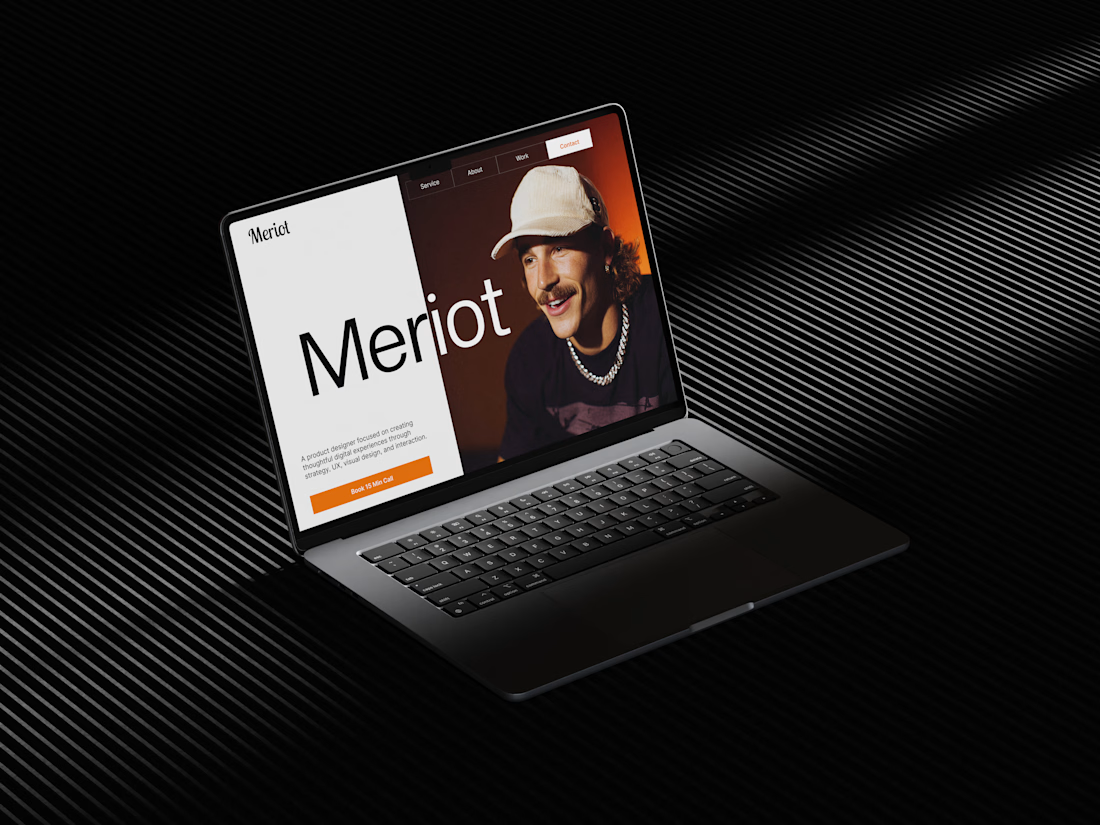
Meriot Netherlands-based product designer portfolio
I explored a portfolio website for Meriot, a product designer based in the Netherlands who wanted a digital presence that felt more personal, editorial, and design-focused.
The challenge was to avoid the typical portfolio formula and create something that communicates personality within the first few seconds.
The direction
→ Bold editorial typography
→ Strong personal photography
→ Minimal black-and-white foundation
→ Warm orange accent for CTAs
→ Simple, structured navigation
→ Clear positioning as a product designer
→ A portfolio experience that feels like a personal brand
The idea was to make the website feel confident without being complicated.
Rather than leading with a long introduction, the hero immediately communicates who Meriot is, what he does, and where the visitor should go next.



Nice design broooo

A closer look at Sagebio.
Designed a clean, simple website experience for a complex health-tech product.
explore the live site: https://www.sagebio.com/
#WebDesign #UXDesign #ProductDesign #HealthTech #EiderDesign


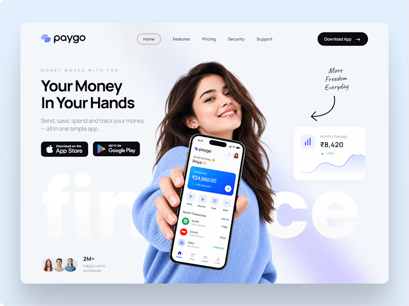
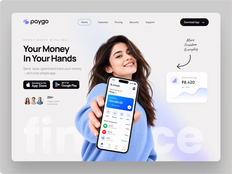
Which landing page looks more premium for a modern fintech app?
14 voted
78%
4 voted
22%
18 votes
Closed