The network for creativity
Join 1.25M professional creatives like you
Connect with clients, get discovered, and run your business 100% commission-free
Creatives on Contra have earned over $150M and we are just getting started
Back to feedPost

The smallest UX decisions usually have the biggest impact on conversions.
While working on an automotive services website, I spent extra time refining the service selection flow. Nothing flashy. Just clearer hierarchy, stronger visual cues, and fewer points of friction.
The result was a user journey that felt faster, simpler, and more intuitive from the first click.
One thing I have learned from building marketing websites is that visitors rarely notice great UX.
They only notice when something feels confusing.
What is one small UX improvement that instantly makes a website feel more professional to you?


The moment the user experiences friction, the design outcomes are lost.
The network for creativity
Join 1.25M professional creatives like you
Connect with clients, get discovered, and run your business 100% commission-free
Creatives on Contra have earned over $150M and we are just getting started

Challenges
View all


Related posts

VYRO — redefining essentials through a bold, minimal digital experience.


Nice work!

If your dashboard has to be beautiful OR instantly understandable, which one wins?
I designed two visual directions for the same AI Sales Agent dashboard.
Same product. Same data. Same core UX.
Only the visual language changed.
Poll options:
A — Clarity First
B — Energy First

30 voted
53%
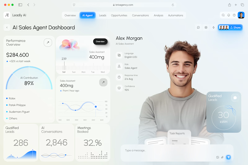
27 voted
47%
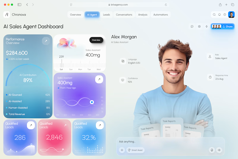
57 votes
Closed

A clarity outstanding

The category default for AI products is dark backgrounds and gradient glow. Heron's audience is architects, so we built the visual system out of their working material instead.
Everything on the site is drawn as architectural line work. Plans, elevations, dimension strings, and annotation boxes styled like redline mark-ups, each one holding a genuine code reference rather than lorem text.
The system does two jobs. It reads as native to someone who spends their day inside Revit, and it supports the product story, because Heron works inside the drawing rather than beside it.


Super thoughtful! 👍