The network for creativity
Join 1.25M professional creatives like you
Connect with clients, get discovered, and run your business 100% commission-free
Creatives on Contra have earned over $150M and we are just getting started
Back to feedPost

Just wrapped my first project on Contra: a full brand identity for Talga Cosmetics.
What made it special is that Sara took a chance on a blank profile with zero reviews. That kind of trust means a lot when you're just getting started on a new platform.
More work to show soon. 😊


NEW PAID PROJECT
Nina MaarTalga Cosmetics
The network for creativity
Join 1.25M professional creatives like you
Connect with clients, get discovered, and run your business 100% commission-free
Creatives on Contra have earned over $150M and we are just getting started



Related posts

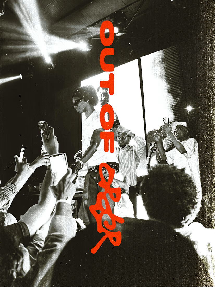
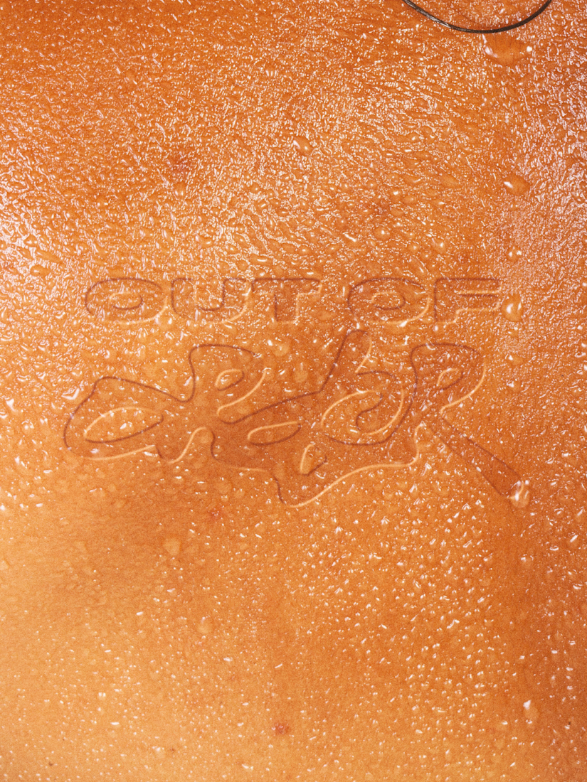
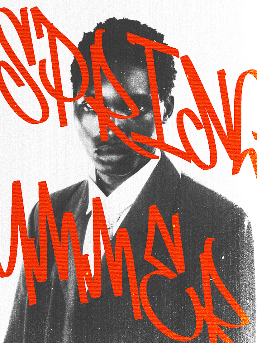
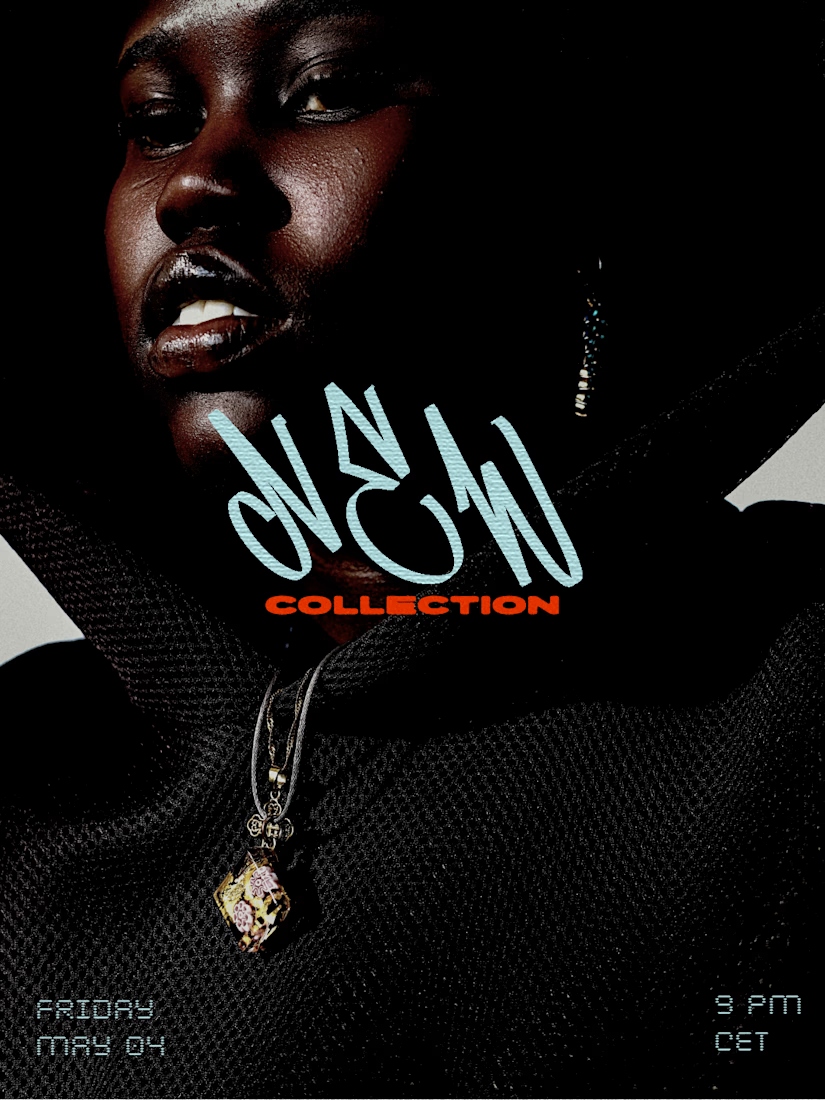
I recently worked on a branding concept for OUT OF ORDER (OOO), a streetwear brand inspired by hip-hop, urban culture and retro aesthetics.
The identity explores the contrast between expressive graffiti-inspired typography and a more refined, high-fashion visual direction.




out of order is a great name for a streetwear brand ngl

The art stays. The care evolves.
A sneak peek at INK VEIL, a skincare brand designed for tattooed skin.
A little preview of our work for INK VEIL.

Love this.

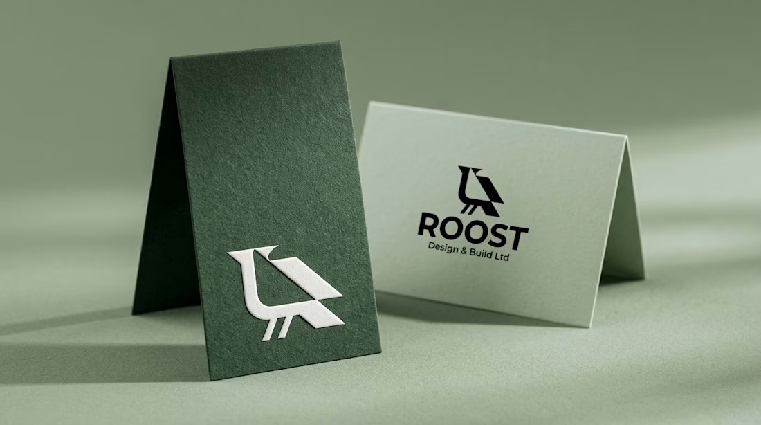
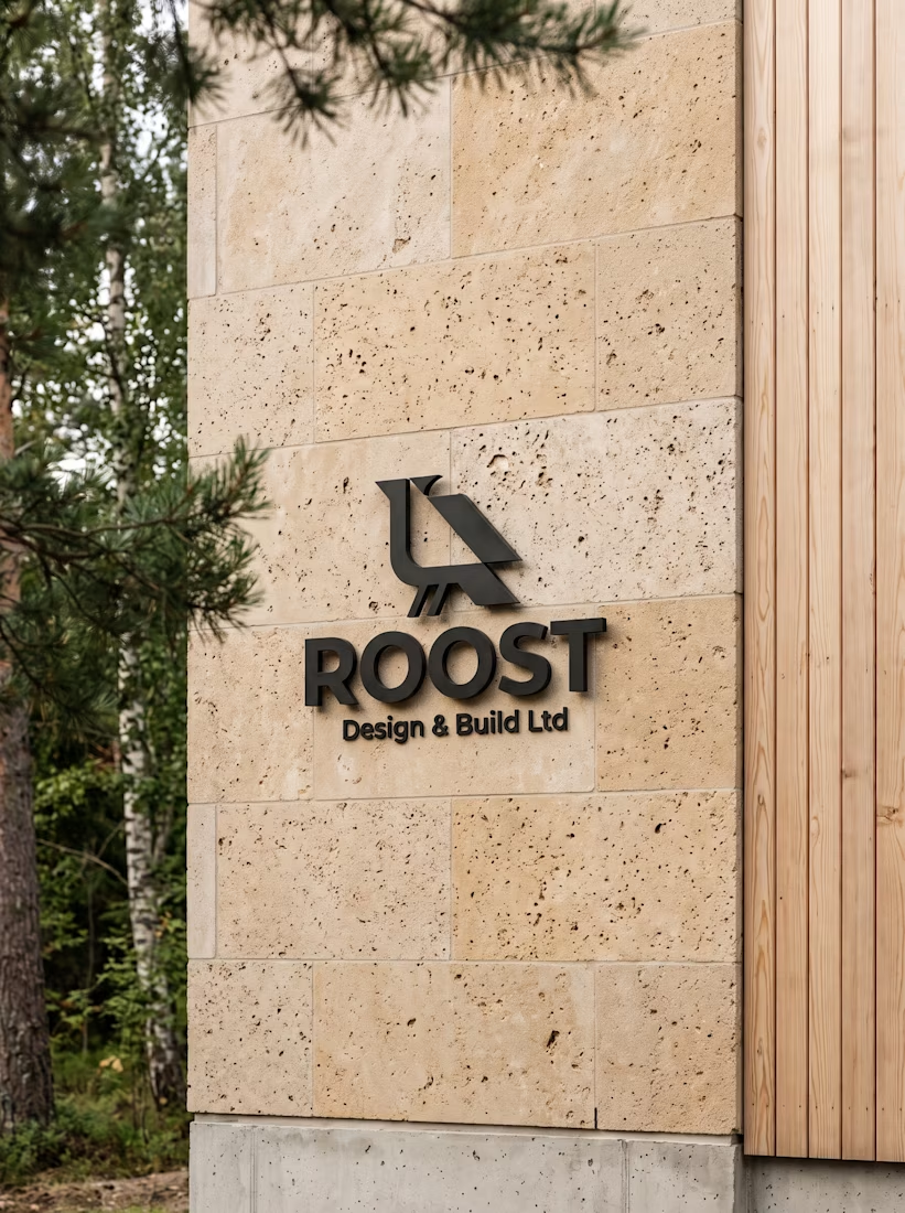
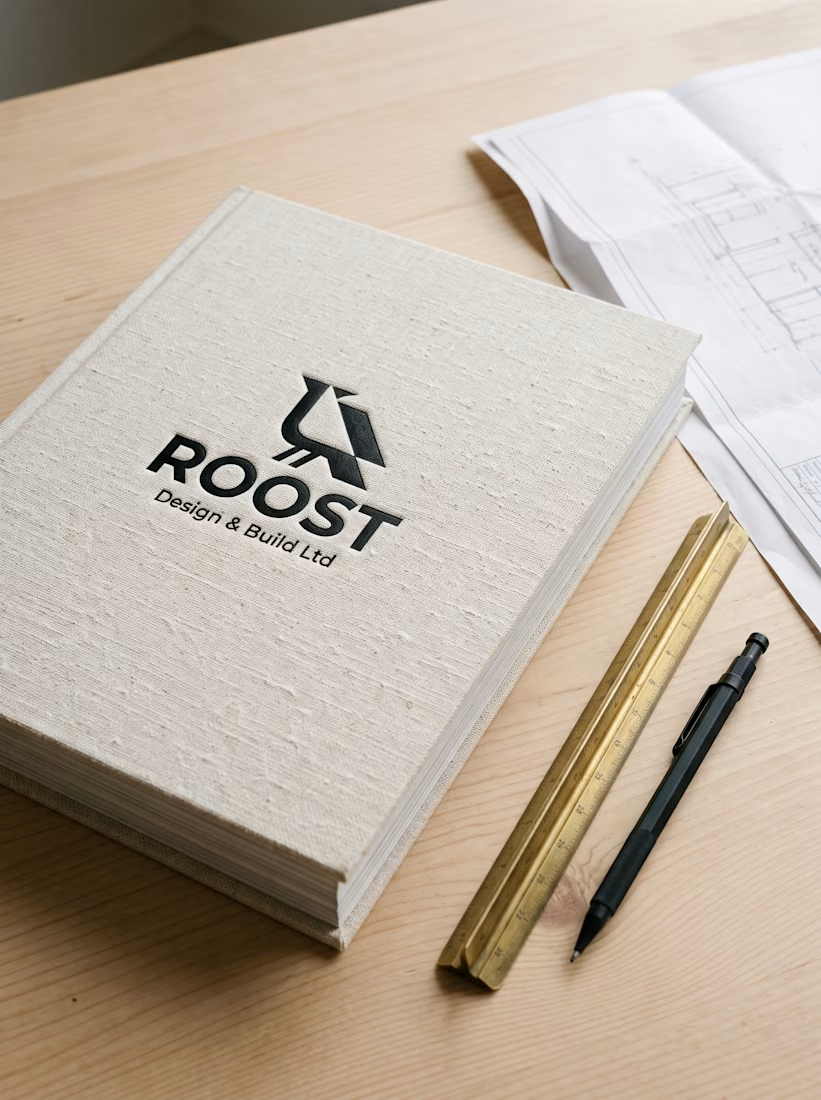
Real estate branding often hides behind cold corporate roofline clichés.
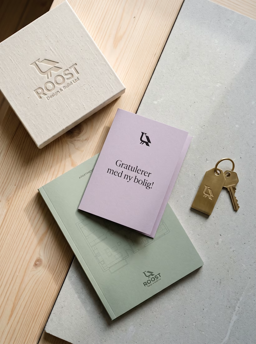
For ROOST in Oslo, my goal was to connect Nordic timber warmth with clean geometry. I paired the perched raven mark across folded sage cards, blackened steel facade signs, and linen handover books.
A brass key fob and lilac welcome card finish the move-in experience on a personal note.
How do you bring warmth into architectural branding without clutter?