The network for creativity
Join 1.25M professional creatives like you
Connect with clients, get discovered, and run your business 100% commission-free
Creatives on Contra have earned over $150M and we are just getting started
Back to feedPost

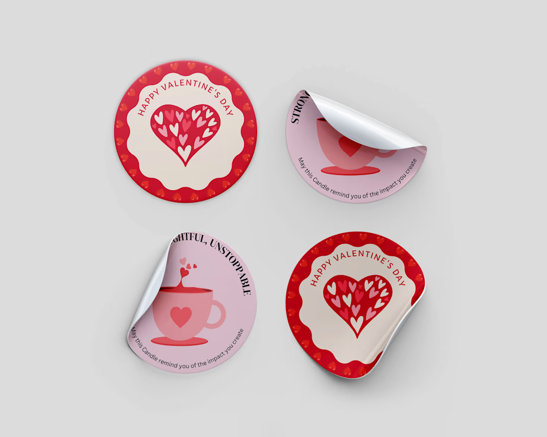
Work done for Orelia Candles. They wanted stickers added in there boxes


The network for creativity
Join 1.25M professional creatives like you
Connect with clients, get discovered, and run your business 100% commission-free
Creatives on Contra have earned over $150M and we are just getting started











Related posts


Three weeks into building the Pasted website, after the design was approved, an 11-page document arrived with a whole new vision.
It was beautiful work, and it described a different project at the agreed price.
I asked them to decide: keep the approved scope, or pause and price the new idea separately. On day six, they chose the original. We shipped two weeks later.


Offering to price the new vision as its own phase also lets the client see what the idea costs without it feeling like a no. Was a change-order process already written into your contract, or did you build that path on the spot?

Two Ads, Two Designs but Different Vibes:
Using the hours and the rest day, I came with these ads using the
software of SVGator combined with the transitions from Adobe After Effects.
Vote and let me know your opinions on which one and why?


12 voted
57%
9 voted
43%
21 votes
Closed


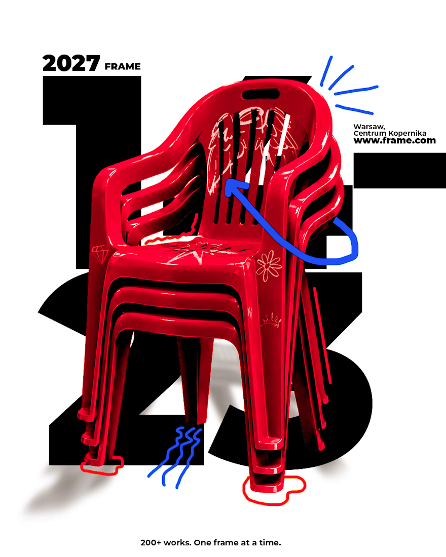
A frame is a decision about what matters 🖼️
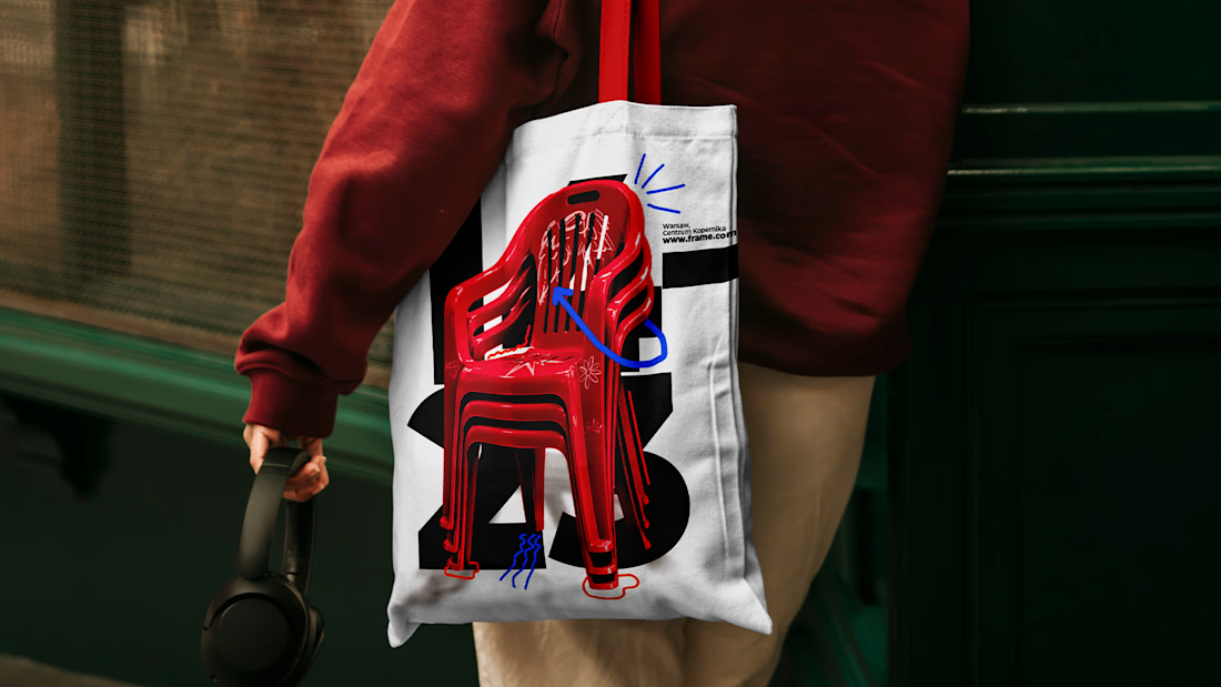
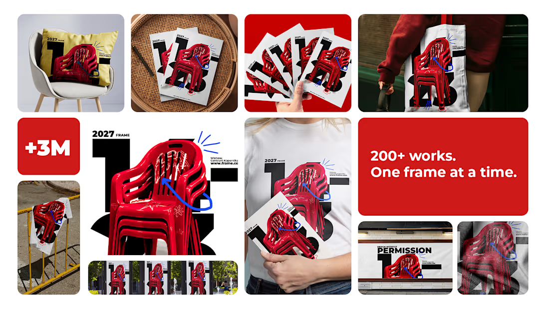
Spent the past week designing FRAME, a brand identity and poster series for a design exhibition. Four posters, one system: a main exhibition visual, a talk, a workshop, and an open call for entries, each with its own composition and the same confident language underneath.
No sterile gallery minimalism, no chaos pretending to be creativity. Just type, color, and a lot of decisions about what goes inside the frame. 🖤
Sometimes the best proof a system works is that no two posters look the same.



I like the design and color palette🔥🔥