The network for creativity
Join 1.25M professional creatives like you
Connect with clients, get discovered, and run your business 100% commission-free
Creatives on Contra have earned over $150M and we are just getting started
Back to feedPost

A frame is a decision about what matters 🖼️
Spent the past week designing FRAME, a brand identity and poster series for a design exhibition. Four posters, one system: a main exhibition visual, a talk, a workshop, and an open call for entries, each with its own composition and the same confident language underneath.
No sterile gallery minimalism, no chaos pretending to be creativity. Just type, color, and a lot of decisions about what goes inside the frame. 🖤
Sometimes the best proof a system works is that no two posters look the same.


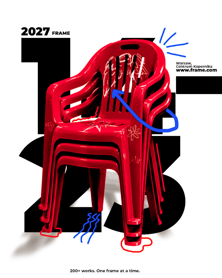
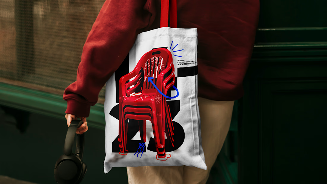
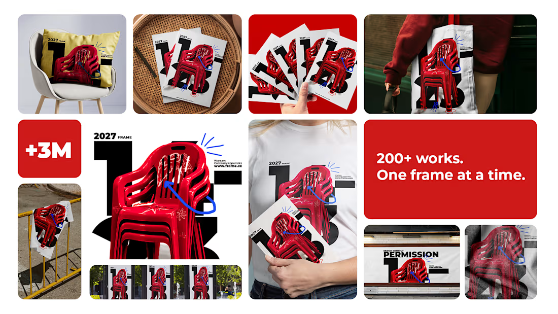

With the red chair on every poster, the system has one fixed point to vary around. Did you lock the type rules first and let the chair crop change per format, or did it go the other way?

The red chairs against the bold type look great across all four posters. Really feels like one system.

No sterile gallery minimalism, no chaos pretending to be creativity is a line worth stealing. And you proved it: four posters that look nothing alike but clearly belong together. The red chair is such a strong anchor. Did you find it first and build the system around it, or did the system come first?

A very stylish and mature project. Inspiring!

I like the design and color palette🔥🔥
The network for creativity
Join 1.25M professional creatives like you
Connect with clients, get discovered, and run your business 100% commission-free
Creatives on Contra have earned over $150M and we are just getting started








Related posts

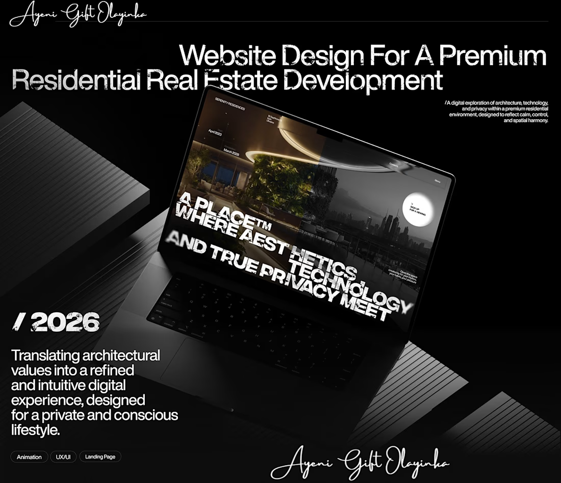
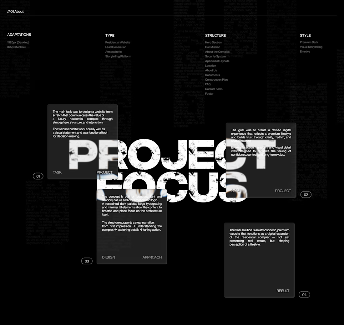
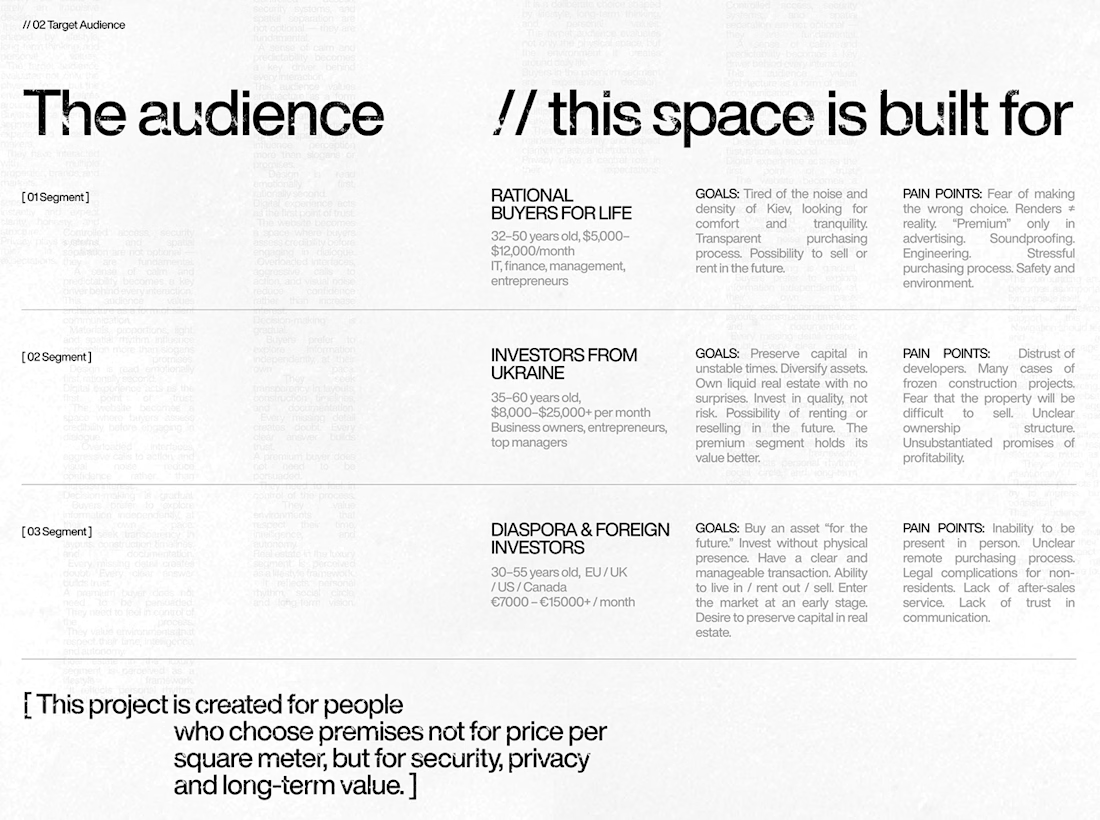
What makes someone stop scrolling and imagine themselves living in a property?
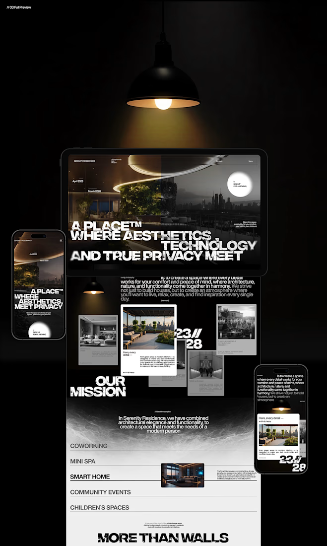
That's something I kept in mind while working on this luxury real estate website concept.
I wanted the design to feel premium without making the experience complicated. The focus was on strong visuals, clean layouts, and a clear structure that lets the properties speak for themselves.
I also paid attention to how visitors move through the website, from their first impression to exploring the properties and taking the next step.
Because when someone is looking for a home, the experience matters just as much as the presentation.
I couldn't fit every screen into this post, so I'll share more of the design in the comments. 👇
I'm curious: when you visit a real estate website, what makes you want to explore further?
#WebDesign #Architecture #LuxuryRealEstate #UIUXDesign #RealEstate #Figma


nice work

I created a modern camera showcase template designed to highlight a product in a sleek and engaging way. The template can be customized for different brands by changing the colors, text, logo, product visuals, and other design elements. My goal was to create a flexible design that can be adapted to different products and brand identities while keeping the animation clean and professional.


Great template, looks easy to customize and adapt! Best of luck!

Ad Campaign Design for Fitness App - PULSE FIT
I created ad creatives for a fitness app to increase downloads and engagement.
What I designed:
App Promo Ads for Social Media
HIIT Challenge Campaign Post
App Feature Announcement Ad - Stay Active
App UI Showcase for Ads
Goal: Clean, bold & colorful ads that grab attention in feed and drive app installs.
Style: Modern, Energetic, Blue / Teal / Orange
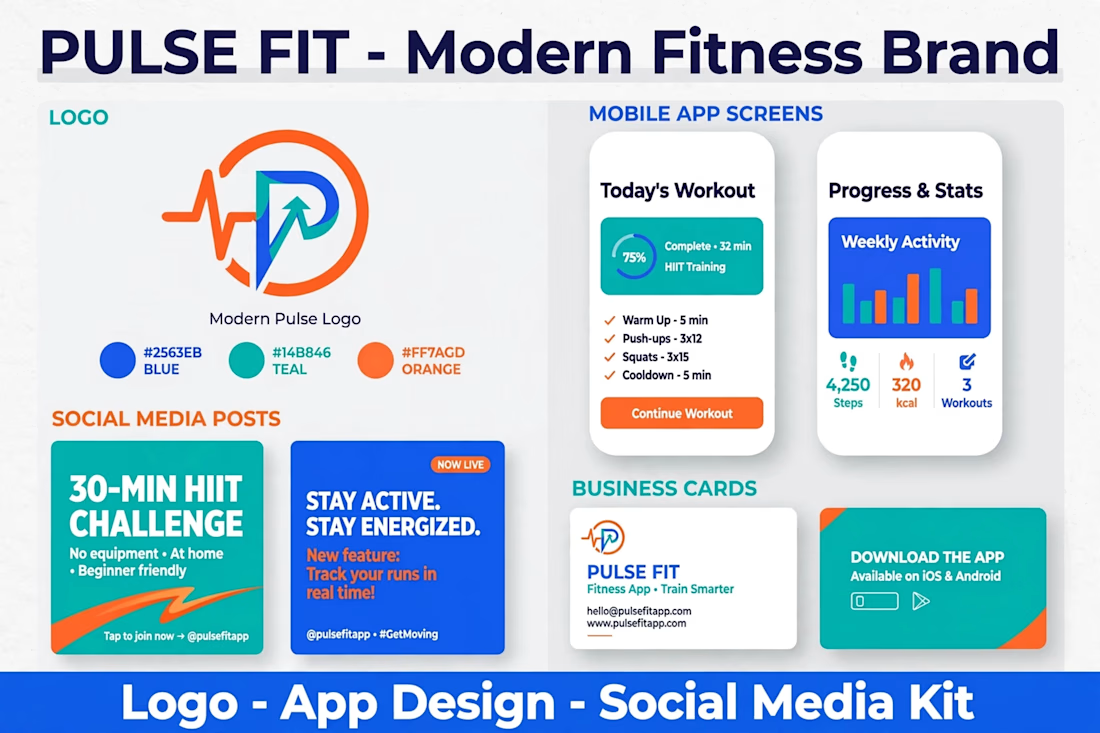
The blue teal orange palette has real energy for a fitness app, irfan. The HIIT challenge posts and app UI showcases cover the full campaign story well. Clean and bold is exactly the right direction for feed-grabbing ads.