The network for creativity
Join 1.25M professional creatives like you
Connect with clients, get discovered, and run your business 100% commission-free
Creatives on Contra have earned over $150M and we are just getting started
Back to feedPost
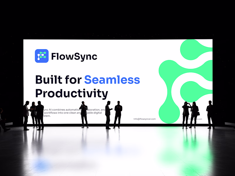
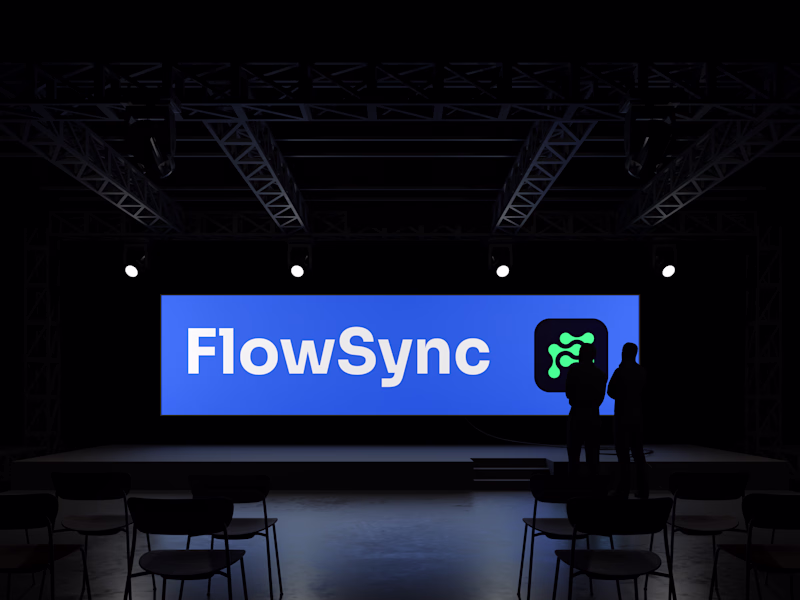
Taste Test
Which one takes the crown? 👑
Testing out two completely different vibes for the new FlowSync brand presentation, and the team is totally split.
👈 LEFT: Clean, high-key white layout that puts the "Seamless Productivity" message front and center. 👉 RIGHT: Moody, high-contrast auditorium setup featuring a powerful blue focal point.
Drop a LEFT or RIGHT in the comments—your feedback determines the winner!
4 voted
80%
1 voted
20%
5 votes
Closed
The network for creativity
Join 1.25M professional creatives like you
Connect with clients, get discovered, and run your business 100% commission-free
Creatives on Contra have earned over $150M and we are just getting started
Related posts
Embroidery branding design over different texture. This would look so cool with the right methods.
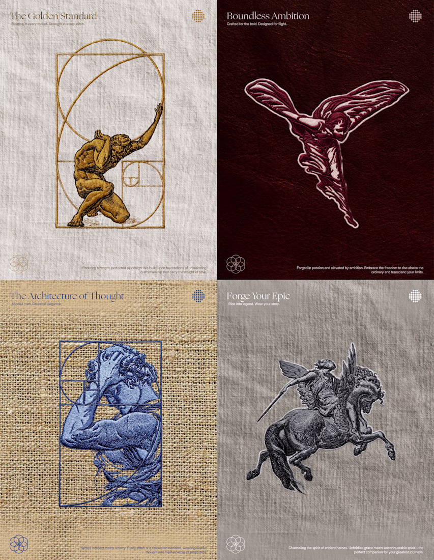
Great work 🔥
May was a busy one.
✓ 8 clients booked
✓ 5 logos delivered
✓ 5 projects delivered
✓ 3 projects still active
✓ 3 brandbooks delivered
✓ 6 packaging designs completed
June is already moving fast, but I’m starting to look ahead to the second half of the year and the new adventures, brands, and challenges that might come with it.
How is your 2026 looking so far?
I can’t wait to land my first gig🥹
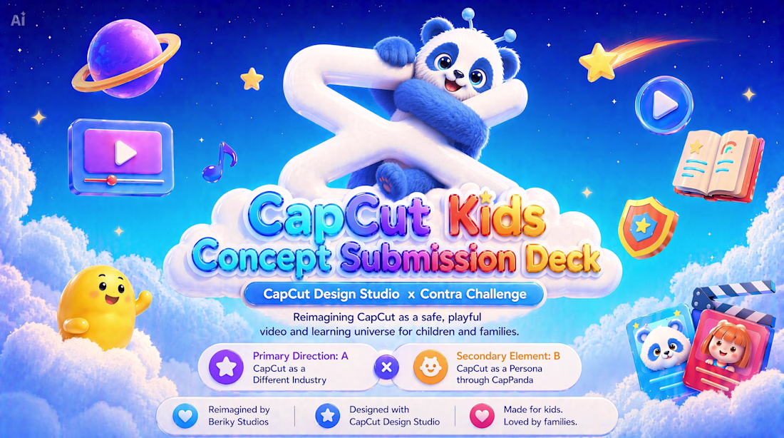
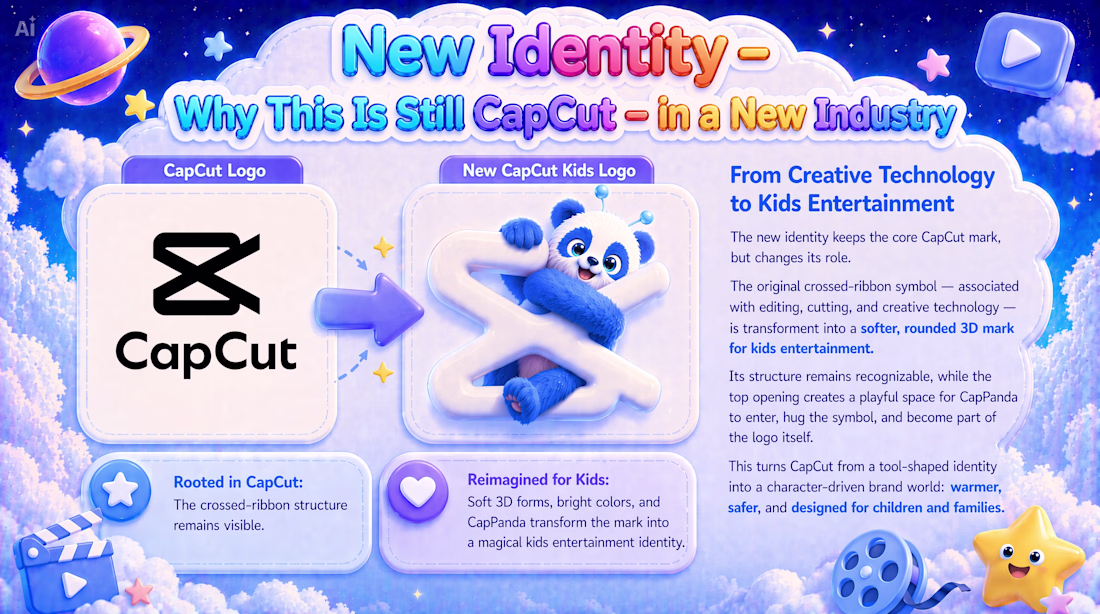
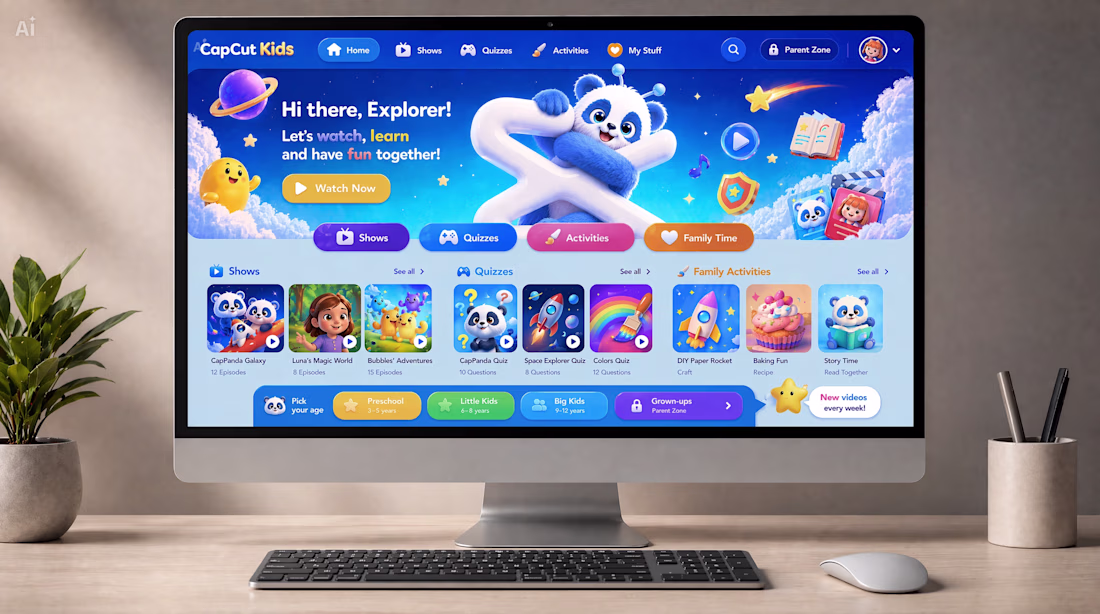
Work Title: CapCut Kids
Main Direction: Direction A — CapCut as a Different Industry
Secondary Element: Direction B — CapCut as a Persona through CapPanda
Concept Statement:
CapCut Kids reimagines CapCut as a safe, playful, and educational video platform for children and families.
The concept translates CapCut from a creative technology tool into a new kids entertainment and learning universe where children can watch, learn, play, and explore through age-appropriate shows, interactive quizzes, creative activities, family experiences, and parent-controlled safety features.
The original CapCut mark remains the foundation of the identity. It is softened, rounded, and transformed into a friendly 3D form, welcoming CapPanda into the logo and turning the brand into a warmer, more emotional, character-driven world.
CapCut Kids keeps CapCut’s core spirit of accessible creativity and visual storytelling, while expanding it into a new industry built around trust, imagination, safety, and joyful design.
The project includes, among other elements:
• Logo evolution and new brand identity
• Mascot system
• Web platform experience
• Mobile app adaptation
• Social media ecosystem
• App store concept
Core Promise of CapCut Kids:
Watch. Learn. Play. Grow.
Created by: Beriky Studios
Built with: CapCut Design Studio
Presentation link: https://drive.google.com/file/d/1a4oWACWuQ_X1msoyzK-lNJeFNanR2MJN/view?usp=sharing
Full submission package link:
https://drive.google.com/drive/folders/13M7B_kjPnWI5tr2f9Ds31M1ofUW7C1Zn?usp=drive_link
The Post on X: https://x.com/Berikystudios/status/2063026056756359536
#CapCutDesignStudio
Awesome
Challenges
View allTrending
Claude
Claude has entered the design space. How are you using Claude Design?
Contra University
Learn from expert creatives how to earn more using next-gen AI tools.
MagicPath
The canvas is infinite, and exploration is becoming the workflow. How are you using MagicPath?
creativeaiflow
Creative AI workflows are evolving. What tools do you use, and what are their strengths and weaknesses?
freelancerlife
Freelancer life is wins, pivots, and everything in between. What’s yours right now?