The network for creativity
Join 1.25M professional creatives like you
Connect with clients, get discovered, and run your business 100% commission-free
Creatives on Contra have earned over $150M and we are just getting started
Back to feedPost
Taste Test

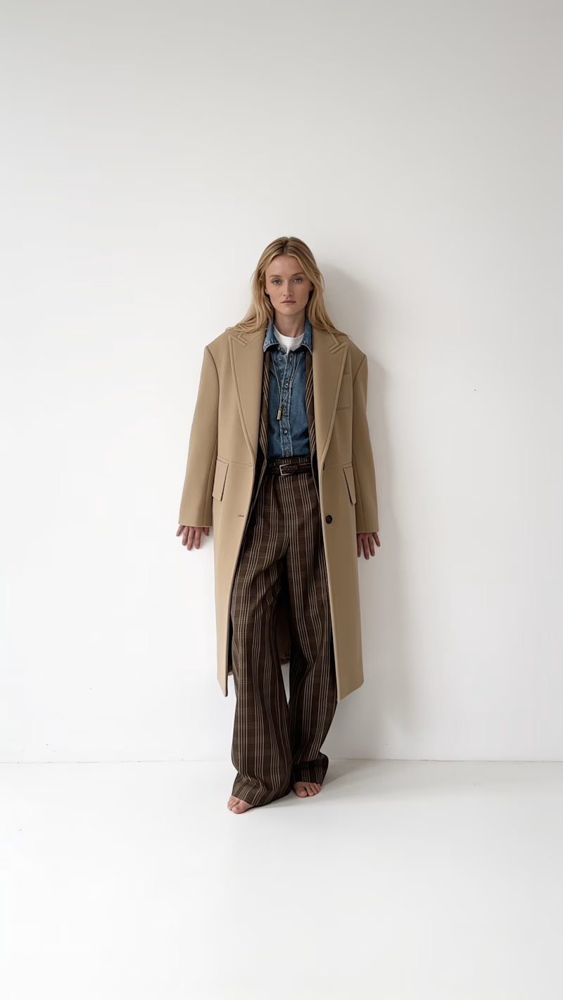
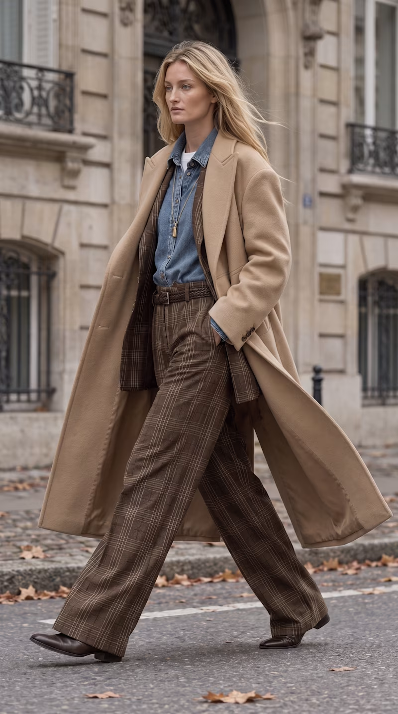

Street look realistic


i love both, but street wins me over here.
The network for creativity
Join 1.25M professional creatives like you
Connect with clients, get discovered, and run your business 100% commission-free
Creatives on Contra have earned over $150M and we are just getting started

Challenges
View all


Related posts


Trying out two cover designs for a project.
Which one looks better to you? Would love to hear your thoughts! 👀
5 voted
20%
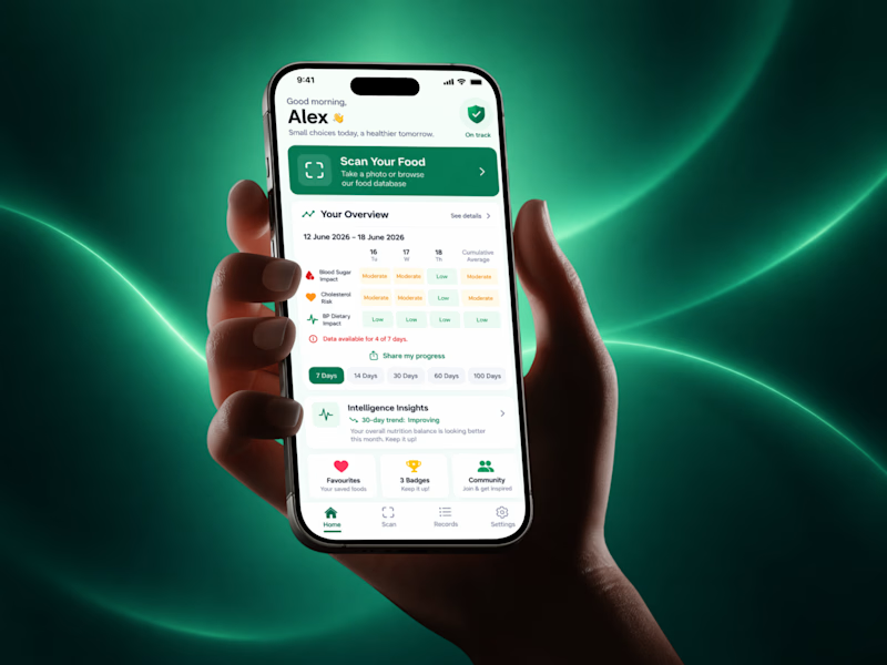
20 voted
80%
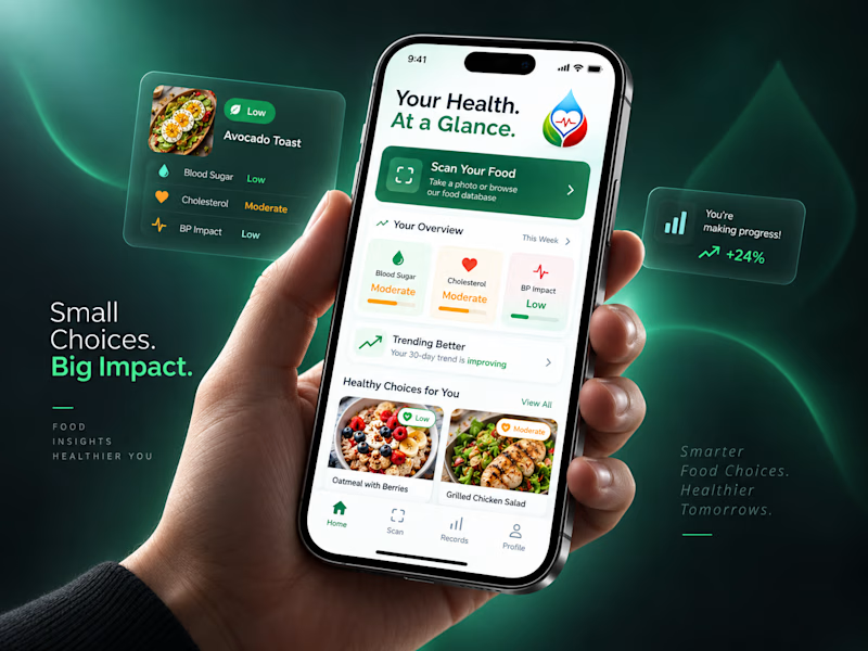
25 votes
Closed

New Direction, no question. Your Health At a Glance plus those cleaner cards actually invite you in, the original feels more like a dashboard you have to decode. Small choices, big impact, very fitting given the copy.


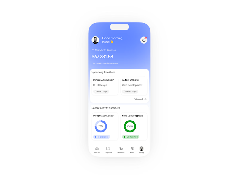
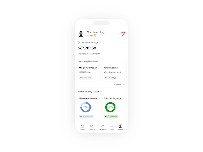

Design A for me. The blue header makes the balance the first thing you read, while B stays a little flat at the top even though the charts are the same.
Which one is the best?
6 voted
60%

4 voted
40%

10 votes
Closed

Black Mode Looks So Beautiful.