The network for creativity
Join 1.25M professional creatives like you
Connect with clients, get discovered, and run your business 100% commission-free
Creatives on Contra have earned over $150M and we are just getting started
Back to feedPost


The network for creativity
Join 1.25M professional creatives like you
Connect with clients, get discovered, and run your business 100% commission-free
Creatives on Contra have earned over $150M and we are just getting started





Related posts

🧟 ZOMBIE CRUSHER 🚗
The city fell tonight. You've got a rusty orange car, a full tank, and a city full of the undead. Run them down before they swarm you.
▶ Play: Zombie Crusher
🎮 Controls
W / ↑: gas
S / ↓: brake and reverse
A D / ← →: steer
Space: handbrake drift
Mouse or touch: hold where you want to go and the car drives there
Click the game first so it picks up your keys.
📜 Rules
Crush zombies by hitting them at speed. If you're too slow, they get pushed aside and start biting your car.
Know your zombies:
Walkers are slow, worth 100 points.
Runners are fast, worth 150 points.
Brutes are huge and only go down if you hit them at full speed, but they're worth 400 points.
Build combos: crush zombies in quick succession to multiply your points, up to ×10.
Watch your health: bites and crashes into buildings damage the car. At zero health, your car is wrecked and the game is over.
🩹 Med kits repair your car by 30% of its health.
🔋 Batteries give you a 10-second shield. The car takes no damage, and every zombie that touches the shield is crushed, brutes included.
Waves: a new wave starts every 40 seconds, with more zombies, more runners, and more brutes.
Use the minimap in the corner to find pickups: red dots are med kits, blue dots are batteries.
How long can you survive? Share your best score! 💀


This is awesome! Such great memories of those early GTA games. Congrats!

Don't Look Away: a candle-lit horror game where the GPU shader is the game.
Something is in the house. It only moves in the dark. Your cursor is a candle. While your light is on the Visitor, it stands still; look at the window, the portrait or the door, and it takes a step closer, in a new pose, somewhere new. In the dark you only see two pale points. When it reaches you, the candle goes out.
Features used: Rive CLI and GPU Canvas, plus Scripting, Data Binding and State Machines.
- GPU Canvas (WGSL): the darkness is a fragment shader: a breathing pool of candlelight around the pointer, smoke in the light, a vignette that closes in with dread, and a tear across the picture every time it steps.
- Rive CLI + RML: the room, the words, the view model and the state machine are plain markup, built and checked with rive --verify, inspect and headless screenshots; the demo video was rendered by replaying a scripted pointer frame by frame.
- Luau scripting: one rule, it only moves while the light misses its head and body; it also draws the Visitor and the candle in your hand.
- Data Binding: its distance drives the step counter and the portrait on the wall, which slowly becomes her. State machine: title, ending, and the flash of the scare.
- Rive Editor: the file was opened in the editor, and the claw marks beside the door were drawn there with the pen tool and pulled back with rive pull.
Play it (lights off): https://dont-look-away-nkdh1b.rive.to
Video with the agent workflow and code: https://youtu.be/Pt_J1wdtQxI

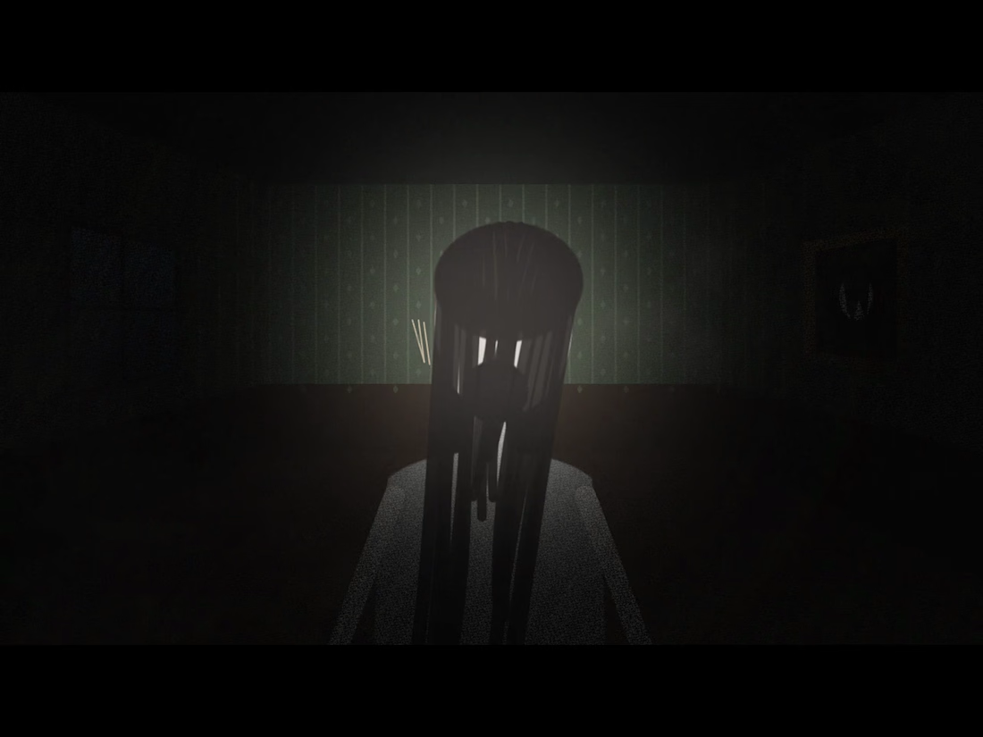
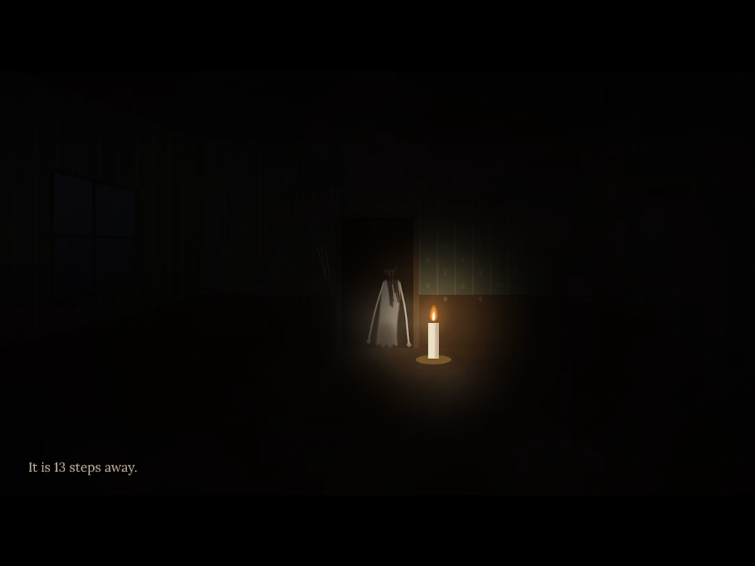

The cursor as a candle and a Visitor that moves only when you look away is a strong mechanic. How did you do the lighting in the shader?

With all the hype about Opus 5.5 and it's seemingly amazing design skills I gave it the task to redesign the UI in my game. Mainly the upgrade screens, the count down screen and the main screen.
Very basic prompt and I'm not a fan of the final result, but it was worth a try.
It gave me a few style choices to pick between and I chose the cartoon style, so it's probably my own fault. 😃
Gameplay wise, I have made a few changes too. I've made the arenas 20% larger, upped the enemy count and a few other tweaks.
Now I want to try the new Rive CLI to create all the UI and implement it into the game using the Rive unity plugin.
