The network for creativity
Join 1.25M professional creatives like you
Connect with clients, get discovered, and run your business 100% commission-free
Creatives on Contra have earned over $150M and we are just getting started
Back to feedPost

The Takeaway Spot is a fast food concept built specifically for quick and convenient pickups. The logo is designed to clearly communicate location, purpose, and offering through bold yet simple visuals and thoughtful color contrast. With clean variations and adaptable concepts, the identity is flexible enough to work seamlessly across different touchpoints while maintaining a strong and recognizable presence.


The network for creativity
Join 1.25M professional creatives like you
Connect with clients, get discovered, and run your business 100% commission-free
Creatives on Contra have earned over $150M and we are just getting started





Related posts

My latest branding project for the Atlanta Museum of Paleontology.
Check out the full project at maximjungle.com

A T-rex drawn in one thin outline is such a good mark 🦖 I'd happily visit that museum.

Had some fun with this one.
Exploring how typography, colour, and a few unexpected details can give a brand its own personality.
Meet Flankman. Full case study is live! ↓




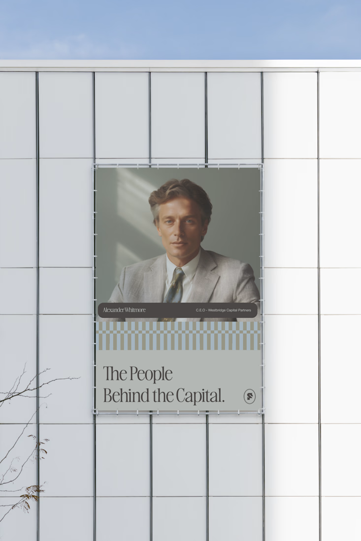


clean


How far can you take a logo beyond the first draft?
I started with Recraft's Logo Maker and a fictional idea: Bibu's Paws, a cosy little dog rescue and adoption shelter.
I wanted the identity to feel warm, homely and full of character, so I explored a few logo directions before settling on the little dog tucked inside a house.
From there, I took the idea further, building out the visual identity with an earthy colour palette, typography, illustrations and a few real-world applications: the shelter space, dog merchandise and an adoption welcome kit.
I enjoyed seeing how a small starting point could grow into a brand with its own personality and world.
Now I'm curious: if you were building a brand around this logo, what would you create next?






It turned out so cozy, you did great