The network for creativity
Join 1.25M professional creatives like you
Connect with clients, get discovered, and run your business 100% commission-free
Creatives on Contra have earned over $150M and we are just getting started
Back to feedPost
Ink'd greetings ad featuring Inky and the raccoon bandits


Good job

Thank you!


the raccoons in bandanas behind the laptop got me lol. how long did inky take to make?
The network for creativity
Join 1.25M professional creatives like you
Connect with clients, get discovered, and run your business 100% commission-free
Creatives on Contra have earned over $150M and we are just getting started





Related posts


Why don’t more DTC brands have mascots?!
I feel like mascots are such a fun way to give brands more personality and create something people can actually connect with.
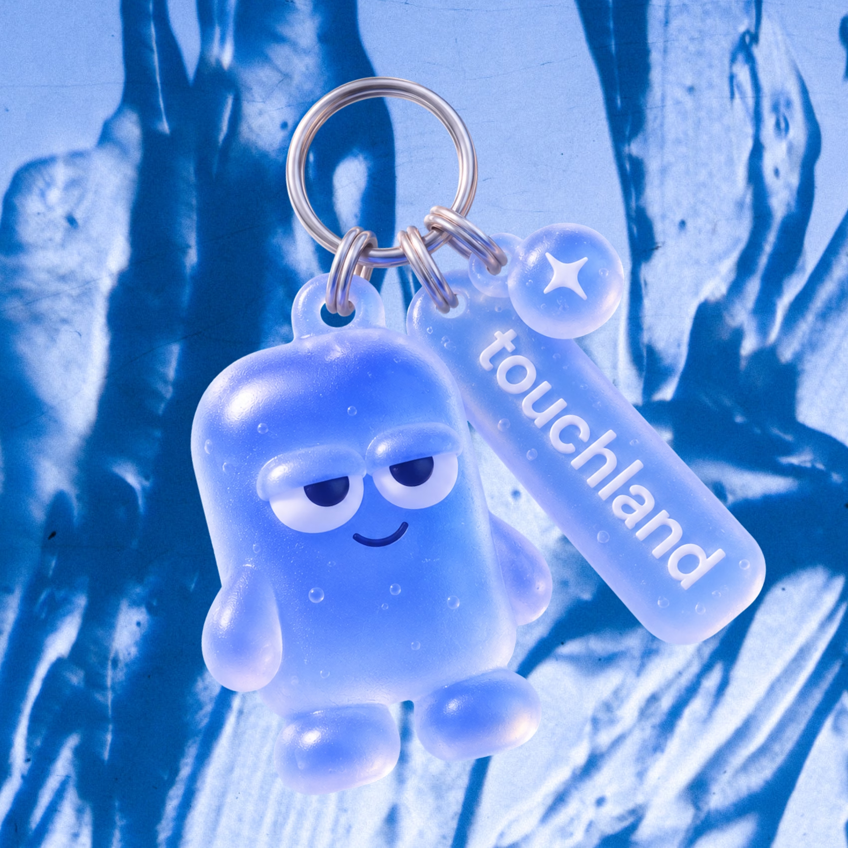
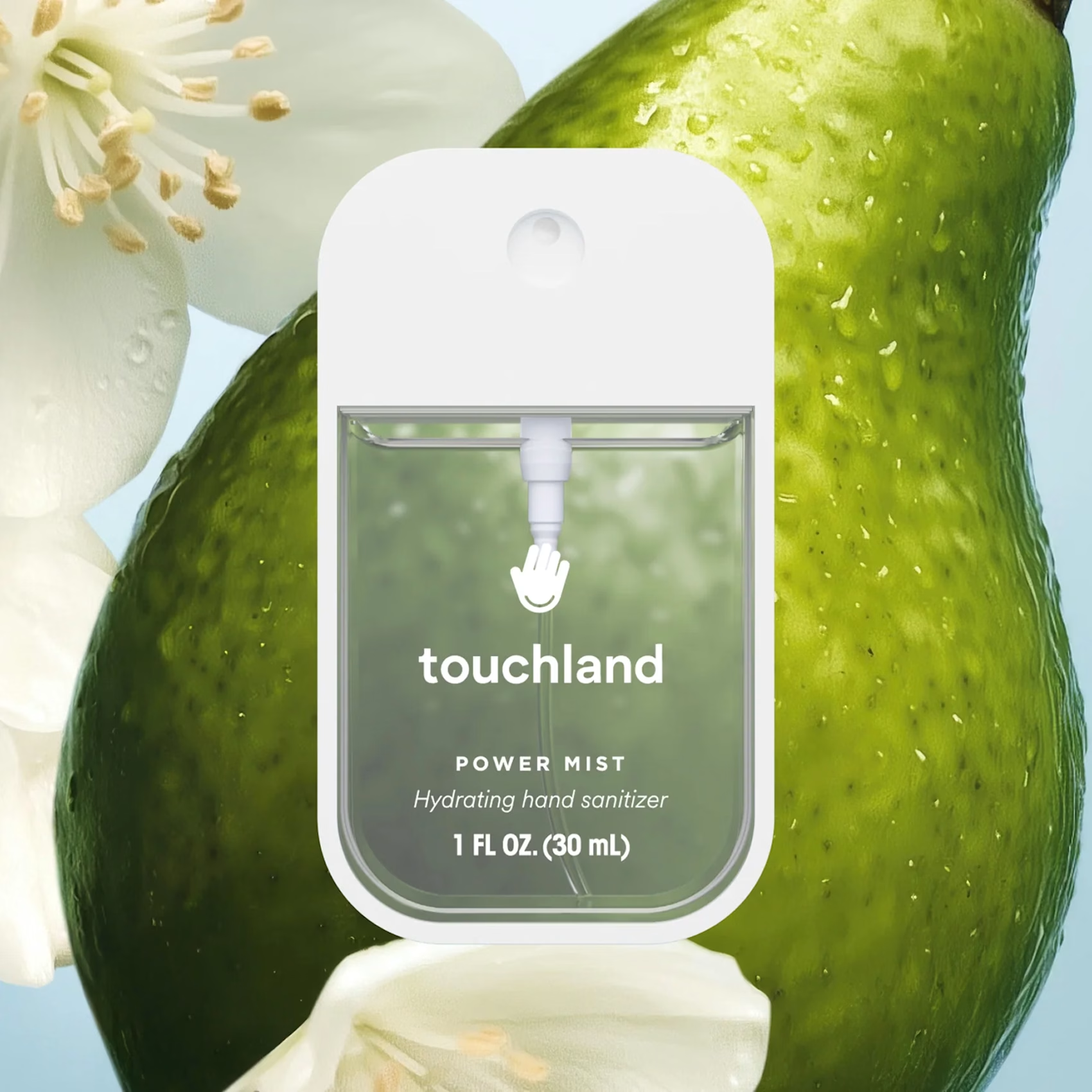
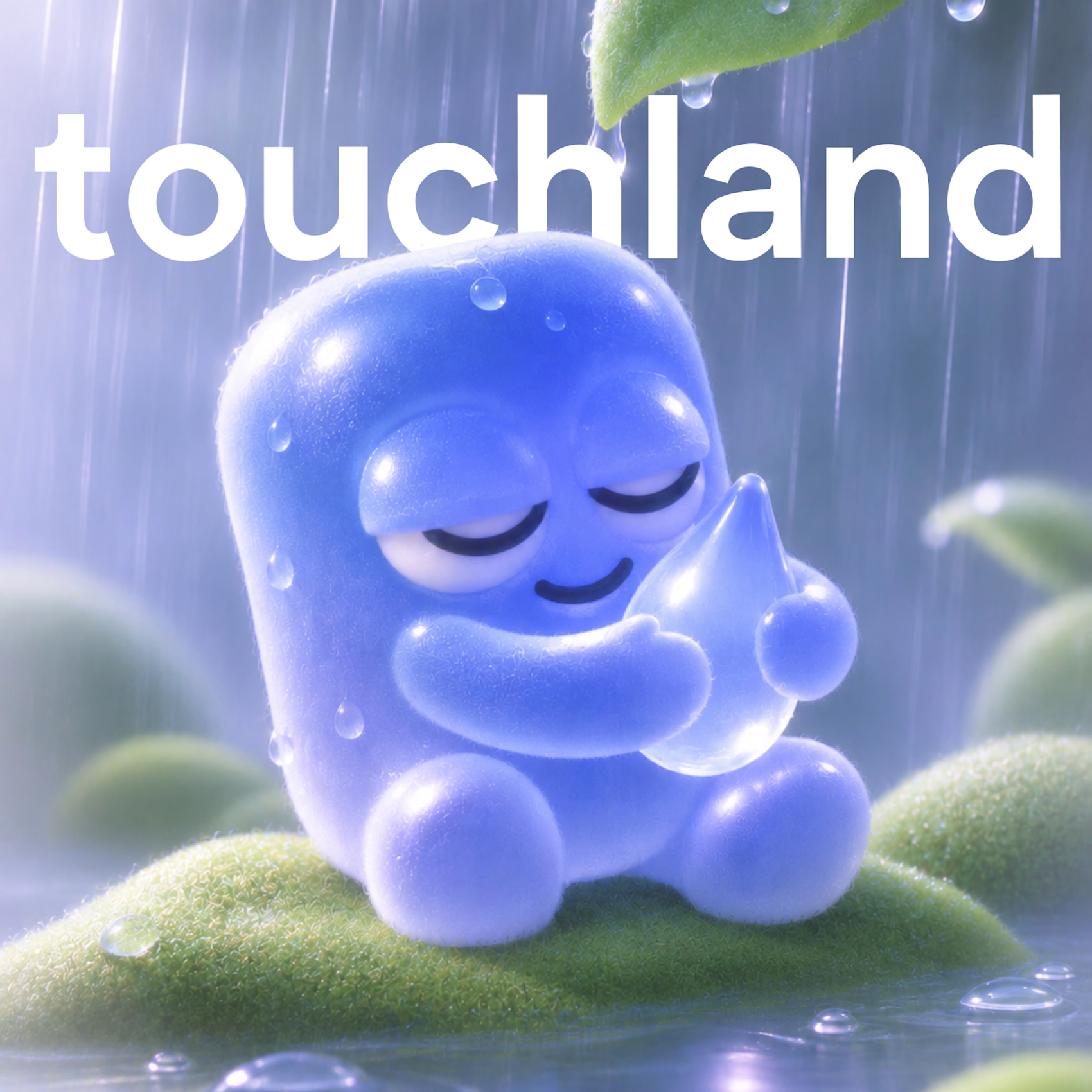
So I decided to give touchland its own little character! A squishy, jelly-like mascot that changes colors, expressions, and moods depending on the scent. And obviously, I had to turn it into a keychain too.
What other brands deserve their own mascot? 👀

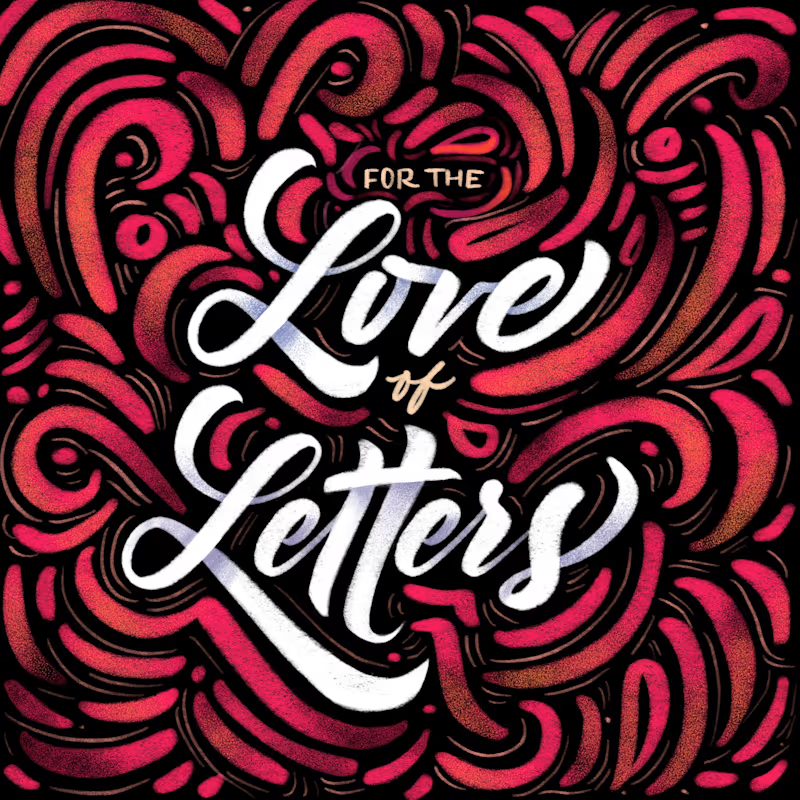
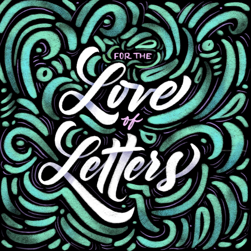
Same lettering, two color directions. Which one would you pick?
I got nostalgic this week looking at this lettering design. About 8 years ago I was deep into it and drew every day. Little by little I lost that rhythm, and now I only do it once in a while for gifts and small things.
Back then I could spend a lot of time choosing colors and comparing options. A taste test like this would have saved me so much time. 😅 I keep wondering how much I would have improved if I had never stopped practicing.
Is there something you used to practice a lot and would love to get back to? I had my lettering, illustration AND tufting phase.
37 voted
61%
24 voted
39%
61 votes
Closed


8 years later and the lettering still holds up

Show Pony 🐎
Its been a long time since I animated any of my illustrations, so today I thought I'd jump back on the horse and see if I still got it.

