The network for creativity
Join 1.25M professional creatives like you
Connect with clients, get discovered, and run your business 100% commission-free
Creatives on Contra have earned over $150M and we are just getting started
Back to feedPost
Hi there, I'm Mimi! I'm new to this platform, so I thought I'd share some one of my favorite works, Ser Uno Project:
photographybrandmotionPhoto EditingDigital illustrationbrandingBrand DesignAdobe IllustratorAdobe InDesignAdobe Photoshop






What a fun project! I really love the logo design!

Thank you!! It was really fun to work on, tbh!
Hiii Mimi, welcome to la comunidad😊
Hiii, thank you, I'm so excited to be here 👀🎉


Really love how well the type works with the color palette!
Thank you so much!!
The network for creativity
Join 1.25M professional creatives like you
Connect with clients, get discovered, and run your business 100% commission-free
Creatives on Contra have earned over $150M and we are just getting started



Related posts

Which ORBIT pulls you in: the quiet one or the loud one? ✨
One name, two directions. Same idea, an object in motion around a center.
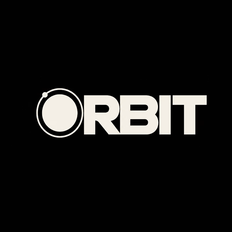
A → Heavy extended sans on black. The orbit is built into the O, a ring with a single satellite. Compact, graphic, impossible to ignore.
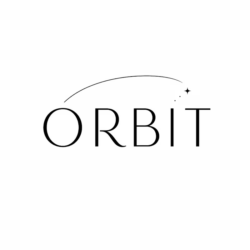
B → Light, high-contrast serif with a hairline arc and a tiny spark. The orbit is a gesture, a trail you almost miss. Elegant, airy, a little mysterious.
If you ask me, I'd pick A.

36 voted
80%
9 voted
20%
45 votes
Closed


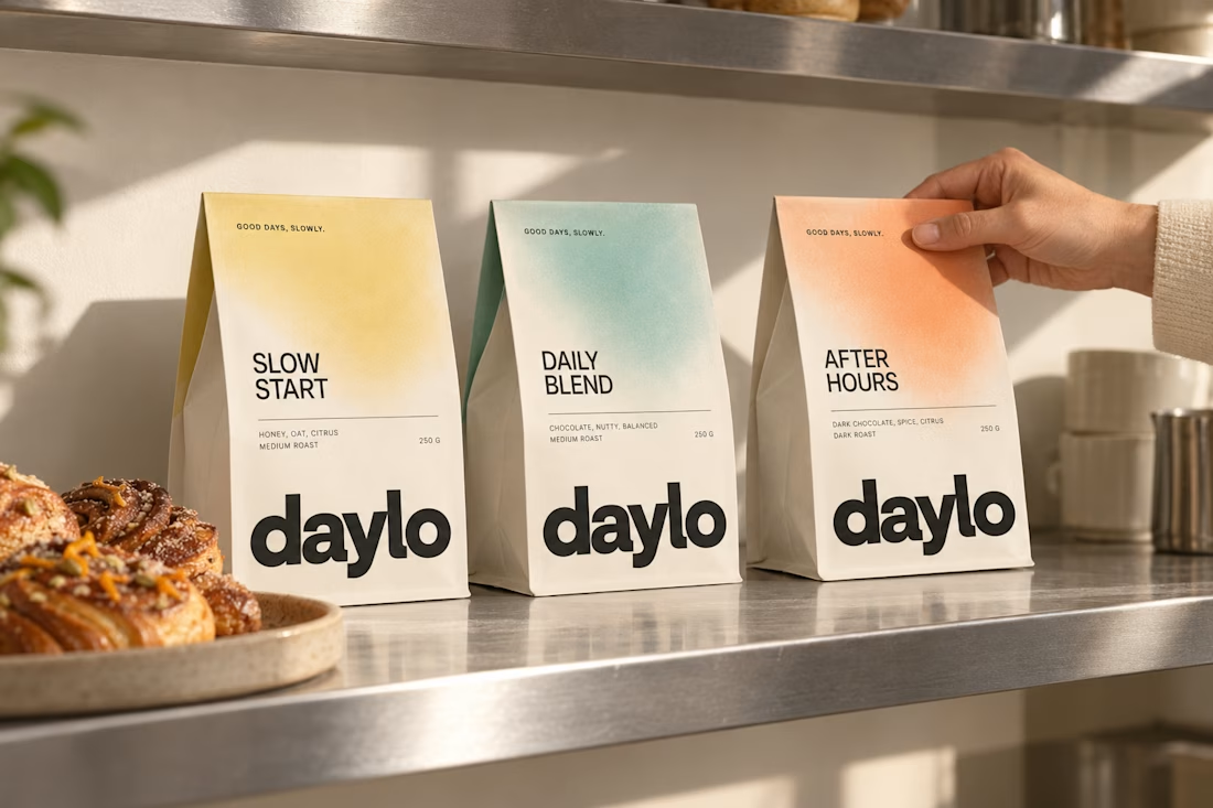
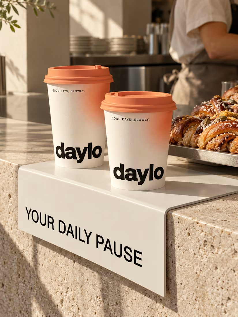
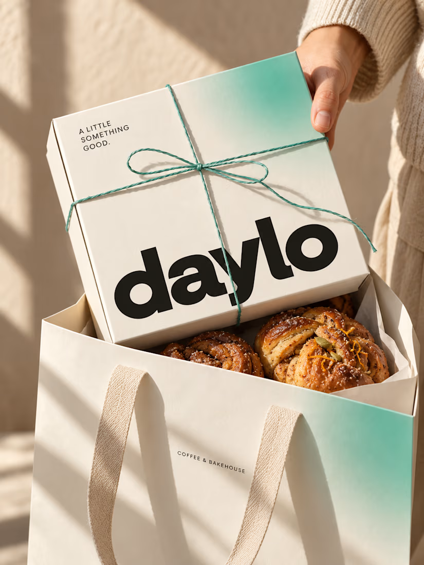
☕ Meet DAYLO - A minimalist coffee branding concept featuring bold typography, warm neutrals, and soft colors designed to make every cup feel a little more special. 🤎
Explore the full project on my Contra profile and let me know your thoughts!




Good branding isn’t just about how a logo looks. It’s about what it represents.
Sharing one of our recent projects: NEXU, a fintech brand identity built around connection, trust, and opportunity.
The idea was to create a visual identity that makes finance feel more human and approachable. The symbol brings together the gesture of reaching out and the strength of a bridge, representing the connection between people, capital, and opportunity.
From the logo concept to the broader visual identity, every detail was designed to communicate confidence, clarity, and progress.
It’s always rewarding to see how a simple visual idea can tell a much bigger story.
Would love to hear what you think!
Check it out
#BrandIdentity #LogoDesign #Fintech #BrandDesign #ContraCommunity

Fantastic work


