The network for creativity
Join 1.25M professional creatives like you
Connect with clients, get discovered, and run your business 100% commission-free
Creatives on Contra have earned over $150M and we are just getting started


The network for creativity
Join 1.25M professional creatives like you
Connect with clients, get discovered, and run your business 100% commission-free
Creatives on Contra have earned over $150M and we are just getting started

Related posts

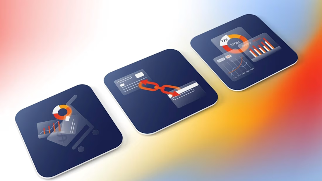
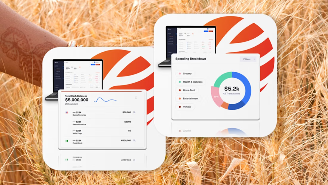
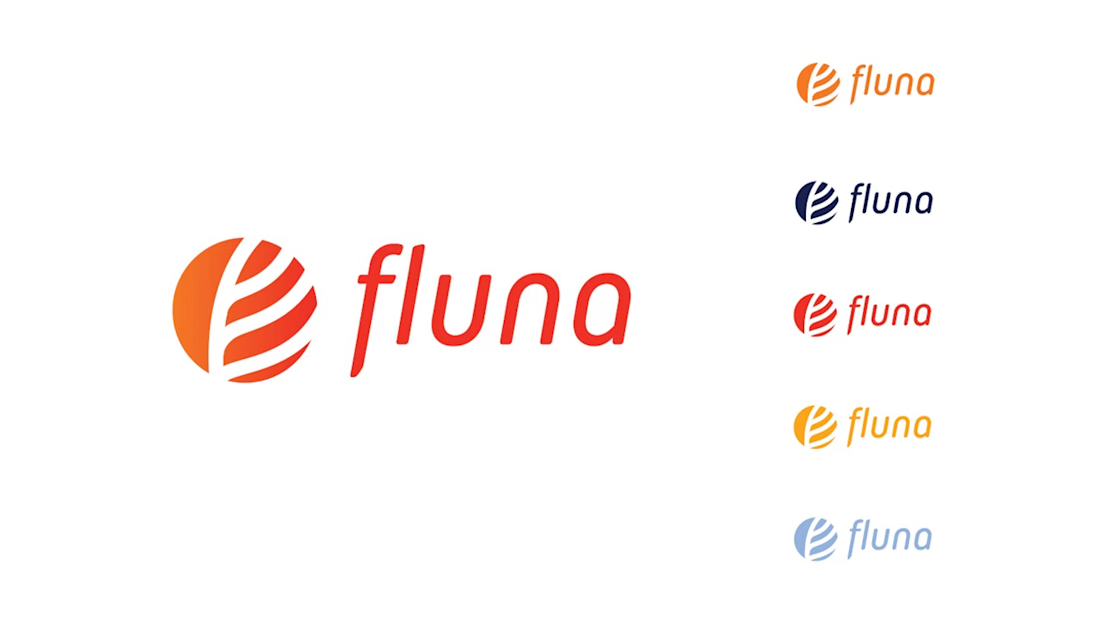
Fintech for agriculture doesn’t have to look earthy, heavy or industrial.
With Fluna, the goal was to create something more premium, distinctive and forward-looking, while still feeling relevant to the market it serves.
What I value most about this project is its longevity. I created this identity four years ago, and the client is still using the logo and visual system today.
For me, good taste in branding is not about following a visual trend. It’s about making choices that still feel right years later, and building a system strong enough to evolve with the company.
#BrandIdentity #BrandDesign #CreativeDirection #FintechBranding




Great work 👍

🚧 WIP – a new template 🚧
This time i want to start with the brand identity. What do you think for this brand identity?
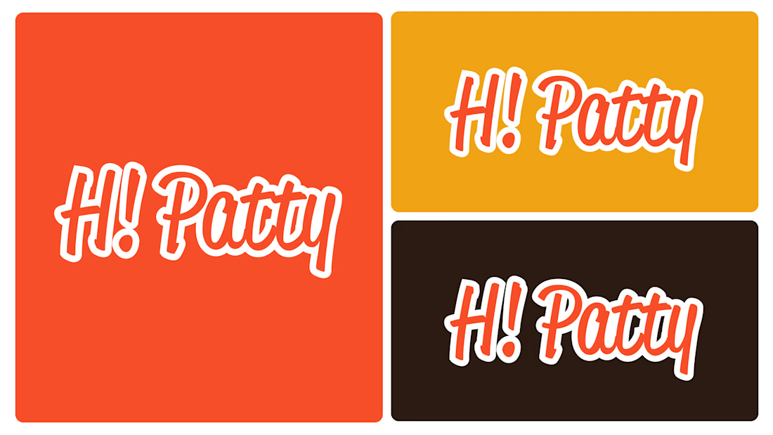
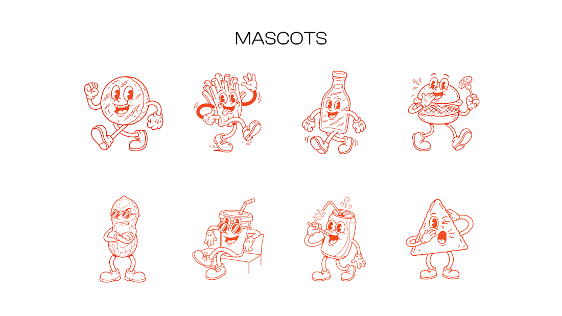
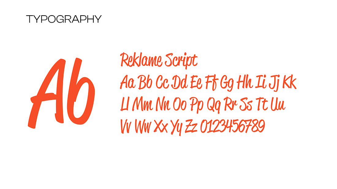
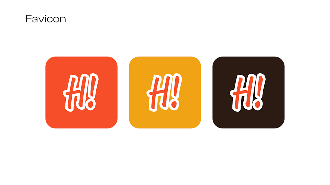

The script holds up on the dark background, which is where a lot of retro scripts collapse - that bodes well for signage and cups. The favicon is the piece I'd keep testing: H! on its own reads like a different brand than the full logotype, so at 16px the mascot's head might carry more recognition than the letters.

One concept can become an entire brand world—cohesive, elevated, and limitless in possibility.
A memorable brand speaks with one voice, and this concept system example was designed to do exactly that with clarity, elegance, and presence. I create refined visual identities that elevate brands and leave a lasting impression.
🎨If your brand is ready for that kind of presence, let’s build it.