The network for creativity
Join 1.25M professional creatives like you
Connect with clients, get discovered, and run your business 100% commission-free
Creatives on Contra have earned over $150M and we are just getting started
Back to feedPost

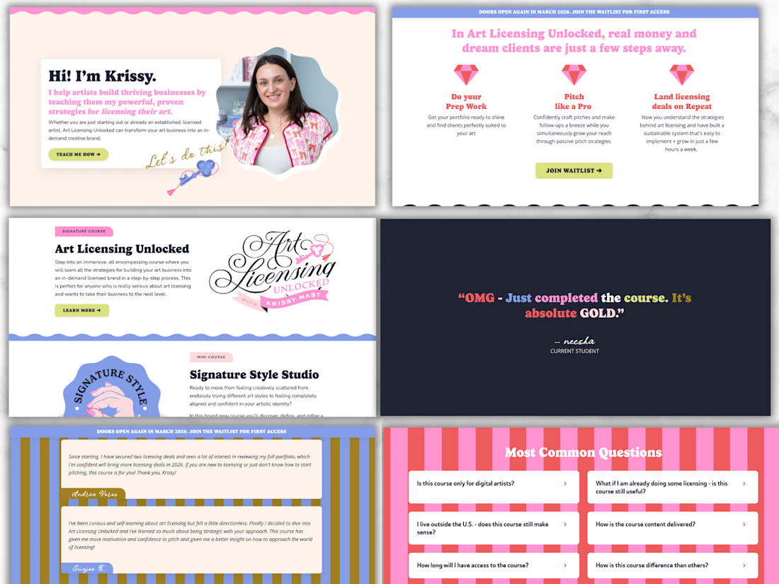
One of my absolute favourite clients, who is an insanely talented artist whose work you can literally find in Target, Bed Bath & Beyond, TJ Maxx and so many more, is not only brilliant at what she creates… she’s also incredible at teaching others how to do it too.
And the way she sells her courses? So good.
Over the past week, we’ve been deep in rebranding mode.
An amazing brand designer brought her new visual identity to life, and together Krissy and I have been translating that brand onto her website, page by page, section by section, making sure everything feels aligned, elevated, and powerful.
It’s still a work in progress… but wow.
This branding is FUN.
It’s bold.
It’s confident.


The network for creativity
Join 1.25M professional creatives like you
Connect with clients, get discovered, and run your business 100% commission-free
Creatives on Contra have earned over $150M and we are just getting started





Related posts


A calm, editorial landing page for an architecture studio, built around daylight and materials. We'd love to hear your thoughts! 🏛️


The warm timber slats against the pale page feel calm. Did you build the motion in Jitter?


One of our favorite & most challenging parts of product video is figuring out how much someone actually needs to see to understand the product
That’s where motion and pacing do a lot of the work: guiding your attention and giving each step enough room to make sense.
Here’s our latest video for evolv, made by the VAAS team.

The glow on the Vee button draws the eye before the UI even appears. Nice pacing for a 1 minute product video.


