The network for creativity
Join 1.25M professional creatives like you
Connect with clients, get discovered, and run your business 100% commission-free
Creatives on Contra have earned over $150M and we are just getting started
Back to feedPost

The pill became the brand.
For Harley Meds, a telehealth provider that looked cold and clinical, we turned the most basic healthcare symbol into a bold icon, a custom icon set and a lifestyle brand around it.
Harley Meds earned a Best of Behance.
Should a health brand look like a clinic at all?

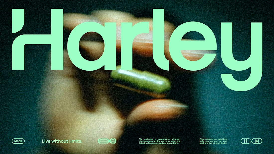

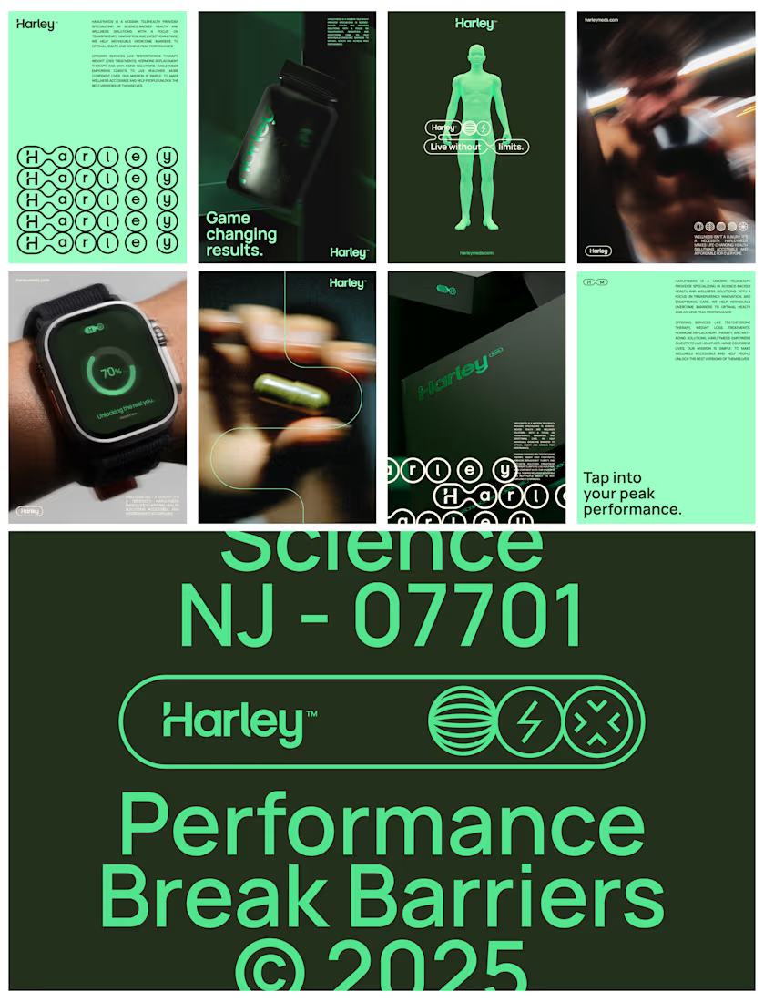

My take is that a health brand needs one clear credibility cue, not the whole clinical look, and the pill icon does that job while everything around it stays warm. Did you test how patients reacted to the bolder tone versus the clinical one before launch?
The network for creativity
Join 1.25M professional creatives like you
Connect with clients, get discovered, and run your business 100% commission-free
Creatives on Contra have earned over $150M and we are just getting started




Related posts



Just wrapped up this brand identity for Vanta and wanted to share a quick peek! Kept the visuals super clean, warm, and fluid, letting the product and textures breathe. Let me know what you think!




Great work!

Ever signed for a pack of pasta? Soon you will.
EDITION is a brand where nothing is decorative and everything is numbered.
Case study landing very soon.