The network for creativity
Join 1.25M professional creatives like you
Connect with clients, get discovered, and run your business 100% commission-free
Creatives on Contra have earned over $150M and we are just getting started
Back to feedPost

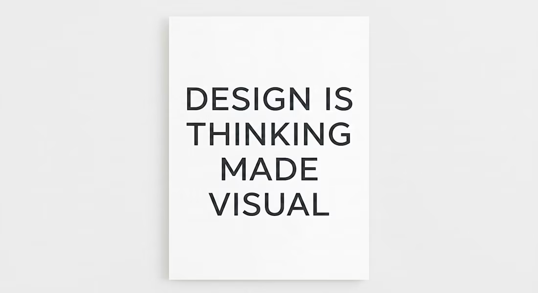
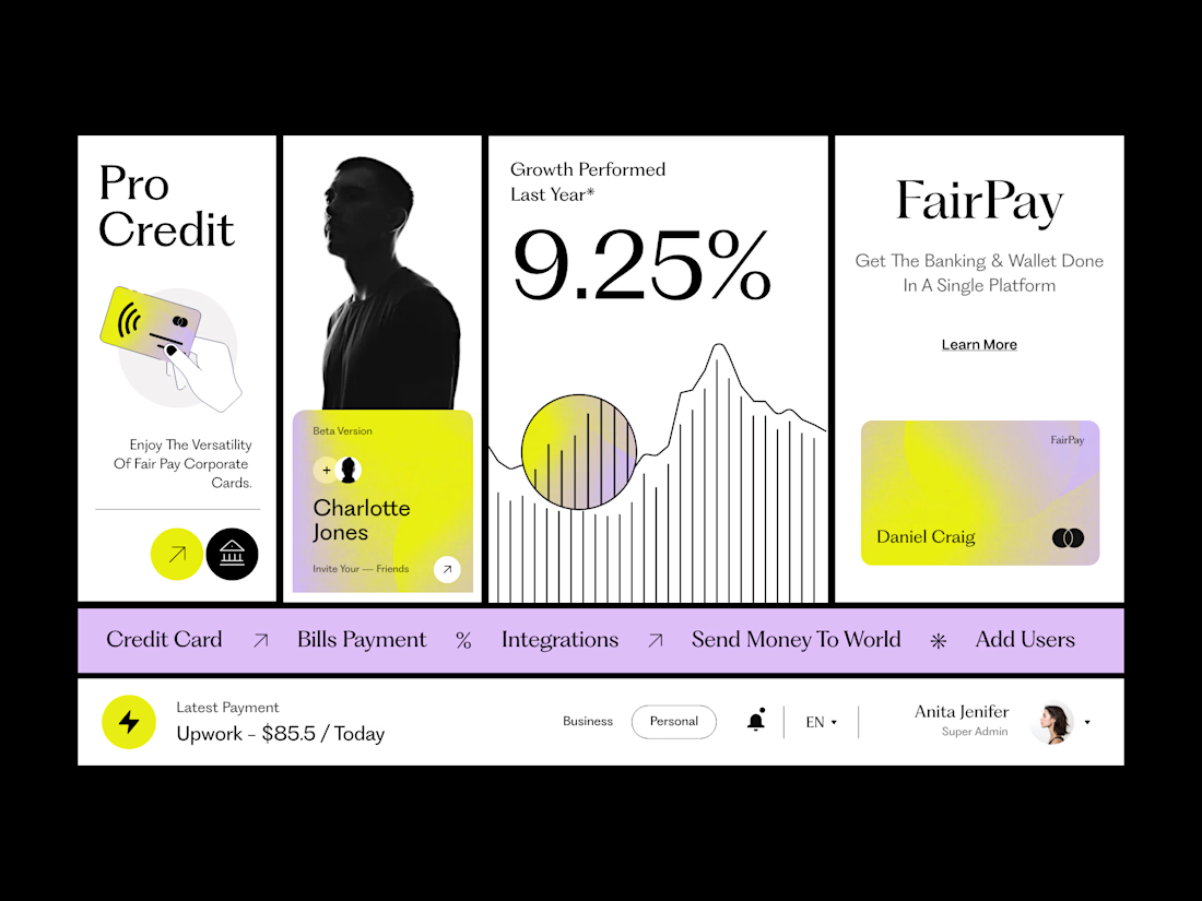
A study in visual balance and modern typography. This project focuses on how clean layout and font selection can create a powerful visual statement.
The network for creativity
Join 1.25M professional creatives like you
Connect with clients, get discovered, and run your business 100% commission-free
Creatives on Contra have earned over $150M and we are just getting started








Related posts


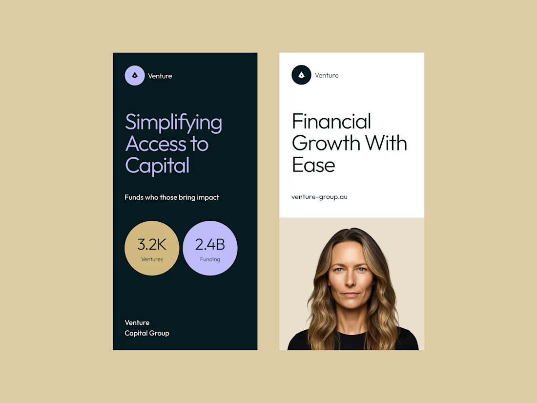

I love the minimalism and cleanliness like this, wonderful execution
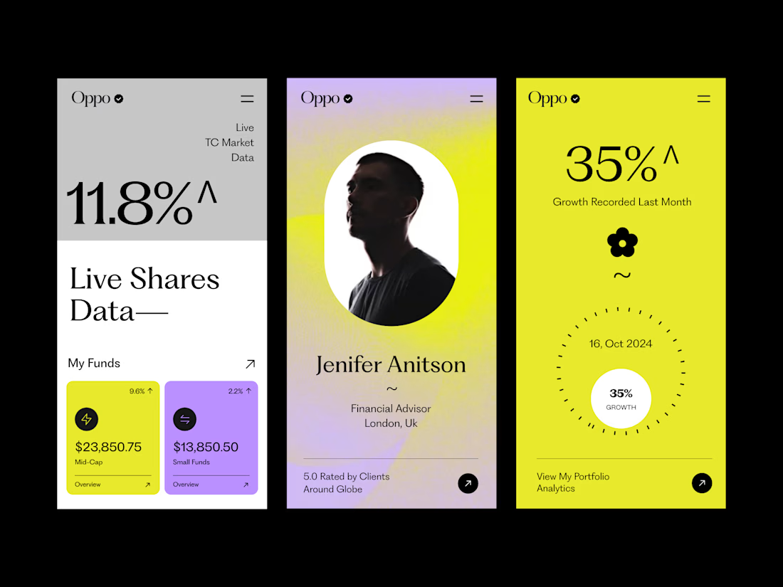
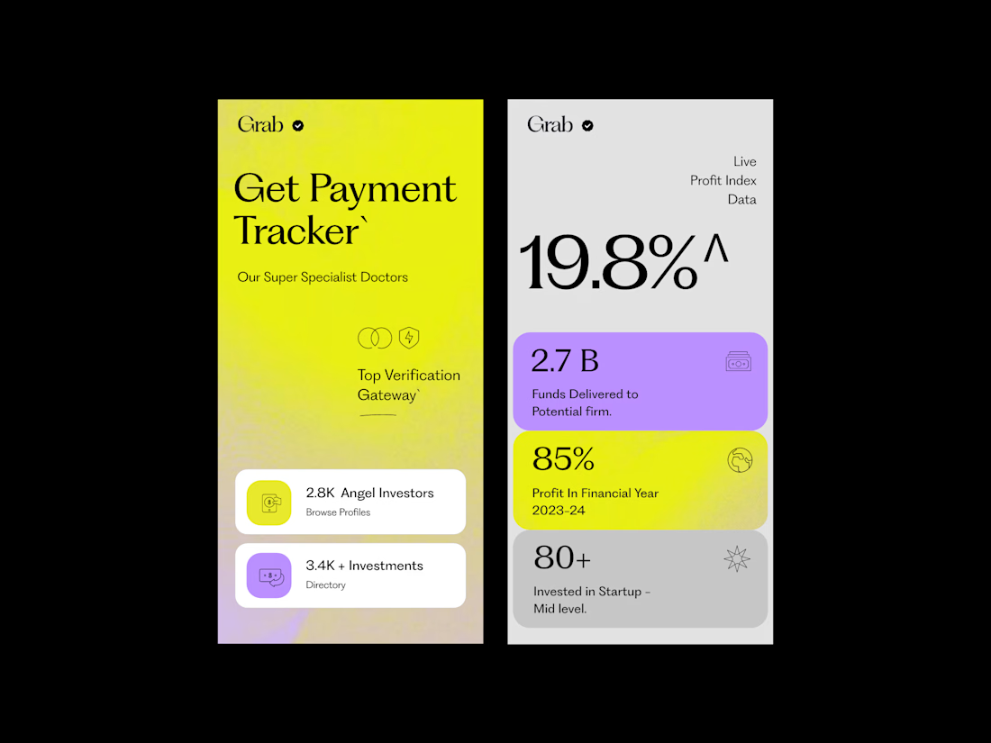
The typography is doing most of the heavy lifting here. The large type, strong contrast, and simple font choices give the screens a very confident look.
The oversized numbers and headlines create an immediate focal point, while the smaller text is kept simple so it doesn’t compete. The different type sizes create a clear hierarchy, making it easy to understand what to look at first and what to read next.
What makes it work is that the typography isn’t trying too hard. There are no unnecessary font styles or excessive weights — just the right scale, line height, and spacing between elements.
That simplicity is what makes the overall design feel premium, modern, and well considered.


Clean work !

PROSPECT — Typography Refinement Concept
An independent typography study based on PROSPECT’s public legacy website.
Desktop and mobile concepts exploring calmer headings, clearer hierarchy, readable line lengths and improved button contrast. Existing copy wording, logo and construction photography are retained.
Includes proposed typography scales and practical recommendations for Figma and website implementation.
Personal concept study; not commissioned by PROSPECT.

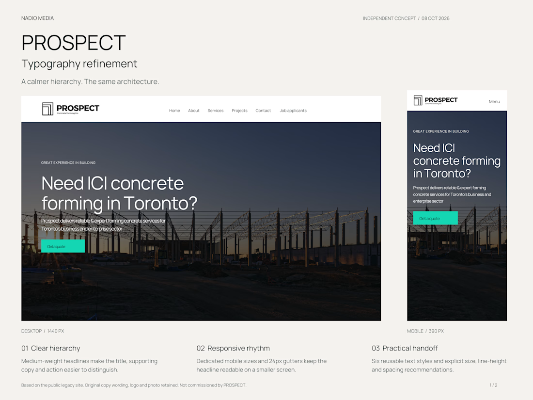

The adjustment to button contrast is interesting because it lets the call to action pop while keeping the overall calm vibe.