The network for creativity
Join 1.25M professional creatives like you
Connect with clients, get discovered, and run your business 100% commission-free
Creatives on Contra have earned over $150M and we are just getting started
Back to feedPost

The network for creativity
Join 1.25M professional creatives like you
Connect with clients, get discovered, and run your business 100% commission-free
Creatives on Contra have earned over $150M and we are just getting started



Related posts


New case study - tash.cards, a Y Combinator backed platform for investing in graded sports cards. Identity design, commissioned by baked.design
The heart of the system is a pattern language taken from security printing. Every letter of the wordmark becomes a guilloché tile, like the engraving on banknotes and certificates, and tiles combine into endless patterns.

Nice!

How do you make a construction brand feel consistent from a business card to a building site?
Brixon’s identity brings angular lettering, an assembled geometric symbol, and a lime, black, and white palette together.
I carried those elements into stationery, brand guidelines, team identification, social graphics, and site signage, then brought the system into motion with Adobe After Effects.
The connecting decision: keep the geometry and layout structure consistent while the logo details, messages, and application previews change within the animated panels.
My contribution covered brand design, graphic design, and motion design.
What draws your attention first: the wordmark, the lime palette, or the rotating symbol?
See the full Brixon case study. If you’re shaping a construction or development brand, I’m available for brand identity and motion projects.

Incomparable work!

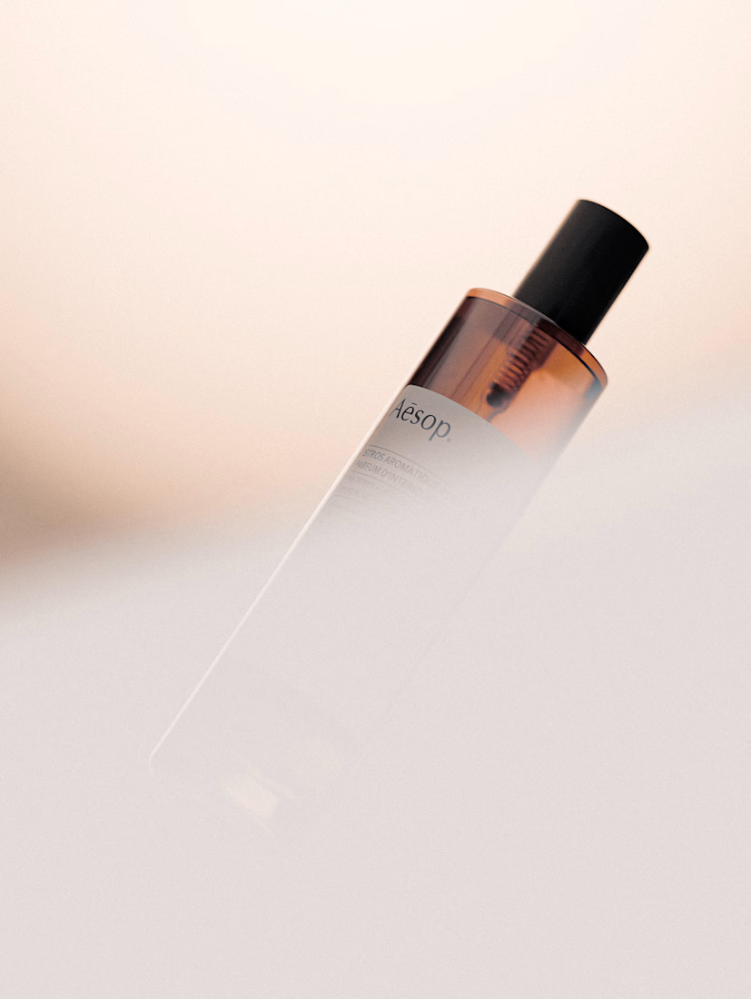
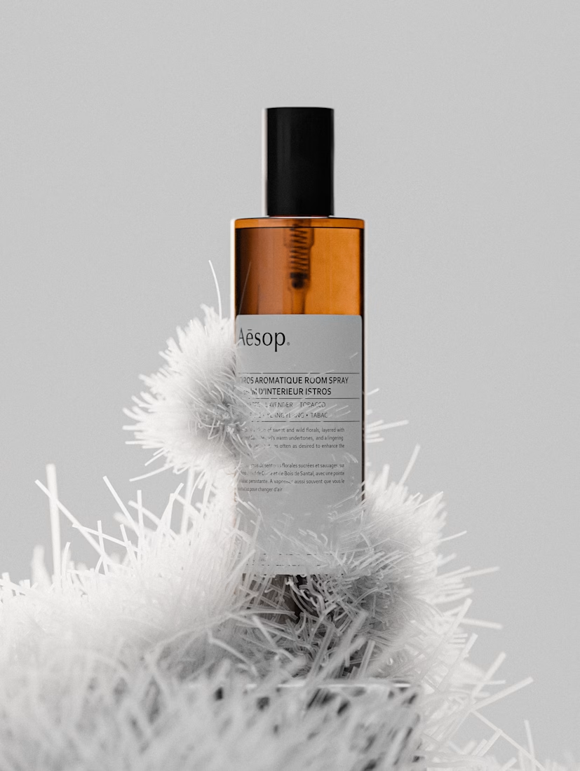
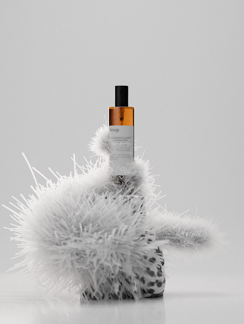
Recreated the beautiful Aesop Istros bottle in Blender. Just wanted to play around with the lighting and make it look as cozy and real as possible.
What do you think? Hope you like it!
Check out more of my renders here: https://contra.com/p/gB3RYvPY-my-product-renders?r=vladimir_yarockiy_5rpf71jz

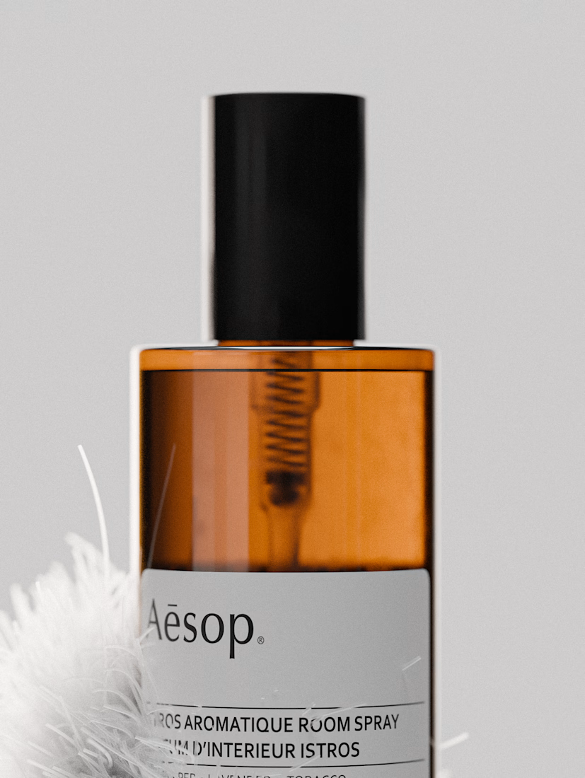

This is really cool, how did you generate those fluffly bits, did you use geometry nodes?