The network for creativity
Join 1.25M professional creatives like you
Connect with clients, get discovered, and run your business 100% commission-free
Creatives on Contra have earned over $150M and we are just getting started
Back to feedPost

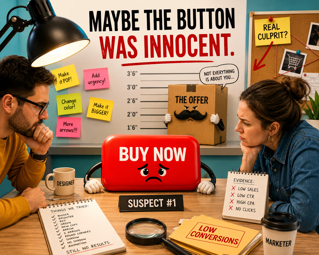
The button isn’t converting.
Obviously, the button has chosen violence.
So we begin treatment:
Make it bigger.
Make it red.
No, green. Green feels more trustworthy.
Change “Buy Now” to “Get Yours.”
Add an arrow →
Maybe two arrows →→
Round the corners.
Unround the corners.
Add a shadow.
Remove the shadow because it looks “dated.”
Perfect.
We have now redesigned the button 11 times.
Sales are still down.
Meanwhile, the actual offer is standing quietly in the corner like:
👀
This is one of my favorite things about design:
Sometimes a business problem arrives at the designer’s desk wearing a fake mustache and introducing itself as a design problem.
Low conversions?
Must be the button.
People don’t understand the product?
Try a new layout.
The offer isn’t compelling?
Perhaps… a gradient?
Of course, design matters.
But design can make value easier to see.
It can’t magically create value that isn’t there.
Sometimes the most senior design decision is not another redesign.
It’s knowing when to stop interrogating the button.
FREE THE BUTTON.
#GraphicDesign #DesignHumor #PerformanceCreative #CreativeStrategy #Advertising
The network for creativity
Join 1.25M professional creatives like you
Connect with clients, get discovered, and run your business 100% commission-free
Creatives on Contra have earned over $150M and we are just getting started

Challenges
View all


Related posts

Just came across this website and really liked the way they’ve combined clean design with immersive interactions.
The smooth animations, typography, transitions, and product storytelling make the whole experience feel premium without being overwhelming.
Website: otsuka-air.jp
What stood out to me:
• Smooth and thoughtful interactions
• Clean visual hierarchy
• Strong product storytelling
• Minimal yet engaging UI
• Great use of motion throughout the experience
Would love to know what you guys think about this design approach.
What’s your favorite detail on this site? 👀


Amazing!

Thaw — AI Mental Wellness Platform Landing page
Designed the landing page and dashboard preview for Thaw — an AI platform that tracks anxiety, mood, and burnout, framing emotional buildup as frost that gradually melts through guided sessions.
Mental health apps tend to land in one of two places: too clinical to feel human, or too soft to feel like it takes anything seriously. So the whole design leans on one strong metaphor instead — a head encased in melting ice — and lets oversized typography wrap directly around it for real visual weight.
Below the hero, the dashboard preview does the harder work: mood stability, anxiety signals, sleep quality, and a specific AI-detected insight that makes the product feel genuinely perceptive rather than generic.
A warm dark palette with cool blue type keeps the tone serious without tipping into heavy.
Creative - Midjourney
Animation - Jitter


Most designers complain that their clients "always pick the boring option."
Usually, that’s because the designer didn’t give them a bridge to the bold one.
In our latest podcast episode, @Alex Aperios shared his 3-option presentation strategy:
The Safe Idea (The baseline)
The Middle Ground (The compromise)
The Wild Card (The one that actually makes them stand out)
The trick isn’t just showing the Wild Card. It’s framing the safe option as the "invisible" choice. You show them exactly what "standard" looks like, so they can finally see why they need to be bold.
We also got into why he defends the Kia rebrand (a hill he’s willing to die on) and how skating taught him more about brand loyalty than design school ever could.
Watch the full episode: https://youtu.be/sp23QtaC9x4?si=GgYOzscmDEEo3goA