The network for creativity
Join 1.25M professional creatives like you
Connect with clients, get discovered, and run your business 100% commission-free
Creatives on Contra have earned over $150M and we are just getting started
Back to feedPost
Slowly but surely on a mission to make sure that decks have brands and brands have decks!
What's your mission, I'm curious?
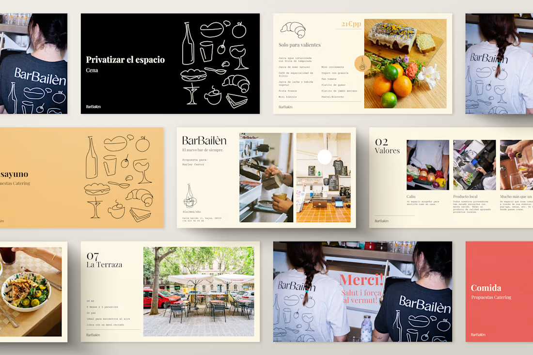
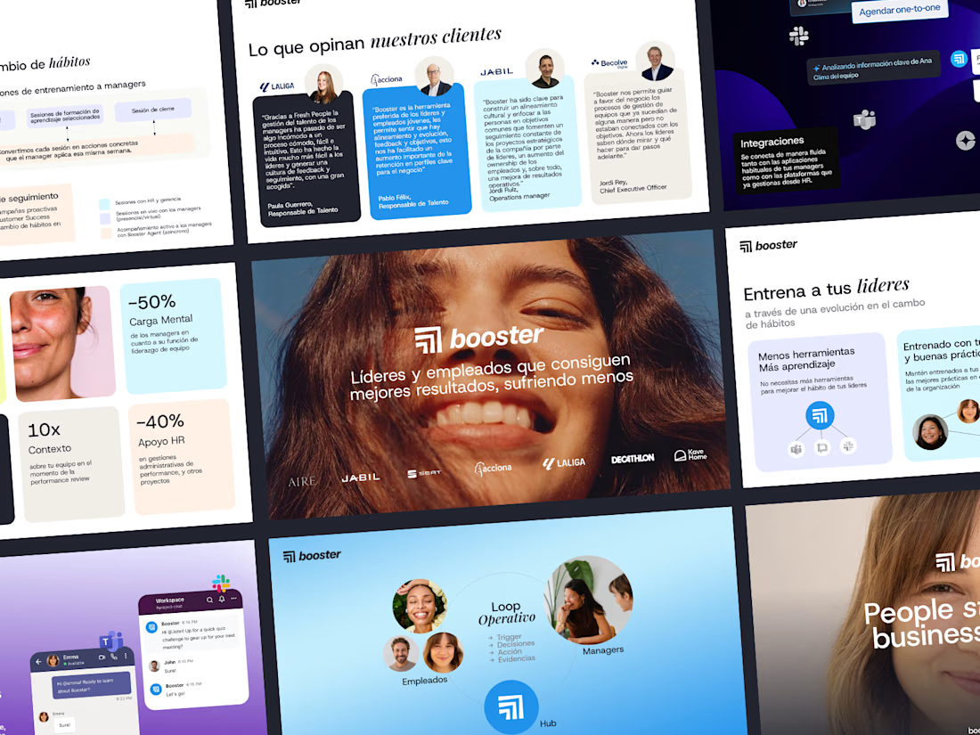
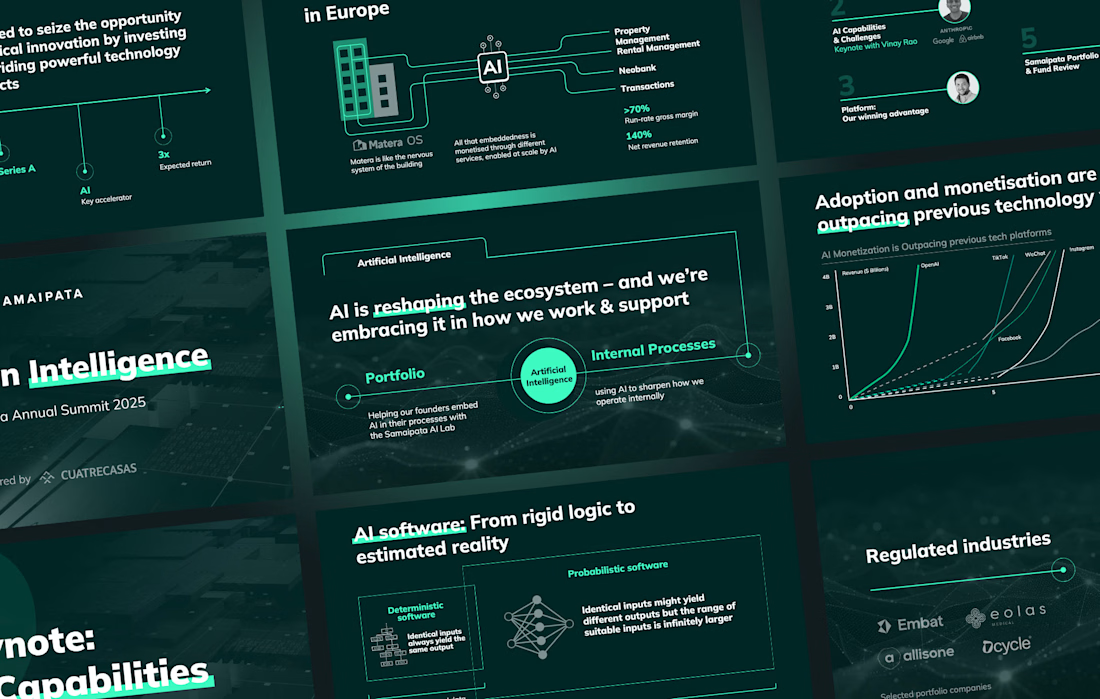
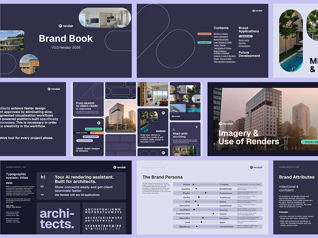

Mine is the same problem from the other side: making brand guidelines usable by whoever builds the next deck, not just the designer who wrote them. In your experience, what breaks first once decks leave your hands, the type hierarchy or the imagery rules?

Hey Artur, I work on both sides too. Usually everything breaks if the deck design system isn't in place from the beginning, even if brand guidelines are in place, hence me being on a mission to solve the problem from both sides! :)
Starting with the deck system makes sense, since the guidelines then have real slide layouts to point to instead of staying abstract. Solving it from both sides sounds like the right way to keep things from drifting.

Impresive
Thanks Rahman!

Great brand design specially top and bottom right I like them ❤️❤️
Great job Hayley🎉🎉🔥🔥
Thank you Mostafa! 😄
Pardon Hayley❤️

Thanks! Yeah, I'm proud of that one, it was a lot of work, and in google slides (which is a challenge!). Your mission sounds tough, but very rewarding when you suceed for sure!

Such a needed mission! Quick question — what's the biggest mistake you see founders make when their deck doesn't match their brand? The color system or the typography?
Often both! They are both tricky things to implement well if you don't have a clear system in place
The network for creativity
Join 1.25M professional creatives like you
Connect with clients, get discovered, and run your business 100% commission-free
Creatives on Contra have earned over $150M and we are just getting started

Related posts

Another very cool brand Identity project I got to work on this year for Elio Mortgage.
Bringing warmth and love to a brand that is usually cold and stressful. Elio are doing things differently to make mortgages easier to deal with. We made a brand that felt more approachable.
Full case study here:


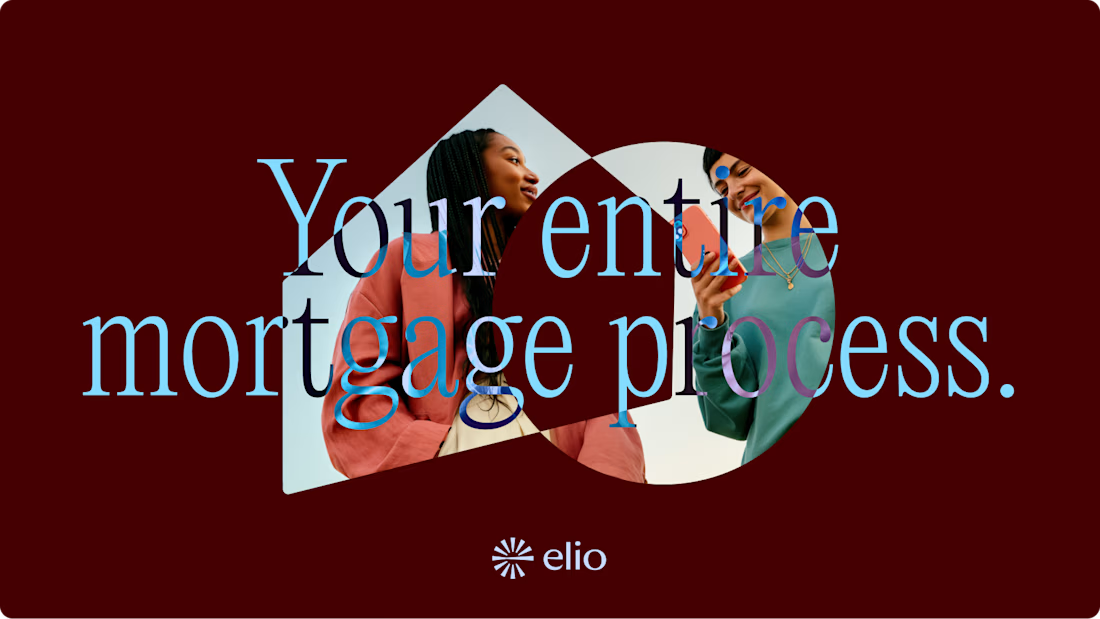
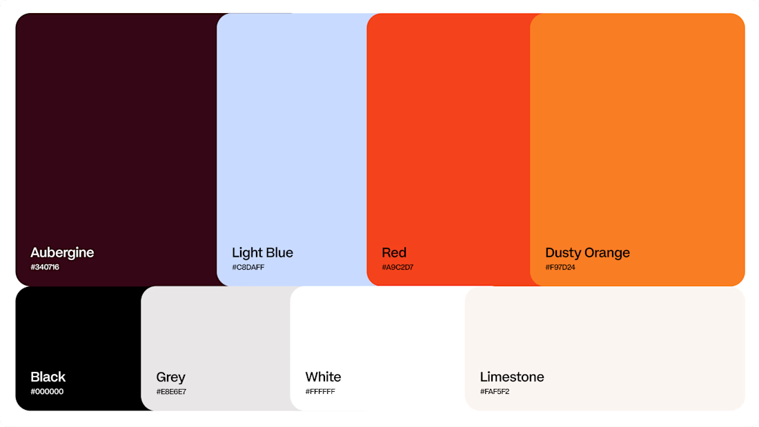
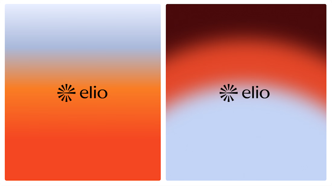

Warm, approachable identity for stressful mortgages.


Solvana is a self initiated brand identity for a boutique yoga studio, built to feel calm, grounded and premium without the usual wellness clichés. The project

Great concept and a very strong visual direction.