The network for creativity
Join 1.25M professional creatives like you
Connect with clients, get discovered, and run your business 100% commission-free
Creatives on Contra have earned over $150M and we are just getting started
Back to feedPost
I wanted a navigation bar that didn't look like a navigation bar.
I was working on a client site and needed something to help visitors move between sections, without a big menu sitting on top of everything. So I started playing with the idea of a ruler on the side of the page. One tick per section, and as you scroll, the active tick stretches out and shows you where you are.
That became RulerNav.
What I like is that the component itself is simple, but it can feel completely different depending on the site. The Marketplace version is bold and playful. The one I'm using on the client site is quieter: no background, thin lines, barely there until you scroll. I'll share the finished version of my client's website soon. Until then, enjoy. ❤️

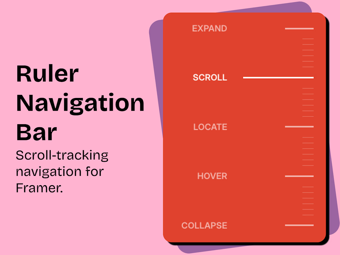

The side-ruler navigation is an interesting idea for showing progress through a page. How did you make it discoverable for visitors who might not immediately recognize it as a menu?

Hey Mykola! Glad you find the idea interesting!
I think what makes it discoverable is that it's never fully still, even collapsed, the tick keeps moving and stretching as you scroll. People tend to notice that motion first, and I think it comes across as pretty intuitive from there.
Motion as a discovery cue—makes sense.
The network for creativity
Join 1.25M professional creatives like you
Connect with clients, get discovered, and run your business 100% commission-free
Creatives on Contra have earned over $150M and we are just getting started

Challenges
View all


Related posts

A SaaS website can explain every feature perfectly and still leave one question unanswered:
Why should I care?
That's why CORESPACE includes Stories.
Instead of only describing what the product does, Stories give those features context — showing how they're used and what they make possible.
Features explain the product.
Stories make it relatable.

The “why should I care?” framing is exactly the right antidote to feature tours. Turning real team stories into the connective tissue between the product and its impact makes the homepage feel human, not just informative.


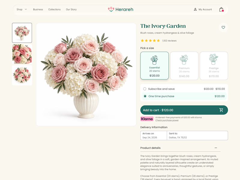
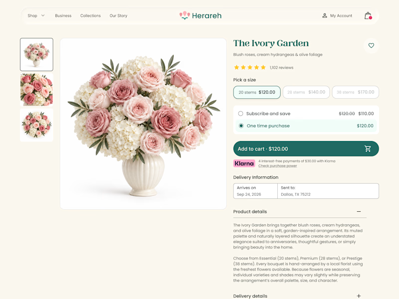

Icon cards for me, bouquets are such a visual purchase that a scannable icon beats reading "small/medium/large" every time. Did the compact chips version convert worse in testing, or are you still gathering data on that?

SENE car rental Website Projects
A car rental website shouldn't make people think too much. It should help them find the right car, understand the price, trust the service, and book with confidence.
I designed SENE around exactly that principle.
Need a website that turns visitors into customers?
I help businesses create modern, conversion-focused websites that look premium and make the user journey easier.
Available for website design & redesign projects.
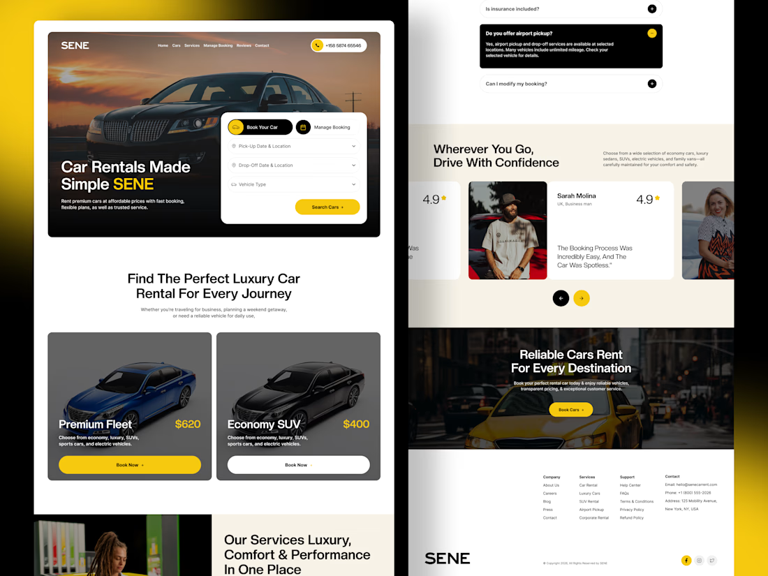

The composition is extremely clean and well organized. It’s impressive how you managed to fit so much information into the layout while keeping everything visually comfortable.