The network for creativity
Join 1.25M professional creatives like you
Connect with clients, get discovered, and run your business 100% commission-free
Creatives on Contra have earned over $150M and we are just getting started
Back to feedPost

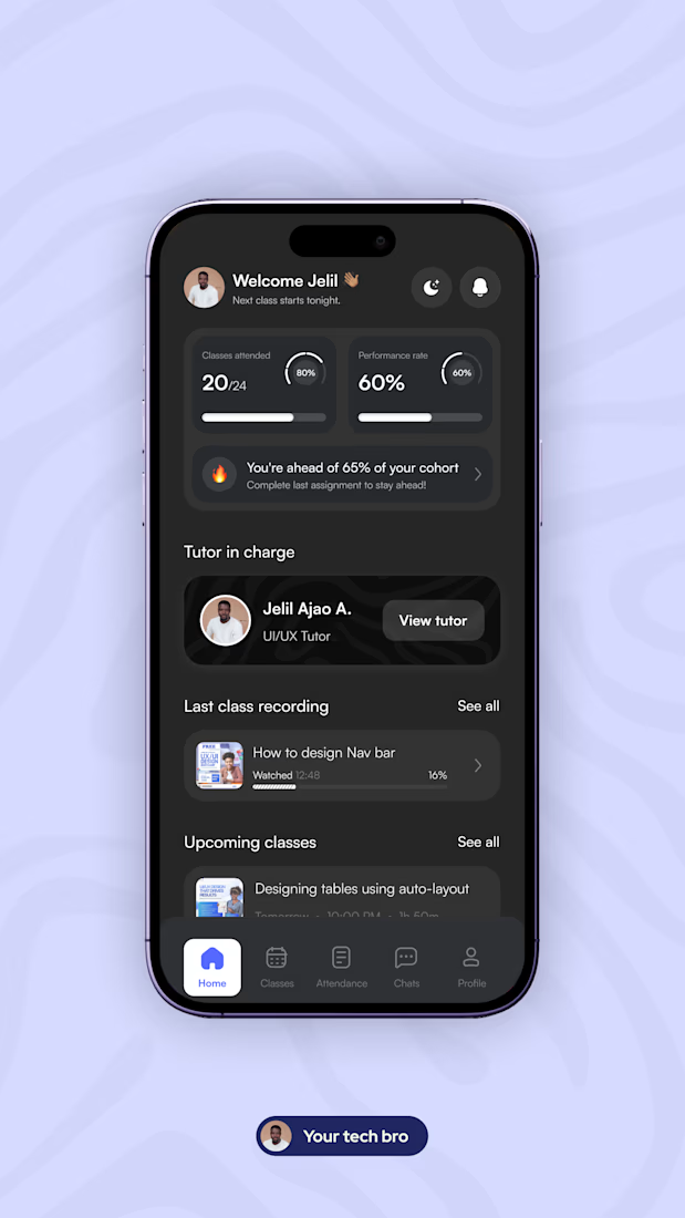
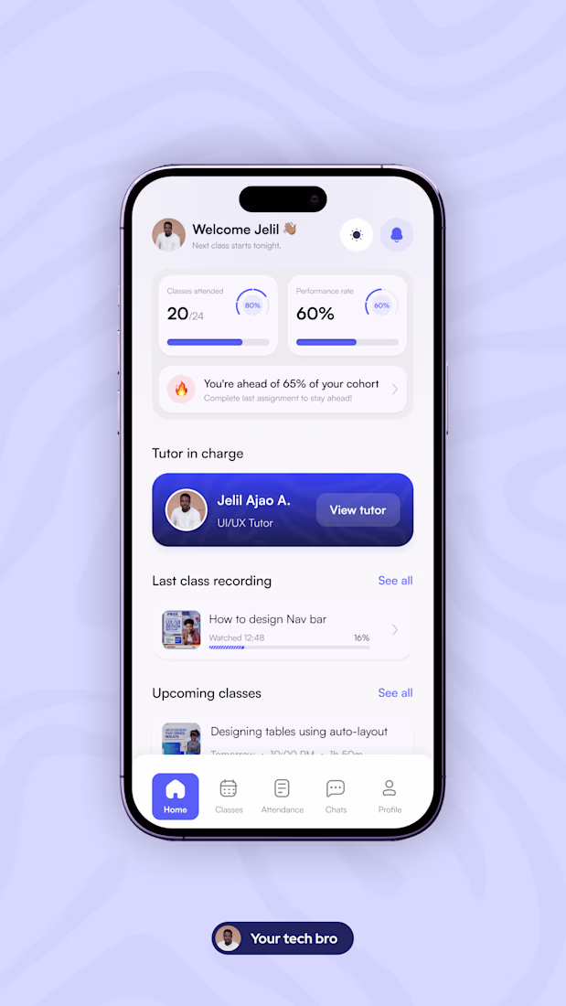
Designing for real usage means thinking beyond a single state.
For this learning app dashboard, I explored both light and dark modes with a focus on how students actually interact with products throughout the day.
The goal wasn’t just visual variation, it was consistency, clarity, and usability across contexts.
In this design:
• Key learning metrics (attendance, performance) remain easy to scan
• Important actions stay visible in both modes
• Visual hierarchy is preserved without relying on brightness
This is part of an ongoing learning platform I’m designing to improve how students track progress, stay accountable, and engage consistently.
Open to product design opportunities, especially in fintech, edtech, and data-heavy platforms.


Nice work
The network for creativity
Join 1.25M professional creatives like you
Connect with clients, get discovered, and run your business 100% commission-free
Creatives on Contra have earned over $150M and we are just getting started
Related posts

“Designers are cooked”
still getting DMs from founders to design their websites.
Because it’s never just about output.
It’s about taste. Clear thinking. Knowing what actually makes someone stop, understand, and feel something.
AI can generate fast.
But it can’t judge what’s right.
And that gap? still wide.


Great insight!

Im personally in love with this animation that we have created for carbon.inc 😍 What you guys think?
Worth an upgoat? 👀


This is smooth 🙌

We want to hire a web designer to work in long term. Here's a project to start with. Come say hi. 👇👇👇
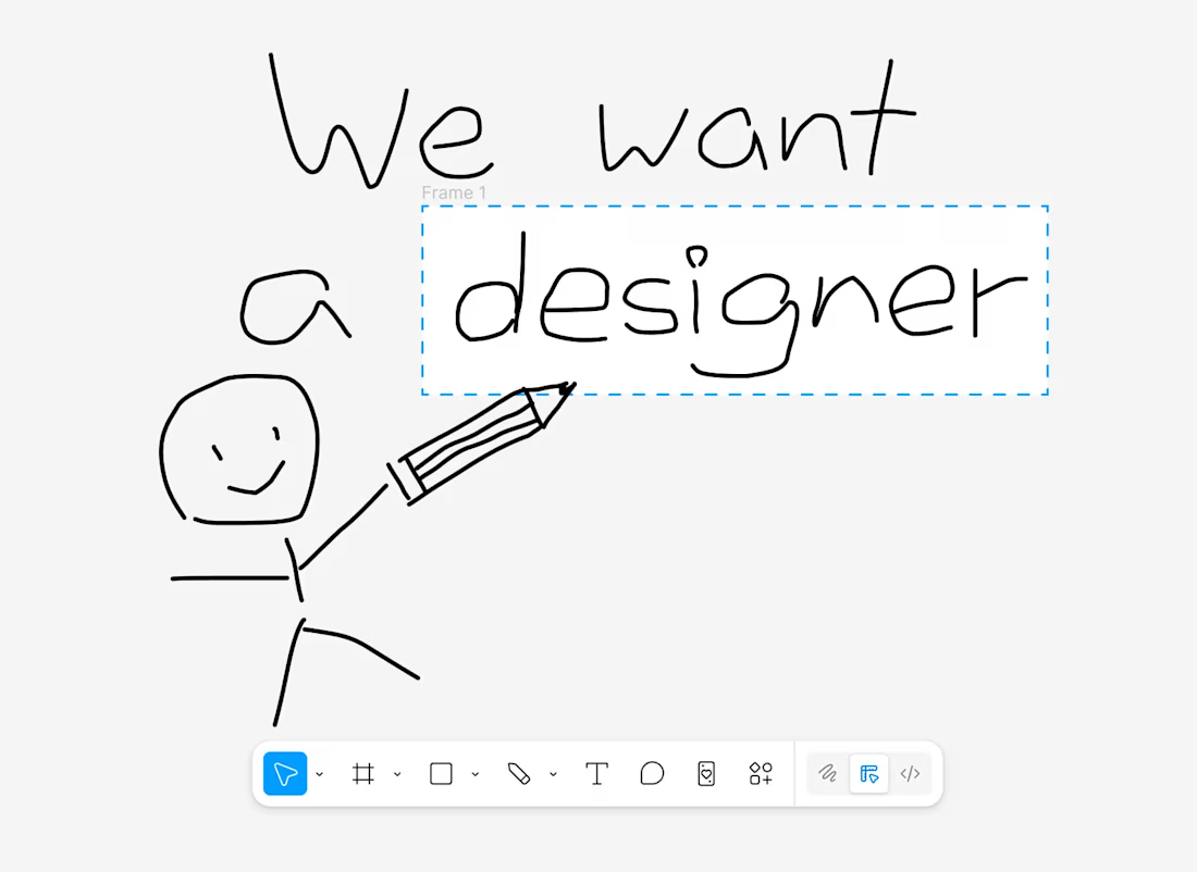
this project


Trending


FLORA
Reusable workflows are replacing one-off prompts in creative AI. Share what you're building in FLORA.
Contra University
Learn from expert creatives how to earn more using next-gen AI tools.
portfolioreview
The best portfolios tell a story, not just show a grid. Share yours for feedback.
freelancerlife
Freelancer life is wins, pivots, and everything in between. What’s yours right now?
aivideo
AI video tools are moving at warp speed. Which ones are you experimenting with?