The network for creativity
Join 1.25M professional creatives like you
Connect with clients, get discovered, and run your business 100% commission-free
Creatives on Contra have earned over $150M and we are just getting started
Back to feedPost
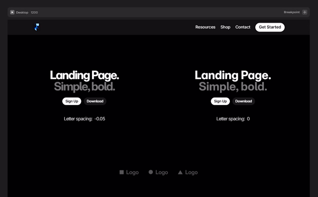
Design tip: Tighten your letter spacing.
Values like -0.05em , -0.04em , -0.03em on bold headings instantly makes your UI feel premium. most devs and designers skip this.
And why it works? tighter spacing helps the eye scan headings faster.
Note: Don't do this with body text. It'll make it harder to read as body text needs room to breathe.
The network for creativity
Join 1.25M professional creatives like you
Connect with clients, get discovered, and run your business 100% commission-free
Creatives on Contra have earned over $150M and we are just getting started
Related posts
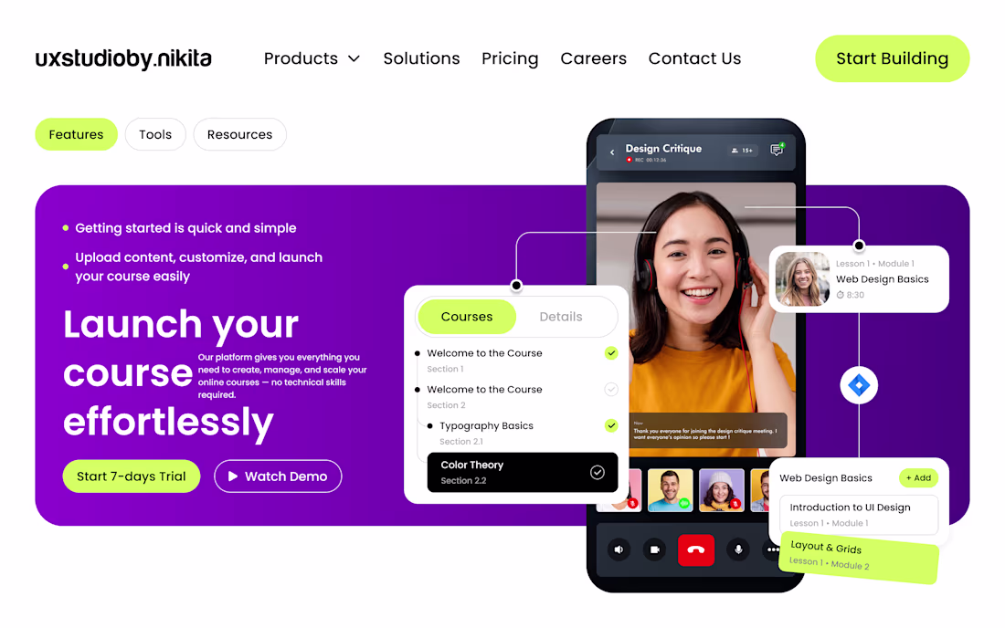
Designed a modern, high-converting SaaS hero section in Figma focused on strong visual hierarchy, clean aesthetics, and usability. Built using a structured grid system with precise spacing and alignment for a balanced and professional layout.
The design highlights a bold gradient hero background, clear typography hierarchy, and impactful call-to-action buttons to boost engagement. Key components like the navbar, buttons, and cards are created using Auto Layout, ensuring scalability and responsiveness.
Interactive elements such as course cards and video overlays are enhanced with subtle shadows, soft corner radius, and layered composition to add depth and a premium feel. Consistent use of color, spacing, and typography ensures a cohesive design system throughout.
Perfect for SaaS platforms, course websites, and startups aiming for a modern, user-friendly, and conversion-driven interface.
#UIUXDesign #FigmaDesign #SaaSDesign #WebDesign #ProductDesign #UIDesign #UXDesign #DesignSystem #LandingPageDesign #StartupDesign #CreativeDesign #InteractionDesign
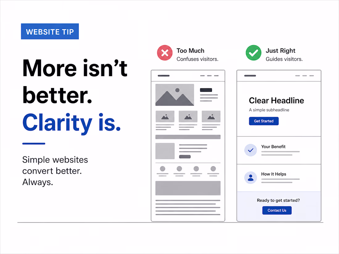
Website mistake I see often:
People add more…
thinking it will improve results.
More sections
More animations
More content
But conversion drops.
Why?
Because users don’t want more.
They want clarity.
– Clear message
– Clear offer
– Clear next step
Simple websites convert better. Always.
#websitetips #uxdesign #conversion #webdesign #freelance
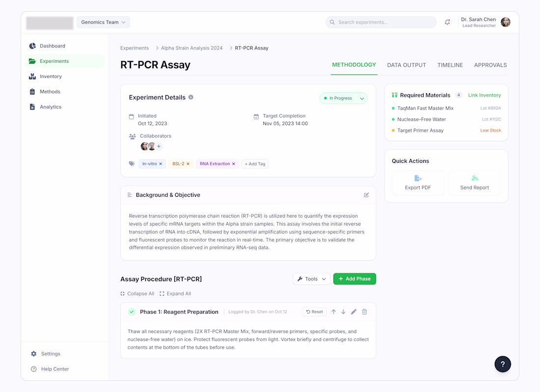
A few ideas behind this screen design:
Show the status first. "In Progress" sits right next to the title. People should see what's happening right after they see the name.
Put problems where people will see them. If something is running low, don't hide it. Show it before they start, not after.
Break big tasks into small steps. Lab work happens one step at a time. The screen should show it that way too.
Trending
Claude
Claude has entered the design space. How are you using Claude Design?
Contra University
Learn from expert creatives how to earn more using next-gen AI tools.
creativeaiflow
Creative AI workflows are evolving. What tools do you use, and what are their strengths and weaknesses?
portfolioreview
The best portfolios tell a story, not just show a grid. Share yours for feedback.
freelancerlife
Freelancer life is wins, pivots, and everything in between. What’s yours right now?