The network for creativity
Join 1.25M professional creatives like you
Connect with clients, get discovered, and run your business 100% commission-free
Creatives on Contra have earned over $150M and we are just getting started
Back to feedPost
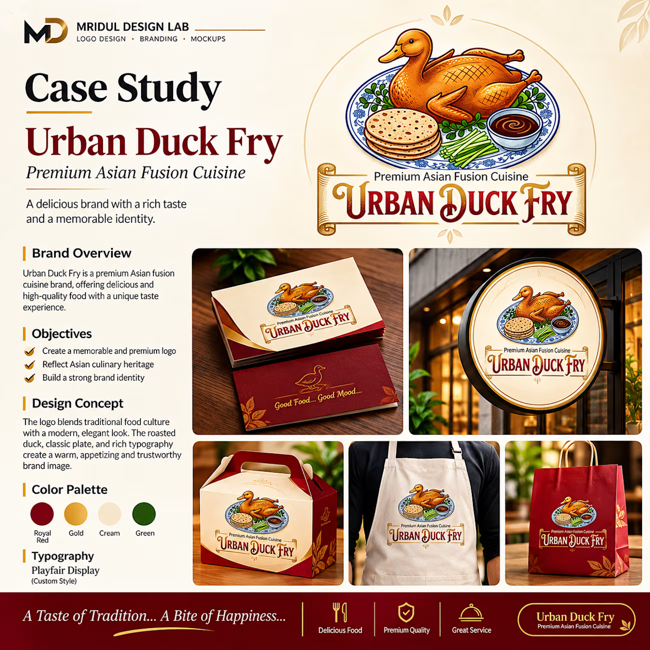
Urban Duck Fry – Premium Asian Fusion Restaurant | Complete Brand Identity Design.
Introducing Urban Duck Fry, a premium Asian Fusion Cuisine brand identity designed to combine traditional food culture with a modern, elegant, and memorable visual experience.
The identity features a distinctive roasted duck illustration, decorative typography, and a sophisticated colour palette of Royal Burgundy, Premium Gold, Cream Beige, Fresh Green, and Royal Blue.
The complete branding presentation explores:
✦ Premium Logo Design
✦ Brand Identity & Colour Palette
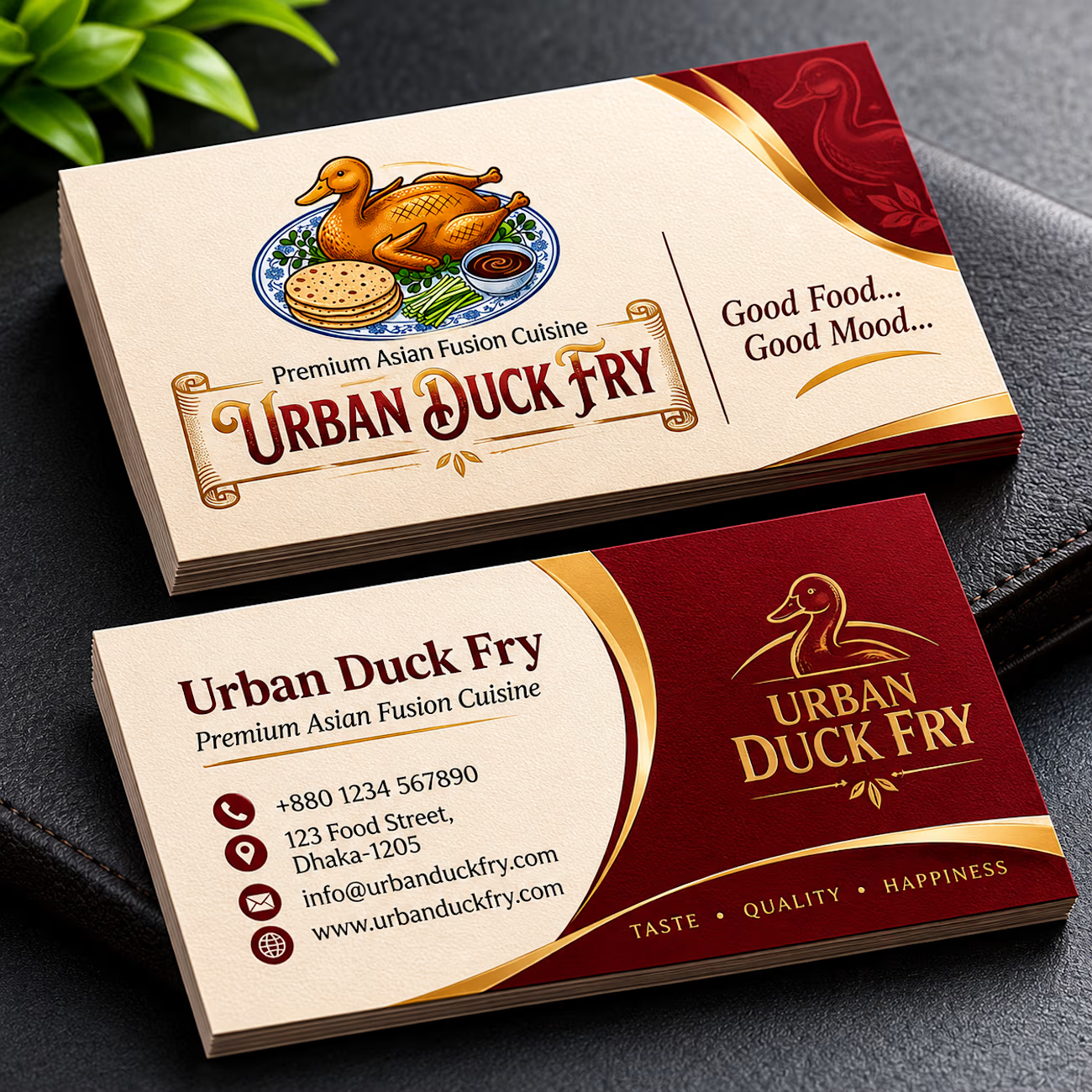
✦ Luxury Business Card Design
✦ Corporate Stationery Design
✦ Billboard Advertisement
✦ Responsive Website Preview
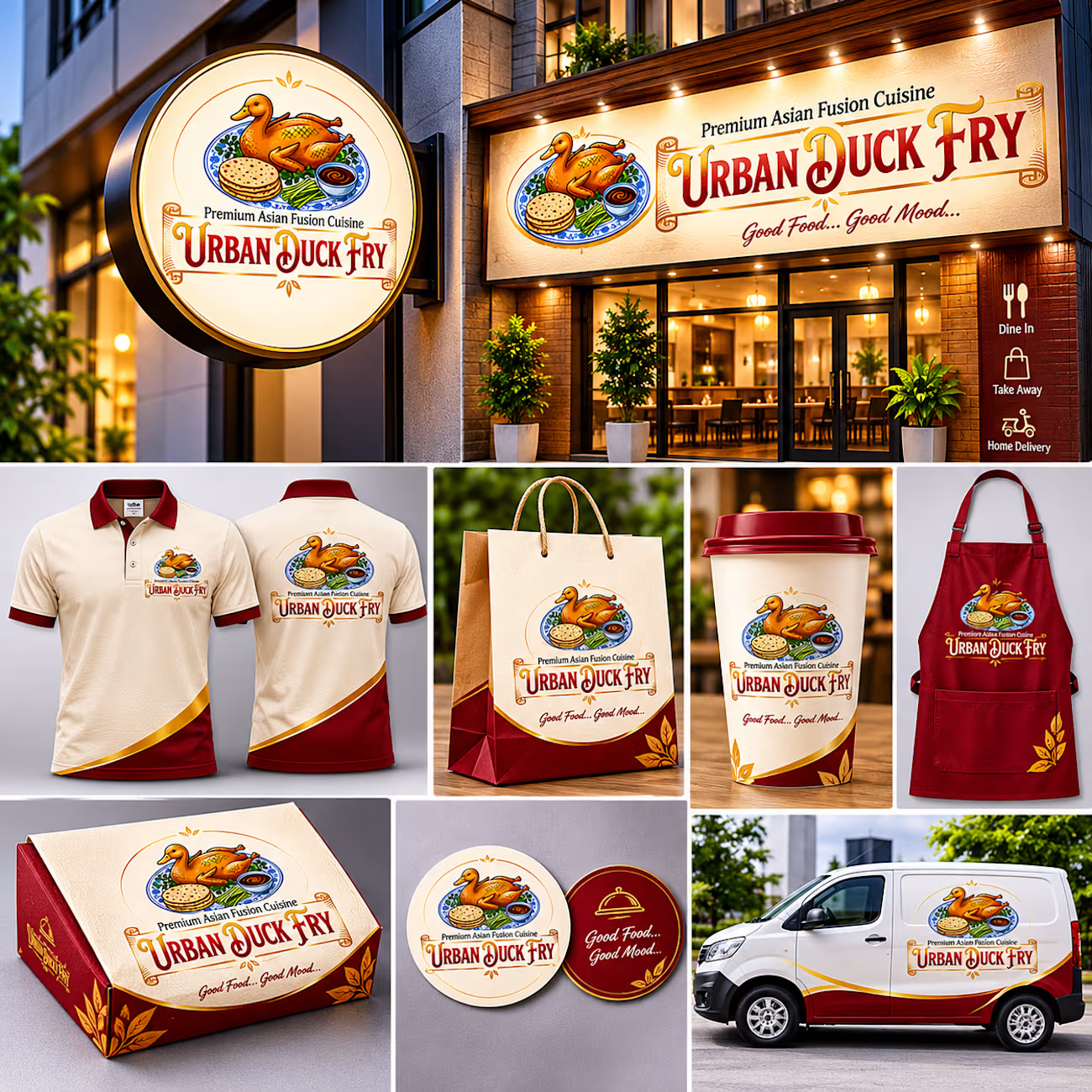
✦ Restaurant Storefront Branding
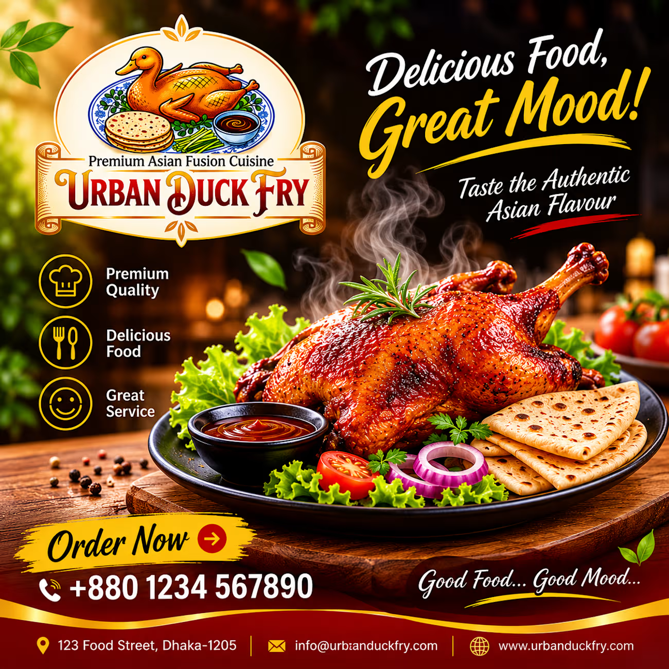
✦ Promotional Poster Design
✦ Food Packaging & Branding Mockups
✦ Professional Brand Applications
Every design element reflects the brand's personality, creating a consistent and recognizable restaurant identity.
Brand: Urban Duck Fry
Category: Restaurant & Food Branding
Industry: Premium Asian Fusion Cuisine
Tagline: Good Food... Good Mood...
Designed & Presented by Mridul Design Lab.



The color contrast between the Royal Burgundy and Cream Beige gives it an immediate high-end feel. Beautiful execution by Mridul Design Lab! Branding like this makes performance marketing so much easier because the visual trust is already built before the ad even runs.

Thank you so much 😊
The network for creativity
Join 1.25M professional creatives like you
Connect with clients, get discovered, and run your business 100% commission-free
Creatives on Contra have earned over $150M and we are just getting started



Related posts


Is text on album covers really tacky?
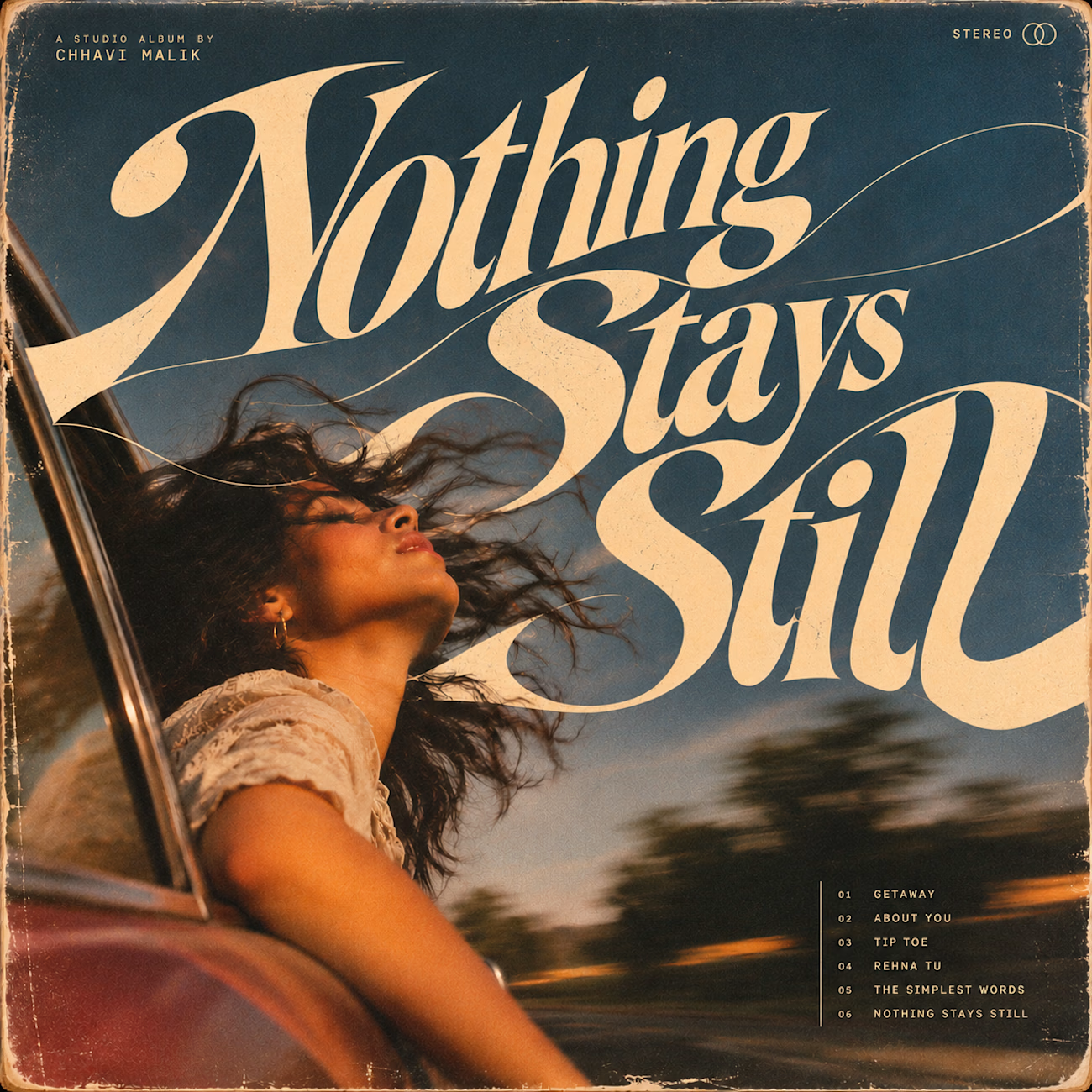
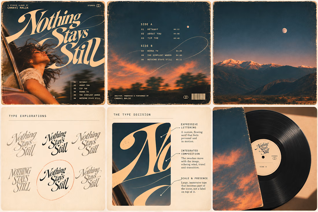
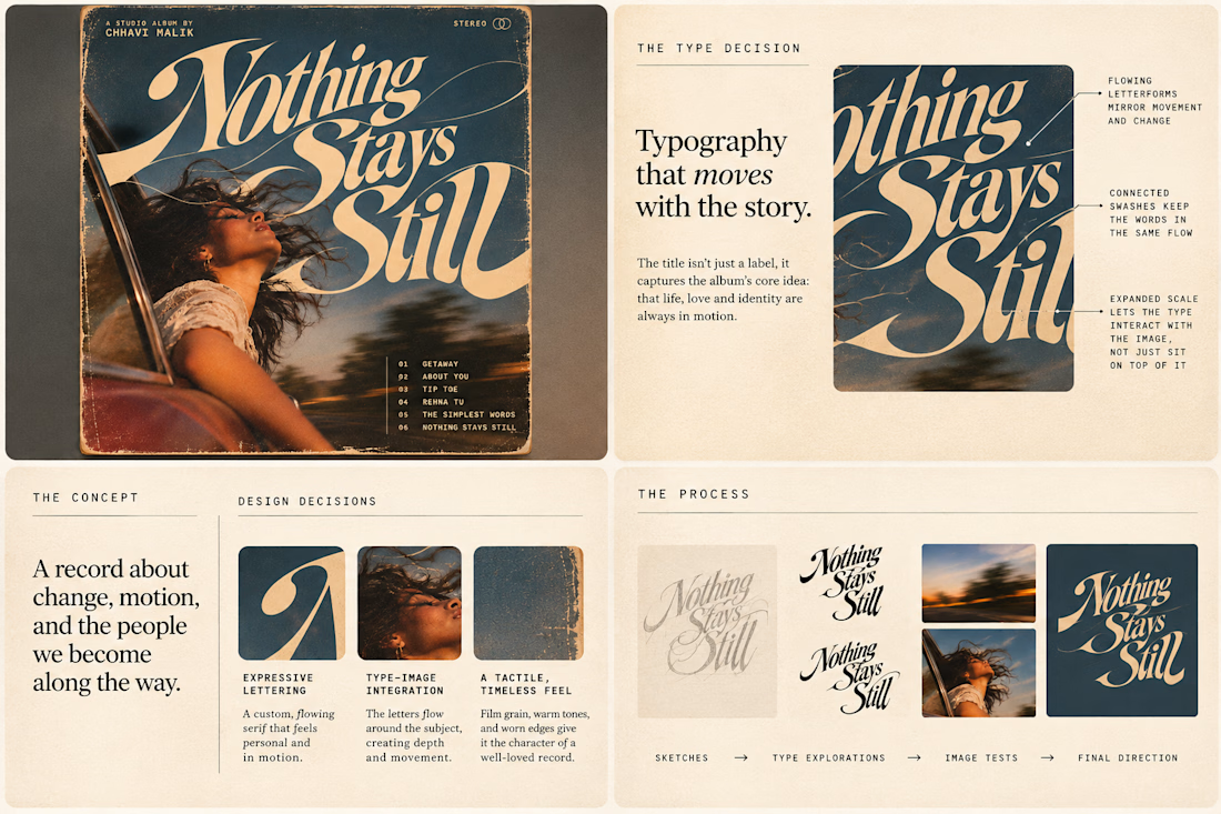
This question has been doing the rounds on X and I have to say, I'm firmly on the other side of that argument. I've always loved seeing typography become part of the artwork rather than just a title sitting on top of it.
So I wanted to put that idea to the test with an imagined album called Nothing Stays Still, inspired by change, fleeting moments and everything in between:)
I played around with the lettering until it felt expressive, a little restless, and inseparable from the photograph.
Because I think badly considered typography is tacky. Typography itself? Give it a chance :)
What's an album cover where the type really makes it for you?


A website hero and motion identity concept for Cycle.
The experience takes the viewer through seven historical eras in one continuous forward journey, while the logo, camera path and core composition remain consistent.
The concept explores how a static identity can become a living digital experience through motion, environment and interaction.
Workflow included Spline, Claude via MCP, Midjourney and SeaDance.
Available for brand identity, motion and digital design projects.


I fall in love, It is like Encarta, but 1000% better