The network for creativity
Join 1.25M professional creatives like you
Connect with clients, get discovered, and run your business 100% commission-free
Creatives on Contra have earned over $150M and we are just getting started
Back to feedPost
Taste Test
Hi, this is my personal website, do you find the brighter or darker version more appealing?( note: images have the strongest alteration)
link:https://garrulous-build-logic-flow.base44.app/
6 voted
38%
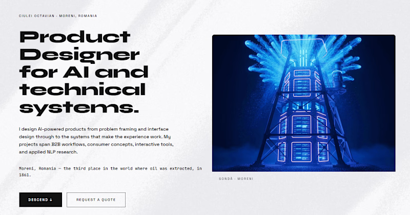
10 voted
62%
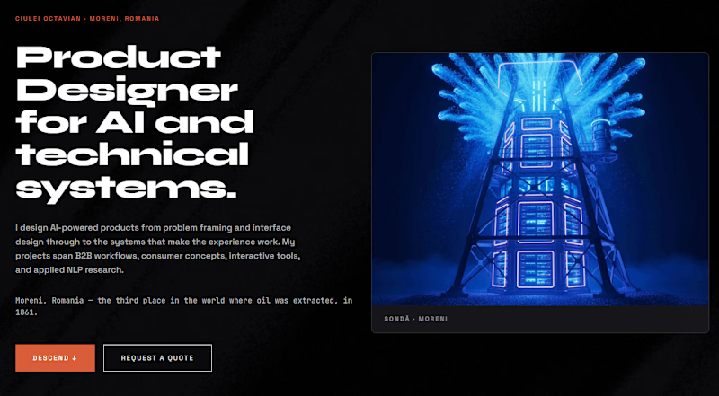
16 votes
Closed

Dark version for me. The contrast makes the visuals pop.

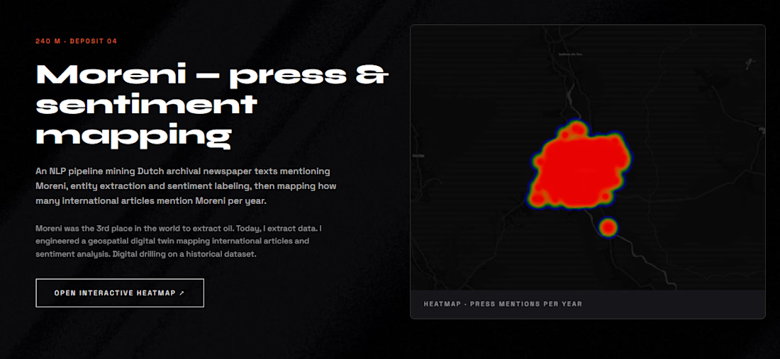
I have the same opinion!! I mean look at this visual where each dot is a real written article in history almost 100 years ago, it looks soo cool! Thank you for the feedback! 🙌

Dark version for me — that blue glow actually reads as light on black, feels washed out on white. Also just fits the “AI/technical systems” positioning better, and the orange CTA pops way harder against black. Only thing I’d double check is white text contrast on mobile in daylight 🌕
thank you for the feedback!🙌 yes I feel like the orange is so eye grabbing

Which way are you leaning yourself before the votes come in? I'll admit the darker version reads more 'technical AI systems' to me, though on a personal site that's not always the vibe you actually want people to walk away with.
I'm towards darker to be honest, I just love the contrast way tooo much; but the real story teller for me is the brighter version, as you scroll through each project, the background gets darker, this is for creating the illusion that you are drilling in the ground, and as more as you drill, as the soil is darker
The drilling metaphor is a great way to justify the progression instead of it just being a stylistic choice. Did the depth of darkening per project follow a fixed rule, or did you eyeball it project by project?

thank you Trueframe💯

Dark😍

Bright does it for me, more unique IMO, great job! 🔥
thank you very much Tan!

Dark Version 🔥


dark, no contest

Dark version is way better because the colors works very well together (the blue, black and orange) and the CTA is clear but bright one you can clearly see the huge contact between the blue image and background and that's not the best for user's eye. if you want to use the light...
ohh I see, maybe it is because of the granular style of the background, because I had problems with the font as well; thank you very much for these useful insights!🙌
Most welcome
The network for creativity
Join 1.25M professional creatives like you
Connect with clients, get discovered, and run your business 100% commission-free
Creatives on Contra have earned over $150M and we are just getting started











Related posts

I’ve been working on a bold, modern-retro logotype and can’t decide between these two options.
🆘 Which one feels more aesthetically pleasing to you?

11 voted
26%
31 voted
74%
42 votes
Closed

CAPITAL is great but SMALL is unique great job Nawras 🔥🔥

Which colour palette would you choose for the banner design for a domain business? 🔥 Fiery or 🧊 Frosty?
20 voted
36%
35 voted
64%
55 votes
Closed

Frosty seems really cool for me!!


Your Hero Section Has One Job: Be Clear.
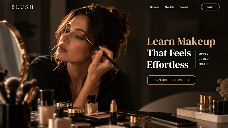
You don’t need huge headlines or long explanations. You need the right image + short headline + clear offer.
For the first version, we worked on the branding, the image and the copy together, so at first glance it’s clear: this is a makeup course, and here’s what you’ll get.
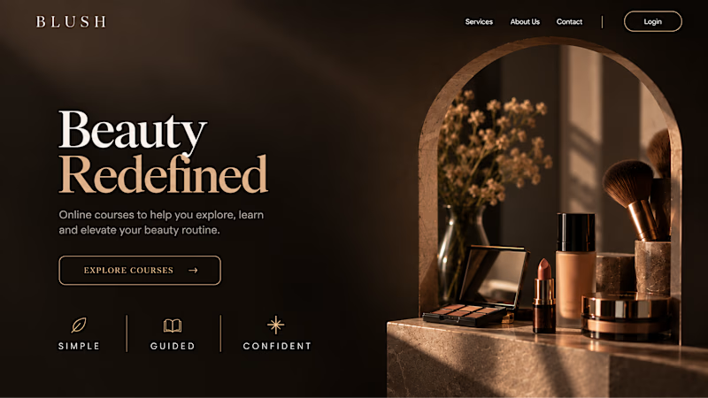
The second version is still beautiful and still feels like beauty. But what are you actually getting? A makeup course? Products? A store? That’s the problem with a Hero that looks good but isn’t thought through.
Your first screen doesn’t need to say everything. It just needs to say the right thing.

22 voted
61%
14 voted
39%
36 votes
Closed
