The network for creativity
Join 1.25M professional creatives like you
Connect with clients, get discovered, and run your business 100% commission-free
Creatives on Contra have earned over $150M and we are just getting started
Back to feedPost

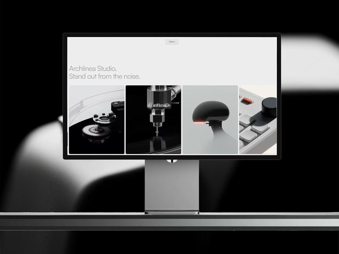
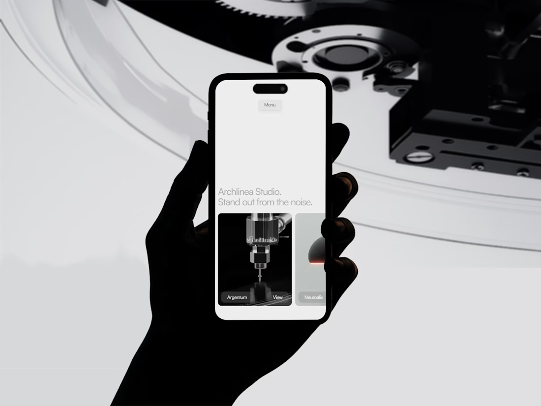
Arclinea | Creative Studio Template
I have been building this for longer than I expected. It’s done.
Archlinea is about clarity and a first impression that stands out without trying too hard. No gimmicks. No gratuitous motion. Every layout decision had to earn its place.
The hero section was the hardest part to get right. I used a project ticker to be distinctive without being loud, creating a first impression that is quiet but hard to forget.
Most portfolios look the same. The ones that get remembered don't try harder. They try clearer.



Looks great! congrats!

love this presentation
The network for creativity
Join 1.25M professional creatives like you
Connect with clients, get discovered, and run your business 100% commission-free
Creatives on Contra have earned over $150M and we are just getting started






Related posts


We designed and built the launch site for Daewoo's Velocipedo in Framer.
It's an electric trike, so the product had to carry the page. The hero is the trike parked under a rock arch, seen from a few angles, and the copy stays out of its way.
Anyone else find product-first sites harder to get right than they look?

Awesome


What is the Shader name?
BTW it is great

and here's how it sits on desktop.
more room to breathe, so the pulse carries the whole about page instead of sharing it.
looks clean?