The network for creativity
Join 1.25M professional creatives like you
Connect with clients, get discovered, and run your business 100% commission-free
Creatives on Contra have earned over $150M and we are just getting started
Back to feedPost
Taste Test

Good design gets attention. Great design gets the click. 👀
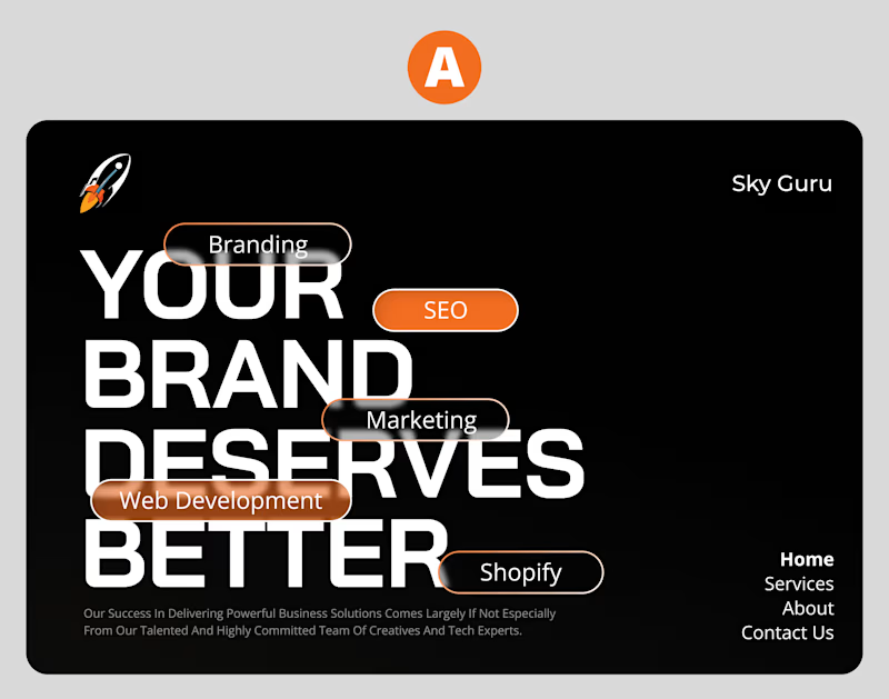
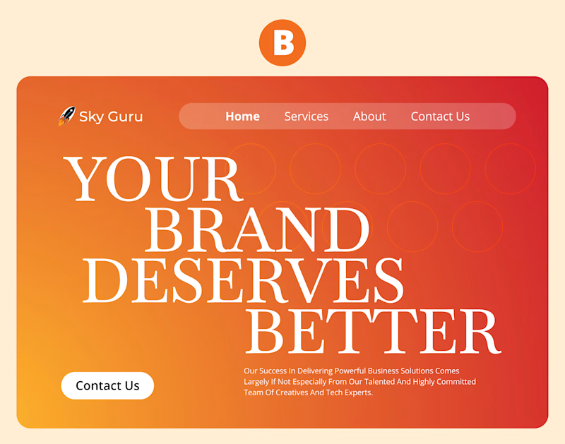
Two landing pages.Same service.Completely different visual directions.
One keeps things clean and minimal.
The other goes bold, expressive, and conversion-first.
Which one would make you stop scrolling and explore?
🅰️Bold & expressive 🅱️Clean & minimal
1 voted
100%
0 voted
0%
1 vote
Closed

Straight away to for - A . Shows exact message in no time.
The network for creativity
Join 1.25M professional creatives like you
Connect with clients, get discovered, and run your business 100% commission-free
Creatives on Contra have earned over $150M and we are just getting started



Related posts

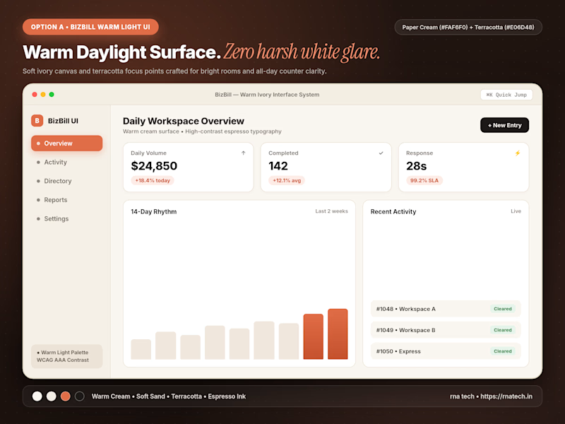
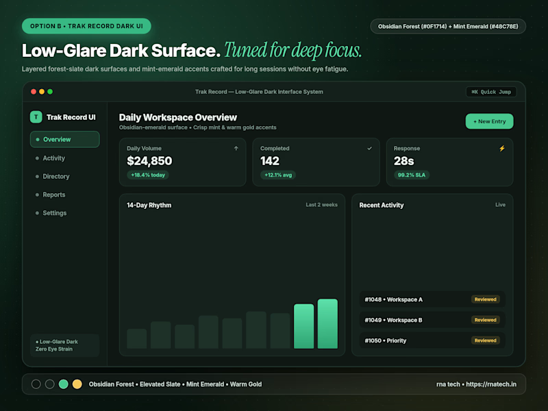
Quick poll for builders & designers here: When you're designing a data-heavy dashboard that people keep open for 6+ hours a day, do you default to Warm Light Mode or Low-Glare Dark Mode first?
4 voted
67%
2 voted
33%
6 votes
Closed

I’d start with warm light mode for a clean, comfortable look, but low-glare dark mode is a great option for long working hours too!

Two ad directions for Aura Aesthetics’ Botox Flash Sale. Same offer, different layout and feel.
Option A: split layout, model left, price card right, olive green accents, bold and direct
Option B: model fills the right, soft rounded cards on the left, all warm neutrals, quieter and more elegant
Which one makes you tap “Schedule Your Discount”? 👇
9 voted
53%

8 voted
47%

17 votes
Closed

I'd tap A: the big $179 reads first and the olive block gives the CTA real contrast. Did you run both as live ads? Curious which one won on CTR.


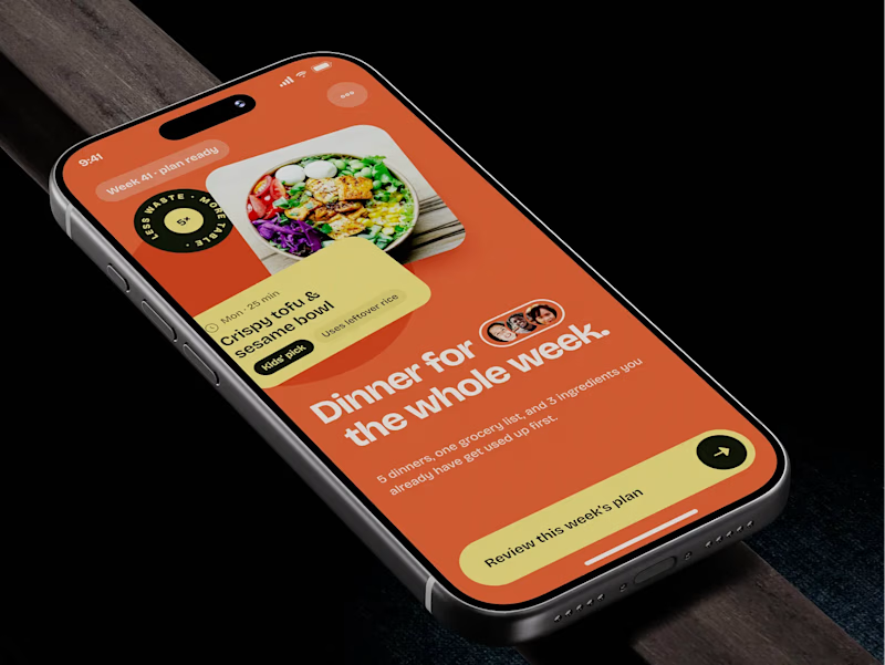
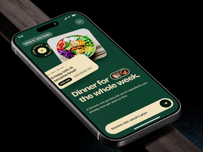
🧪 TASTY TEST: WHICH ONE MAKES NEXT WEEK FEEL SORTED?
Meal planner mobile app design. Same UX, two palettes.
🍊 A · Citrus Energy
Orange + buttery yellow. Appetite first.
🌿 B · Forest Calm
Deep green + cream. A calmer weekly ritual.
💡 GROWTH THINKING
Users want dinner handled, not another planning task.
My hypothesis: orange could win the first tap; green could signal less effort. I’d test plan-open rate AND grocery-list completion. More taps mean little if people abandon the next step.
🗳️ A OR B — WHICH WOULD YOU TRUST WITH NEXT WEEK’S DINNERS?
Vote and tell me why.
📩 BUILDING A MOBILE APP? LET’S FIND WHAT’S HOLDING GROWTH BACK.
https://calendly.com/asol_design/demo
#MobileAppDesign #AsolDesign
15 voted
68%
7 voted
32%
22 votes
Closed