The network for creativity
Join 1.25M professional creatives like you
Connect with clients, get discovered, and run your business 100% commission-free
Creatives on Contra have earned over $150M and we are just getting started
Back to feedPost

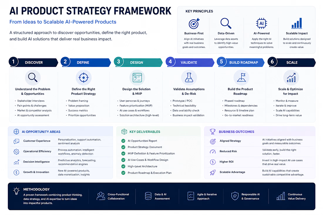
AI Product Strategy Framework
Developed a structured framework for helping startups and businesses identify, validate, and prioritize AI opportunities before investing in product development.
The framework combines product strategy, business analysis, AI opportunity assessment, and roadmap planning to ensure that AI initiatives are aligned with measurable business outcomes.
Objective
Create a repeatable approach for transforming ideas into scalable AI-powered products while reducing implementation risk and maximizing return on investment.
Framework Components
• Opportunity Discovery & Assessment
• Business Problem Definition
• Product Strategy Development
• AI Use Case Identification
• MVP Planning & Prioritization
• Technical Feasibility Evaluation
• Product Roadmap Design
• Growth & Scaling Strategy
Key Deliverables
✓ AI Opportunity Analysis
✓ Product Strategy Document
✓ MVP Definition & Prioritization
✓ High-Level Solution Architecture
✓ Product Roadmap
✓ Go-to-Market Recommendations
✓ Execution Plan
Business Impact
✓ Reduced product development risk
✓ Faster validation of new ideas
✓ Improved investment prioritization
✓ Clearer product direction
✓ Better alignment between business goals and technology decisions
Applications
This framework is suitable for SaaS products, AI startups, internal business platforms, automation initiatives, marketplaces, and digital transformation programs.
The approach focuses on delivering practical, business-driven AI solutions rather than implementing technology for its own sake.


The network for creativity
Join 1.25M professional creatives like you
Connect with clients, get discovered, and run your business 100% commission-free
Creatives on Contra have earned over $150M and we are just getting started

Challenges
View all


Related posts


“Or similar” leaves a lot to the imagination.
A few billboard designs I made for Sync as part of the rebrand. The campaign centres on a simple promise: the car you see is the car you drive.
I kept that message big and direct, with the cars up close and enough pink to make you look twice.
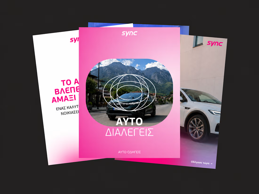
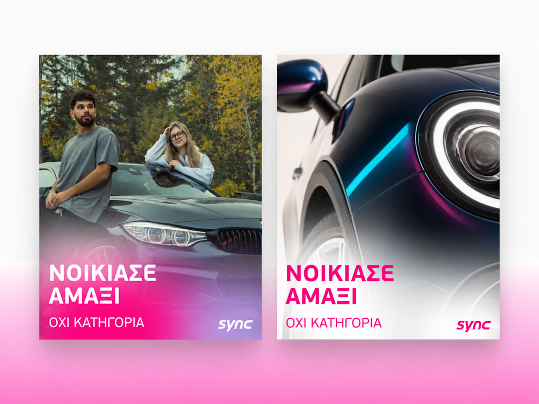

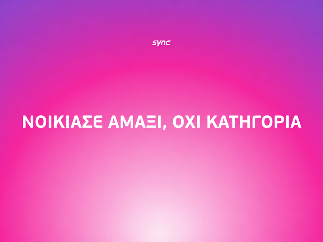

The way the oversized promise carries through the pink palette is really effective—the close-up crops make the car feel immediate without losing the campaign idea.


The low-poly scene already has a strong sense of place, and the 60fps browser target makes the interaction feel ambitious in the best way. I especially like how the restrained palette lets the “Explore the Silo” typography lead the experience.

Keystone - HR Management Platform
Employee list screens are the homework assignment of SaaS design. A table is a table is a table. Nobody's winning an award for this view and that's exactly why it matters.
The restraint here is the point. No colored tags, no status badges fighting for attention, no dashboard widgets crammed into the sidebar. Just the data, breathing in a dark container with enough row spacing that your eyes don't blur at record five.
That split between a bold brand identity and a restrained product UI is one of the hardest things to get right in B2B SaaS.
#SaaS #DashboardDesign #DarkUI #B2BTech #ProductDesign
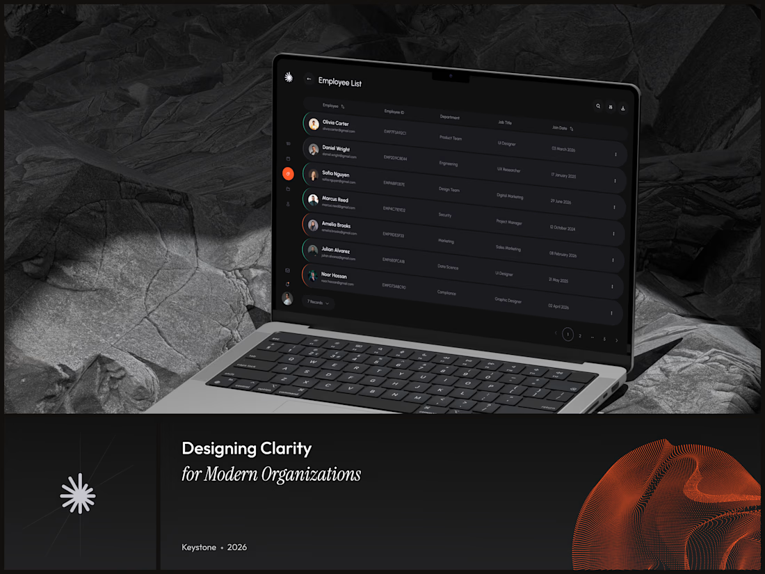

"A table is a table" is the harder argument to make internally than the design itself - most teams would've shipped colored status tags just to have something to show in a review.