The network for creativity
Join 1.25M professional creatives like you
Connect with clients, get discovered, and run your business 100% commission-free
Creatives on Contra have earned over $150M and we are just getting started
Back to feedPost
Wix gets underestimated a lot.
I have worked on Wix websites where the problem wasn’t the platform at all.
The real problem was how the website was built.
A business can have a great service, great branding, and great content, but if the website has poor spacing, confusing navigation, weak CTAs, slow sections, or doesn’t work properly on mobile, visitors will notice.
When I work on a Wix website, I look beyond the visual design.
I focus on:
→ Clean and responsive layouts
→ Better user experience and navigation
→ Stronger calls to action
→ Wix CMS and dynamic content
→ Booking and form functionality
→ SEO structure and on-page optimization
→ Mobile and tablet performance
→ Making the site easy for the owner to manage
One thing I especially like about Wix is that businesses can manage a lot themselves after the website is built.
That only works when the foundation is set up properly.
A website shouldn’t make the business owner dependent on a developer for every small update.
For the Wix designers and developers here:
What is the most common problem you find when taking over an existing Wix website?
I’m curious to hear what everyone is seeing in client projects. 👇
#Wix #WixDeveloper #WebDesign #WixbyVelo #WebDevelopment #SEO


While all three areas are critical for a successful project, fixing mobile navigation almost always yields the biggest impact on your business.
Mobile Navigation: Because Google uses mobile-first indexing and over half of all web traffic is on mobile, a confusing menu acts as a...
The network for creativity
Join 1.25M professional creatives like you
Connect with clients, get discovered, and run your business 100% commission-free
Creatives on Contra have earned over $150M and we are just getting started





Related posts

AI Sales Agent SaaS Landing Page
A modern AI Sales Agent & Sales Intelligence SaaS website designed for startups and growing businesses looking to automate sales workflows, streamline lead management, and boost revenue through intelligent automation and real-time insights. The design combines a premium SaaS aesthetic with a conversion-focused user experience, featuring clear product messaging, interactive sections, and a scalable interface built to support modern sales teams.


Amazing design

Solene: skincare e commerce website, built in Framer
Skincare shopping should feel as good as the routine itself. For Solene, I designed and built a full online store with a soft, warm identity: a bold maroon and pink palette, big expressive type and real-skin photography.
What's inside:
A hero that sets the brand tone straight away
A Bestsellers section for quick browsing
Category pages for Cleanse, Hydrate and Protect
A shop page with price slider, filters, sorting and hover image previews
An Our Story page with brand values
A clean, confident footer
Need a website for your beauty or lifestyle brand? Let's talk.


The hover image previews on the shop page caught my eye - they let shoppers sense texture instantly without an extra click.

Saas Management Landing Page Design


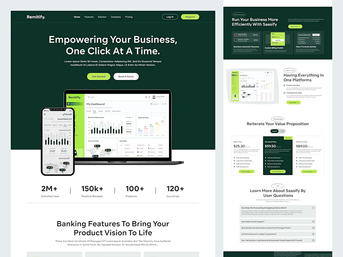


The deep green with lime accents reads "finance you can trust" without feeling like a bank, and the stats row right under the hero adds instant credibility. When pages like this get built, the dashboard in the hero is the part I'd make live: a lightweight animated version with...